In this article
As an engineering manager leading multiple teams, I face a common challenge daily: creating the right visibility for different audiences. My developers need detailed metrics on cycle times and code quality. My leadership wants high-level insights on business impact and delivery progress.
Jellyfish’s new dashboard functionality has transformed how I handle this challenge. I’ve created customizable views that deliver exactly the right information to each audience, eliminating hours of report preparation each week.

Instead of cobbling together spreadsheets and screenshots before meetings, I now share purpose-built dashboards with a single link. The impact has been immediate – more focused discussions, faster decisions, and better alignment across my organization.
Creating specialized dashboards for specific needs
Creating specialized dashboards for specific needs
What I appreciate most about Jellyfish’s new functionality is how easily I can create and maintain different views for different purposes.
Here’s how I’ve used it to transform our daily operations:
Team meetings
For our team ceremonies, I’ve created a specialized dashboard showing metrics worth celebrating, at-risk deliverables, current priorities, and sprint progress. This focused view guides our conversations toward specific improvement opportunities rather than general feedback. Our meetings now result in more actionable improvements because we’re discussing real data, not perceptions.

Selecting the metrics that matter
I’ve configured dashboards to highlight only the metrics that move the needle for us – commits per week, epic cycle time, issues resolved, and team deployments.
The real power of this setup is in the focus – it cuts through the noise and highlights only the metrics that matter for this team. No more digging through irrelevant data or disconnected reports. Now, every time we review the dashboard, the team gets an immediate visual of what’s on track and what needs attention.
Highlighting critical deliverables
One of my biggest challenges used to be keeping everyone focused on the right work, especially during busy sprints. To solve this, I updated our dashboard to spotlight our highest-priority deliverables. By surfacing key epics and projects, I created a single source of truth that keeps everyone aligned on what matters most right now.
The impact was immediate:
- Standups became more focused
- Team members stopped asking, “What should I be working on?”
- Everyone started moving in the same direction
It’s become a simple but powerful way to keep priorities clear and execution tight.
Setting and tracking goals
The true game-changer has been the ability to display goals with clear visual indicators showing if we’re on or off track. I’ve configured our dashboard to highlight sprint velocity, quality metrics, and DORA metrics with green/yellow/red indicators.
![]()
These visual indicators create immediate accountability and focus. When a metric turns red, the team doesn’t need my prompting to address it – they can see the issue and take action.
Onboarding new team members efficiently
When we added two new developers last month, I created a tailored onboarding dashboard to accelerate their ramp-up. It included:
- Our team’s key performance indicators (goals)
- Current priorities and in-progress work
- Metrics that are important to our team and the business
This gave new team members instant context around what success looks like and helped them integrate into the team’s workflow quickly. With this new dashboard, instead of spending weeks figuring out what matters, new team members start productive, aligned, and confident from day one.
Creating executive-ready views for leadership conversations
As my teams’ performance improved, I needed a better way to communicate that progress to senior leadership. The multi-dashboard functionality made it simple to tailor insights for different audiences.
While some technical leaders need visibility and the ability to dig deep, executives care most about business value delivery – they want to see the business impact.
Elevating the conversation with executive dashboards
To shift from status updates to strategic discussions, I created a dedicated “Engineering Delivery Overview” dashboard for my monthly meetings with our VP of Engineering. It intentionally takes a different approach:
- Aggregated performance across all teams
- Progress on major deliverables tied to quarterly objectives/goals
- Business impact indicators, like feature adoption
This allows me to move the conversation from tactical details to strategic value. Our leadership meetings now spend 70% of the time on future planning rather than status reporting.
Tip: Your dashboard should answer “How is engineering delivering business value?” – not just “What is engineering doing?
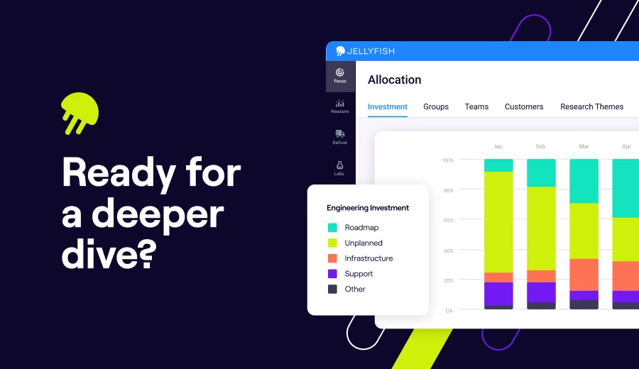
Resource allocation visibility
One of the most valuable components for executive discussions has been the allocation views. With this, I can clearly show:
- How resources are split between maintenance and interruptive work (KTLO) and new and planned development (roadmap and technical investment)
- Whether strategic initiatives have the right staffing levels
- Where we might need additional investment to stay on track

This visibility has transformed our resourcing conversations from subjective debates to data-driven discussions.
Implementation made simple
Implementation made simple
Building a dashboard takes just a few clicks. I start by navigating to Home > Dashboard Management and hitting + Create New Dashboard. From there, I select exactly what to display, hit Publish, and share the link with my team.
The entire setup process takes less than 10 minutes, but the impact on your team’s visibility and alignment is immediate.
Transforming your engineering insights
Ready to transform your engineering insights?
Jellyfish’s new dashboard functionality eliminates the need to create different reports for different audiences. You can now build targeted views that deliver the right information to the right people at the right time.
Whether you’re aligning teams, informing executives, or onboarding new members, these tools provide the visibility and context you need.
For engineering managers, this means less time creating reports and more time driving results. It means clearer communication, faster decisions, and better alignment across your organization.
The dashboard functionality is available now in your Jellyfish account. Log in today to create your first custom dashboard!
Get started with Jellyfish today!
Not a Jellyfish customer? Explore Dashboards and so much more in the Jellyfish platform.
About the author

Marilyn is an Engineering Manager at Jellyfish. Her specialities include communicating, programming, researching, working well with others and with the command line, leading, being independently motivated to learn and to create.
She primarily works in Java, JS (mostly React/Redux, some NodeJS, MongoDB, and Angular), and python, with previous experience in PHP, Haskell, C, Perl, and Ruby. Diverse interests along the full stack have led to a plethora of other familiarities, including git, AWS (mostly ECS, S3, RDS, Dynamo, and Cost Explorer), Jenkins, TravisCI, PostgreSQL, Spring, mvn, svn, MySQL, XML, XSLT, CSS, sed, yacc, x86 assembly, and many other acronyms.