In this article
Harness SEI offers engineering teams a window into delivery performance, cycle times, and developer productivity – all within a broader DevOps platform. That bundled approach works for some organizations, but it also creates headaches.
Some common user complaints include a slow and cluttered interface, one-size-fits-all dashboards, and a learning curve steeper than what you’d find with standalone SEI tools.
Maybe you’ve experienced these pain points first-hand, or maybe you’re just researching options before making a decision. Either way, this guide covers what you need to know.
We put together a list of 8 Harness SEI competitors worth considering in 2026. For each tool, we compared core capabilities, integration options, pricing models, and what users are saying on G2 and Reddit.
Why Look for an Alternative to Harness SEI?
Why Look for an Alternative to Harness SEI?
Harness SEI is one piece of a much larger DevOps platform, and that context shapes the user experience. Here’s what comes up most often when teams explain why they’re looking elsewhere:
- Cluttered, slow interface: Users report that the UI feels overwhelming, with visualizations that don’t fit properly on screen and important parameters buried under layers of navigation. [Read Full G2 Review]
- Limited filtering and search capabilities: Teams can’t filter by multiple account names or service types simultaneously. If you’re managing numerous services across different environments, this makes finding relevant information unnecessarily tedious. [Read Full G2 Review]
- Limited dashboard customization: The out-of-the-box dashboards may not match how your team tracks performance. Without the ability to build custom views, you’re stuck adapting your reporting to the tool rather than the other way around. [Read Full G2 Review]
- Platform complexity bleeds into SEI: Harness SEI sits within a much larger DevOps suite, and that sprawl can make onboarding harder than it needs to be. Teams that just want engineering metrics often find themselves confused over a platform built for a dozen other use cases. [Read Full G2 Review]
- Troubleshooting falls on you: Connecting SEI to your existing dev tools should be straightforward, but some teams have struggled to get timely help from the support team when configurations go sideways. For a module that relies heavily on integrations, that can be a major gap. [Read Full G2 Review]
- Gaps in native reporting: Built-in metrics and analytics don’t always provide the depth teams need for comprehensive reporting. Many users find themselves pulling in extra analytics tools to get a complete picture of performance and outcomes. [Read Full G2 Review]
Key Features and Functionalities to Look For in a Harness SEI Alternative
Key Features and Functionalities to Look For in a Harness SEI Alternative
SEI platforms vary more than feature lists suggest, and the right choice depends on what you’re primarily trying to solve.
The features below cover both the basics that should work well out of the box and the areas where purpose-built SEI platforms tend to outperform Harness’s module:
Dashboards you can customize
Look for platforms that let you build custom views around the metrics you care about – cycle time by squad, PR throughput, allocation by initiative, or whatever else fits your workflow.
Custom dashboards also make it easier to give engineering managers, directors, and executives each a view that’s relevant to their role without cramming everyone into the same generic interface.
A clean, navigable interface
You shouldn’t need a training session to find basic metrics. The best SEI platforms put frequently used insights within easy reach and let you drill down without getting lost in navigation.
Pay attention to how the UI feels during demos. If it’s frustrating when you’re being guided through it, it probably won’t get much better once you’re on your own.
Flexible filtering and data slicing
You should be able to filter data by team, repository, project, sprint, or custom time ranges without limitations.
If the platform forces you into broad, pre-defined views, you’ll spend more time in spreadsheets than you should.
Reliable integrations and responsive support
Your SEI platform needs to connect to everything from GitHub to Jira to your CI/CD system, and those integrations need to stay healthy over time.
Before committing, confirm that the platform supports your specific stack and see what users say about getting help when configurations go sideways.
Alignment between engineering work and business outcomes
DORA metrics show delivery speed and track deployment strategies like rollbacks, but they won’t tell you if your team spent the quarter on features that moved the needle or got buried in unplanned work.
Platforms that categorize engineering effort (features vs. bugs vs. technical debt vs. support) give you the context you need for resource allocation conversations with leadership.
This is where Jellyfish and similar tools stand out. Sure, Harness SEI captures delivery velocity well, but the business alignment layer is much thinner.
Financial reporting and R&D capitalization
If your company capitalizes software development costs or claims R&D tax credits, someone has to track which engineering work qualifies.
Some SEI platforms (like Jellyfish) automate this by mapping work to capitalizable categories and generating audit-ready reports. Harness SEI doesn’t focus on this area, so if DevFinOps matters to your finance team, it’s worth prioritizing tools that do.
Measuring AI tool impact
AI coding assistants are now standard, but measuring their business impact is still a guessing game for most teams. A handful of SEI platforms, Jellyfish being one, let you compare adoption and outcomes across tools like Copilot, Cursor, and Amazon Q.
Harness SEI hasn’t made this a priority, so if you’re trying to justify AI tooling spend or figure out what’s truly working across your engineering team, this is a differentiator worth considering.
Top Alternatives to Harness SEI on the Market Right Now
Top Alternatives to Harness SEI on the Market Right Now
The SEI market has grown crowded, and the differences between tools aren’t always obvious from a features page.
Some of these alternatives lean heavily into delivery metrics, others focus on connecting engineering work to business outcomes, and a few offer capabilities that Harness SEI doesn’t prioritize at all.
For each one, we looked at what it does, who it’s built for, what users say about it, and where pricing lands when that information is available:
- Jellyfish
- DX (Atlassian)
- Waydev
- Axify
- Haystack
- Oobeya
- Allstacks
- Faros AI
| Solution | Platform Type & Focus | Best For |
| Jellyfish | All-in-one engineering intelligence (delivery, allocation, DevEx, AI adoption, R&D financials) | Organizations that want full visibility from code to boardroom in a single platform |
| DX (Atlassian) | Developer experience platform with survey-driven insights | Teams that prioritize DevEx measurement, especially Atlassian-heavy shops |
| Waydev | AI-native engineering analytics with a conversational interface | Teams that want fast setup and natural language data exploration |
| Axify | Value stream mapping with Monte Carlo forecasting | Teams struggling with delivery predictability and missed deadlines |
| Haystack | Team-level Git analytics, anti-surveillance design | Engineering orgs where developer trust is a top priority |
| Oobeya | DORA metrics with proactive issue detection | Large orgs with complex hierarchies or Azure DevOps environments |
| Allstacks | ML-powered delivery forecasting and stakeholder reporting | Teams that need to communicate progress to non-technical leadership |
| Faros AI | Data unification platform with 100+ connectors | Companies with complex, non-standard, or homegrown toolchains |
1. Jellyfish
Jellyfish is a software engineering intelligence platform that covers more ground than any other tool in the category. It includes delivery metrics, capacity planning, resource allocation, developer experience, AI tool adoption tracking, and R&D financial reporting, all in a single platform.
Used by over 700 companies, including DraftKings, Keller Williams, and Blue Yonder, it’s the broadest and deepest SEI solution available.
Compared to Harness SEI, which treats engineering metrics as one module in a broader DevOps platform, Jellyfish is purpose-built for engineering intelligence and offers deeper coverage of resource planning, R&D financials, and AI adoption.
Key Features
- Patented resource allocation model for investment visibility: Jellyfish automatically categorizes engineering work by initiative, work type (features, bugs, tech debt, support), and business priority.
- AI Impact dashboard for coding tool ROI: Tracks adoption, usage, and productivity outcomes across GitHub Copilot, Cursor, Amazon Q, Claude, and other AI assistants. You can compare tools side-by-side, tie usage to delivery metrics, and make data-backed decisions on where to invest.
- Scenario Planner for resourcing decisions: Simulates how allocation changes affect timelines before you commit. It’s especially useful for helping engineering, product, and finance align on what’s realistic given available capacity.
- DevFinOps and R&D capitalization: Maps engineering work to capitalizable categories automatically and generates audit-ready reports for software capitalization and R&D tax credits.
- Developer experience surveys and sentiment tracking: The platform collects engineer feedback on friction, tooling, and workflow health through built-in surveys. Combines with system data to surface blockers that pure metrics won’t reveal.
- Life Cycle Explorer for end-to-end flow analysis: Shows where work spends time across the entire delivery pipeline – backlog, development, review, and deploy. You can easily spot bottlenecks like slow PRs or rework loops and prioritize fixes.
Why Do Companies Choose Jellyfish Over Harness?
Harness SEI handles the basics of delivery tracking, but teams often outgrow it when they need more flexibility, better support, or answers that pipeline metrics can’t provide.
Here’s where Jellyfish pulls ahead:
- Flexible dashboards vs. rigid out-of-the-box views: Harness users frequently mention limited dashboard customization. On the other hand, Jellyfish lets you build custom views around the metrics that matter to your role, whether you’re in engineering, product, or finance. [Read Full G2 Review]
- Hands-on support vs. DIY troubleshooting: When Harness integrations break, users report waiting too long for help. Jellyfish’s support team is consistently rated as responsive and proactive, especially during onboarding and configuration. [Read Full G2 Review]
- Purpose-built platform vs. module in a larger suite: Harness SEI is one piece of a sprawling DevOps platform, and that complexity bleeds into the user experience. Jellyfish is built specifically for engineering intelligence, which means less bloat, faster onboarding, and a product roadmap focused entirely on what engineering leaders need. [Read Full G2 Review]
- Granular filtering vs. limited search and slicing: Harness doesn’t let you filter by multiple account names or service types simultaneously, which makes finding relevant data tedious at scale. Jellyfish supports flexible filtering by team, repo, sprint, or custom time ranges out of the box. [Read Full G2 Review]
- AI tool impact measurement vs. no native support: Measuring the ROI of AI coding assistants isn’t a Harness focus. Jellyfish tracks adoption, usage, and productivity outcomes across tools like Copilot, Cursor, and Amazon Q so you can make data-backed decisions on AI investments. [Read Full G2 Review]
- Engineering-to-business alignment vs. DevOps metrics only: Harness tracks delivery velocity, but doesn’t help you answer where investment is going. Jellyfish connects engineering work to initiatives, work types, and capitalizable categories. [Read Full G2 Review]
What Real Customers Are Saying about Jellyfish
TravelPerk had no unified way to measure velocity or resource allocation because each team tracked things differently. With Jellyfish, they spotted bottlenecks like slow code reviews and addressed them quickly. The company now spends 30% more time on roadmap work with 25% better delivery predictability.
Kaleris, a collection of eight acquired subsidiaries, had over 600 engineers using different tools with no shared view of performance. Jellyfish gave them a consistent way to track investments across product lines. As a result, PR cycle time improved by 21%, and mean time to resolution dropped by 19%.
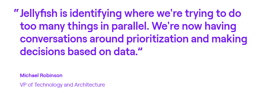
Acoustic had no way to compare contractor performance against internal teams. With Jellyfish benchmarking, they identified underperforming agencies, saved $80K in contractor costs, and saw a 35% increase in delivery predictability.
2. DX (Atlassian)
DX is an engineering intelligence platform that combines system metrics from your dev toolchain with self-reported developer survey data to measure productivity across speed, quality, and business impact.
Atlassian acquired DX in September 2025 for $1 billion, and integration with Jira, Bitbucket, and Compass is expected to deepen over time.
Where Harness offers primarily on system-based delivery metrics, DX puts equal weight on developer experience data, so it’s a stronger fit for teams that want to understand friction and morale alongside velocity.
Key Features
- Developer Experience Index (DXI): A proprietary 14-question survey framework that quantifies developer experience and correlates it with productivity outcomes. DX claims a one-point DXI improvement saves about 10 hours per developer per year.
- Benchmarking against peers: DX lets you compare your DXI and productivity metrics against anonymized data from hundreds of other engineering organizations.
- Atlassian ecosystem integration: With the acquisition, DX will integrate tightly with Jira, Bitbucket, Bitbucket Pipelines, and Compass. If your team is already deep in the Atlassian stack, this makes DX a natural fit.
Advantages
- Actionable, low-friction feedback loops: The snapshot surveys are quick for developers to complete and give managers timely input they can act on. [Read Full G2 Review]
- Easier access to custom data: The AI query builder makes it easier to pull custom reports without needing to write complex queries yourself. Users report that it lowers the barrier to accessing the specific data they need. [Read Full G2 Review]
- Structured visibility into developer sentiment: Getting clear, comparable data on how developers feel about their work and tooling is hard to do manually. DX automates the survey cadence and tracks trends over time, so you’re not starting from scratch each quarter. [Read Full G2 Review]
Limitations
- Tiered pricing can force unwanted upgrades: Certain connectors require moving to a higher subscription tier, even if you don’t need the rest of what’s included. This makes the pricing feel less flexible than it could be. [Read Full G2 Review]
- Custom data access still requires some technical skill: SQL support is available, but users have noted they’d like more native tooling to make data exploration easier for non-technical users. [Read Full G2 Review]
- Trend insights take time to build: Because DX relies partly on historical survey data, meaningful long-term trends won’t appear until you’ve been using the platform for a few quarters. [Read Full G2 Review]
Pricing
DX requires a sales conversation to get pricing. It’s structured around team size and feature selection, which is typical for enterprise-focused SEI tools, but means there’s no easy way to compare costs upfront.
3. Waydev
Waydev is an engineering intelligence platform that integrates with Git, Jira, CI/CD tools, and calendars to provide 130+ metrics on velocity, quality, and team performance.
The platform is known for its fast setup, clean UI, and conversational AI features that let you ask questions about your engineering data instead of clicking through dashboards.
Compared to Harness SEI, Waydev has leaned heavily into AI – both in how you interact with the platform and in its ability to track adoption and impact of AI coding tools like Copilot.
Key Features
- Conversational AI for engineering data: Waydev AI lets you ask natural language questions like “What’s our average cycle time this sprint?” or “Which teams are accelerating velocity?” and get instant, data-backed answers.
- AI coding tool integration: Waydev integrates with GitHub Copilot, Cursor, and other AI assistants to track adoption rates, acceptance patterns, and productivity impact.
- Fast time-to-value: Waydev commonly mentions its quick onboarding, where you get initial insights within 15 minutes of connecting your first repo and baseline metrics within 24 hours.
Advantages
- Low-friction onboarding: Getting Waydev connected to your stack is straightforward, and the default dashboards give you a workable overview right away. From there, you can customize views without starting from scratch. [Read Full G2 Review]
- Automated performance summaries: Waydev sends scheduled emails with key team metrics, so you’re not constantly logging in to stay informed. [Read Full G2 Review]
- Better signal for retrospectives and coaching: The platform brings quantitative grounding to sprint retros and 1:1s, so it can replace vague impressions with specific metrics. [Read Full G2 Review]
Limitations
- Limited historical data imports: Waydev doesn’t pull data from as far back as some users would like, which can make it harder to compare current performance against older projects or long-term trends. [Read Full G2 Review]
- Roadmap and community presence could be stronger: Users have noted they’d like more visibility into upcoming features and broader developer-focused content. [Read Full G2 Review]
- Occasional slowness: Some users report that the platform can lag at times, particularly when loading dashboard templates. It’s not a dealbreaker, but worth noting if speed is a priority. [Read Full G2 Review]
Pricing
A free trial is available, and paid plans are priced per active contributor on an annual basis:
- Pro ($29/mo per contributor): Covers DORA metrics, health and delivery dashboards, and benchmarking (up to 50 repos with 6 months of data).
- Premium ($54/mo per contributor): Builds on Pro with resource planning, custom metrics, DX surveys, AI coding tool insights, and API access. Supports 300 repos and retains 36 months of data.
- Enterprise (contact sales): Unlimited repos and retention, on-prem options, SSO/SAML, and hands-on engineering support.
4. Axify
Axify combines value stream mapping, DORA metrics, and predictive delivery forecasting into a single engineering intelligence platform that helps teams ship more predictably.
While Harness SEI focuses more on DevOps performance and productivity metrics, Axify is a better fit if your main problem is missed deadlines and unclear timelines.
Key Features
- Delivery forecasting: Uses Monte Carlo simulations based on your team’s historical performance to predict when items will ship. You can forecast either how many items you’ll deliver in a given timeframe or when a specific set of items will be done.
- Value stream mapping: You get visual maps of your entire development process to better understand where time is spent, where work gets stuck, and where bottlenecks slow things down.
- DORA metrics dashboard: Real-time tracking of continuous deployment frequency, lead time, change failure rate, and recovery time. The dashboards are presentation-ready and built for both team retrospectives and stakeholder reporting.
Advantages
- Responsive, hands-on support: The Axify team gets high marks for responsiveness and follow-through. If you hit a wall during setup or configuration, you’re not left figuring it out alone. [Read Full G2 Review]
- Fast setup and flexible configuration: The platform connects to your existing tools in minutes and adapts to how your team functions already, rather than forcing you into a rigid structure. [Read Full G2 Review]
- Makes hidden inefficiencies visible: Even if your internal systems have the data, it’s often buried or hard to interpret. Axify organizes it so you can see exactly where work is getting stuck and what to improve. [Read Full G2 Review]
Limitations
- Steeper curve for advanced features: The basics are straightforward, but some of the deeper functionality isn’t immediately intuitive. [Read Full G2 Review]
- Limited depth for historical analysis: If you want to compare current performance against data from years back, the platform may not go as deep as you’d like. It’s better suited for ongoing and recent project tracking. [Read Full G2 Review]
- Feature set is still maturing: Axify is actively evolving, which means some capabilities you might expect aren’t there yet. Worth checking during your evaluation whether specific features you need are available or on the roadmap. [Read Full G2 Review]
Pricing
Axify offers a free tier and modular pricing based on what you need:
- Free Forever ($0): One team, one project, with access to Accelerate and AI Impact module features. Good for testing the platform.
- Accelerate ($19/month per contributor): Focused on delivery speed and includes VSM, DORA metrics, sprint tracking, and pull request metrics. Unlimited teams, up to 10 projects.
- AI Impact ($19/month per contributor): Built for measuring AI tool adoption and comparing AI vs. non-AI workflows. Unlimited teams, up to 10 projects.
- Bundle ($32/month per contributor): Both modules at a discounted rate.
- Enterprise (contact sales): Unlimited projects, volume discounts, data export, custom development, and on-premise options.
5. Haystack
Haystack is a Git-based engineering analytics tool that integrates with GitHub, GitLab, Bitbucket, and Jira to measure DORA metrics, visualize delivery flow from commit to deploy, and point out team health patterns.
The platform built its reputation on being explicitly anti-surveillance. Metrics stay at the team level, there are no individual developer comparisons, and engineers see the same dashboards as leadership.
Key Features
- DORA metrics and delivery flow visualization: Tracks change lead time, deployment frequency, change failure rate, and throughput from first commit to deploy. The interface breaks down cycle time into sub-stages (coding, review wait, rework).
- No individual developer rankings: Haystack deliberately avoids features that compare or rank engineers. There are no leaderboards or individual scorecards.
- Weekly insights and sprint health reports: Delivers automated assessments of sprint progress, blockers, and improvement opportunities. It’s especially useful for retrospectives and delivery check-ins.
Advantages
- Guided onboarding with clear explanations: Setup walks you through each feature and metric in detail, so teams understand what they’re looking at from day one. [Read Full G2 Review]
- Risk alerts that are easy to act on: Slack notifications for blockers like stale PRs or overloaded team members are clear, fast, and don’t require digging through dashboards. [Read Full G2 Review]
- Flexible historical views: Metrics can be tracked over different time ranges, from sprint-over-sprint comparisons to six-month trends. [Read Full G2 Review]
Limitations
- Interface can feel sluggish: The web UI occasionally lags, and some users have noted that the design feels dated compared to newer tools in the category. [Read Full G2 Review]
- Limited integrations with communication tools: Slack alerts exist, but deeper continuous integrations with other communication platforms would help get metrics in front of more people. [Read Full G2 Review]
- Not all metrics are immediately actionable: Some stats feel more informational than useful, and the path from insight to team action isn’t always clear. [Read Full G2 Review]
Pricing
Pricing is straightforward with a 14-day free trial to start:
- Growth ($20/month per member): For teams under 100 engineers. Includes unlimited alerts, 12 months of historical data, and email/Slack support with account specialist access.
- Enterprise (custom pricing): Built for larger teams (100+). Includes everything in Growth plus on-premise options, custom integrations, a dedicated performance specialist, quarterly reports, and onboarding sessions.
6. Oobeya
Oobeya is an engineering intelligence platform that integrates with Git repos, CI/CD pipelines, and APM tools to track DORA metrics, cycle time, agile performance, and code quality. Companies can streamline delivery at both the team and org level.
The platform leans harder into proactive issue detection and cross-platform DORA tracking, while Harness SEI is more tightly coupled to its broader DevOps suite.
Development teams that found Harness SEI too dashboard-heavy or reactive may prefer Oobeya’s automated alerts and prescriptive recommendations.
Key Features
- Symptoms Module: Automatically scans for delivery problems like long PR review times, stuck work items, scope creep, and under-planned sprints. Each detected symptom includes a description, potential causes, and recommended improvements.
- Organizational hierarchy support: You can model your org structure (clusters, tribes, and squads) and view metrics at any level. This is useful for larger engineering orgs that need to optimize delivery performance across multiple teams.
- Agile board analytics: Connects to Jira and Azure Boards to track sprint accuracy, work type distribution, and issue flow.
Advantages
- Clean, customizable dashboards: The interface is user-friendly and easy to tailor for different audiences, whether you’re reporting to a team lead or presenting to executives. [Read Full G2 Review]
- Seamless Azure DevOps integration: Connects quickly and gives instant visibility into delivery pipelines, work types, and lead times with minimal setup. [Read Full G2 Review]
- Engineering-to-business alignment: Makes it easy to see how teams are splitting time between new features, tech debt, and support, which helps tie engineering investment back to business priorities. [Read Full G2 Review]
Limitations
- Limited export options for charts: Reporting works well inside the platform, but exporting visuals in different formats could be more flexible. [Read Full G2 Review]
- Symptom detection could be more contextual: Alerts flag issues effectively, but they don’t always account for team-specific nuances. [Read Full G2 Review]
- Custom Jira workflows need configuration: Teams with non-standard Jira setups may need to tweak things before data syncs properly, though usability stabilizes once dialed in. [Read Full G2 Review]
Pricing
Pricing isn’t listed publicly. Oobeya uses a tiered model based on team size and feature access:
- Starter: 25 contributors, 10 repos, and 3 teams. Basic support and self-service.
- Business: 50 contributors, 50 repos, and 10 teams. Basic support and self-service as well.
- Premium: 100 contributors, 300 repos, and 20 teams. Adds SSO, API access, private cloud, and premium support. A free trial is available.
- Enterprise: Unlimited analytics, dedicated CSM, org chart setup, and volume discounts. You’ll have to contact sales for extra details.
7. Allstacks
Allstacks is a value stream intelligence platform that pulls data from Git, CI/CD, and project management tools and applies machine learning to forecast delivery dates and detect at-risk work.
The platform is more forward-looking than Harness SEI, which tends to focus on retrospective metrics and dashboard reporting.
Engineering teams that want to know when work will ship and what might cause delays will find Allstacks’ predictive capabilities more useful.
Key Features
- Predictive delivery forecasting: Uses machine learning to analyze historical patterns and generate risk-adjusted completion dates at the initiative, epic, or story level.
- Engineering-to-business alignment: Tracks how engineering work maps to business initiatives and OKRs. It’s particularly helpful for communicating progress to non-technical stakeholders.
- DevEx surveys and sentiment tracking: Built-in developer experience surveys measure satisfaction across key areas.
Advantages
- Dashboards are easy to read and act on: The interface is intuitive, and the predictive insights make it easy to spot risks before they escalate. [Read Full G2 Review]
- Responsive, helpful support: The support team is quick to reply and genuinely useful when issues come up. [Read Full G2 Review]
- Easy integration across data sources: Setup is smooth, and pulling data from multiple tools into one view makes cross-org visibility simple. [Read Full G2 Review]
Limitations
- Team-specific views need upfront setup: Configuring filtered dashboards for individual product teams takes some work. Out of the box, users see a global view and have to filter manually. [Read Full G2 Review]
- Daily data sync may feel slow: Data refreshes once a day, which works for high-level tracking but can be frustrating if you need to verify recent changes quickly. [Read Full G2 Review]
- Forecast accuracy depends on source data quality: The predictions are only as good as what’s coming in from Jira, Git, etc. If your data hygiene isn’t strong, the forecasts can be harder to interpret or trust. [Read Full G2 Review]
Pricing
Pricing starts with a free trial (no credit card). Paid options include:
- Premium ($400/contributor/year): Multitenant hosting, SSO/SAML support, up to 500 contributors, and six weeks of guided onboarding.
- Enterprise ($600/contributor/year): Everything in Premium plus single-tenant hosting, data export API, unlimited retention, and a dedicated CSM.
- R&D Cap ($200/contributor/year): Built for teams that just need automated R&D capitalization and audit-ready reporting.
8. Faros AI
Faros AI maps data from 100+ engineering tools (Git, CI/CD, issue tracking, incident management) into a canonical schema, then applies ML and natural language queries to generate insights across the SDLC.
For companies with complex or non-standard toolchains that need deep customization and API-level access, Faros’s enterprise-grade platform brings much more flexibility than Harness.
Key Features
- Lighthouse AI: A natural language interface for exploring engineering data. You can ask questions, generate charts, and get AI-powered explanations of metrics.
- Canonical data schema: Faros maps data from different sources into a unified schema with 50+ connected entities (tasks, commits, deployment pipelines, incidents, etc.).
- 100+ integrations with custom source support: Connects to GitHub, GitLab, Jira, Jenkins, CircleCI, PagerDuty, and many more out of the box. For homegrown systems, you can build custom Airbyte connectors or use the real-time Events API.
Advantages
- Hands-on partnership from the start: The Faros team takes the time to understand your setup and stays responsive throughout onboarding. [Read Full G2 Review]
- Handles complexity well: The platform takes care of the heavy lifting around data normalization and logic, which would otherwise take months of work from technical teams. [Read Full G2 Review]
- Strong visualization flexibility: Lots of options for how you display and slice your data, which helps when building dashboards for different stakeholders. [Read Full G2 Review]
Limitations
- Dashboard load times can lag: Some dashboards take a while to load, especially when pulling in larger data sets. [Read Full G2 Review]
- Org structure setup takes some effort: Configuring how your organizational hierarchy maps into the platform can be tricky, particularly for multi-level structures. The Faros team helps work through it, but expect some back-and-forth. [Read Full G2 Review]
- Self-service features are still maturing: Early on, doing things yourself without support was limited. This has improved over time, but it’s worth knowing if you prefer a more hands-off vendor relationship. [Read Full G2 Review]
Pricing
Faros AI has three pricing tiers starting at $29 per contributor:
- Professional: Core productivity insights, SaaS integrations, SSO, and Lighthouse AI recommendations.
- Enterprise: Everything in Professional plus custom connectors, SAML, API access, and granular access controls.
- Ultimate: Full schema access and unlimited connectors for teams with complex or custom data needs.
How to Select the Right Alternative for Your Needs
How to Select the Right Alternative for Your Needs
Every team has a different reason for moving away from Harness SEI, and the best alternative depends on which pain point you’re solving for. Here’s a quick breakdown of what each tool does best:
- If you want the most complete package, Jellyfish covers the widest ground with DORA metrics, resource allocation, business alignment, DevEx insights, AI tool tracking, and R&D capitalization in one platform.
- If developer experience and sentiment data matter as much as delivery metrics, DX is built for that. Its survey framework quantifies developer pain points and tracks them over time, though Jellyfish also covers DevEx with less survey dependency.
- If you want AI-native features and fast time-to-value, Waydev leans heavily into conversational AI and AI coding tool tracking. Jellyfish also tracks AI tool adoption but with stronger ties to business outcomes.
- If your main problem is missed deadlines and unpredictable delivery, Axify’s Monte Carlo forecasting gives you probability-based delivery dates. Jellyfish approaches this through allocation visibility and initiative tracking rather than statistical modeling.
- If you have a complex org structure or run on Azure DevOps, Oobeya handles organizational hierarchies well and integrates tightly with Azure. Jellyfish scales across large orgs too, though its Azure integration isn’t as deep.
- If your toolchain is complex, custom, or non-standard, Faros AI offers the most integration flexibility with 100+ connectors and a canonical data schema.
- If you need ML-powered delivery forecasting and stakeholder-ready reporting, Allstacks focuses on predicting completion dates and communicating progress to non-technical leadership. Jellyfish covers stakeholder reporting with a heavier emphasis on investment allocation.
The table below also breaks down what makes each alternative different and which teams get the most out of it:
| Platform | What Sets It Apart from Harness | Best Fit For |
| Jellyfish | The all-in-one option with DORA, allocation, business alignment, developer experience, AI adoption, and financial reporting in one tool | Organizations that want to consolidate point solutions into one platform that speaks to both engineers and executives |
| DX | Survey-driven developer experience data combined with system metrics | Orgs that want quantified DevEx insights alongside continuous delivery performance |
| Waydev | Conversational AI interface and fast onboarding (insights in 15 minutes) | Startups that want natural language queries and quick time-to-value |
| Axify | Monte Carlo software delivery forecasting with probability-based timelines | Teams struggling with missed rollout deadlines and an unpredictable release process |
| Haystack | No individual developer rankings, while metrics stay at the team level | Engineering orgs where developer trust and transparency are non-negotiable |
| Oobeya | Proactive issue detection and strong Azure DevOps integration | Large orgs with complex hierarchies or heavy Azure investments |
| Allstacks | ML-powered delivery predictions and stakeholder-ready reporting | Teams that need to communicate progress to non-technical leadership |
| Faros AI | 100+ integrations and canonical schema for custom toolchains | Companies with complex, non-standard, or homegrown dev infrastructure |
If you already know you need a specialized tool for things like forecasting, DevEx surveys, or deep integration flexibility, the options above have you covered.
However, if you want a platform that handles the full picture without trading depth for breadth, Jellyfish is where most evaluations end up.
Jellyfish – The #1 Harness Alternative
Jellyfish – The #1 Harness Alternative
Engineering intelligence shouldn’t stop at pipeline metrics. Jellyfish connects the dots between developer activity and business outcomes, so leaders can get a clear view of resource allocation, AI tool ROI, and delivery predictability.
If your conversations involve executives, board members, or finance teams, Jellyfish speaks their language.
Here are just some of the functionalities you get with Jellyfish:
- A patented allocation model that shows exactly where engineering time is going across projects, teams, and work types
- AI Impact dashboards that compare adoption, usage patterns, and ROI across tools like Copilot, Cursor, Amazon Q, and Claude, broken down by team or individual
- Scenario Planner for modeling roadmap trade-offs and resource changes before committing to delivery dates
- Built-in DevEx surveys that point out developer pain points by team, role, or region, with research-backed questions and automated analysis
- DevFinOps capabilities for automated R&D capitalization, tax credit reporting, and audit trails without manual time tracking
DevOps metrics are table stakes. Jellyfish goes further with allocation tracking, AI impact dashboards, and the kind of reporting that finance and executives are most interested in.
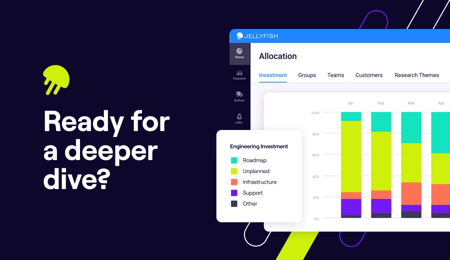
Take a closer look at Jellyfish
Book a demo to see how it fits into your stack and workflows.
Request a DemoFAQs
FAQs
What is Harness, and how does Harness SEI fit into the broader platform?
Harness is a software delivery platform that includes modules for CI/CD, feature flags, cloud cost management, and security testing.
Harness SEI is the engineering intelligence module within this suite, focused on tracking delivery metrics and developer productivity.
While the broader platform helps teams automate deployments across multi-cloud environments, SEI specifically measures how engineering work flows through the pipeline.
Does Harness SEI work with GitOps workflows?
Harness as a platform supports GitOps through its CD platform, but the SEI module focuses on metrics and analytics rather than deployment orchestration.
If you’re running GitOps workflows and want visibility into delivery performance, SEI can pull data from your git repositories, but the GitOps capabilities live in other parts of the Harness suite.
Can Harness SEI track deployments to AWS, Kubernetes, and Docker environments?
Harness SEI pulls data from your CI/CD pipelines regardless of where you’re deploying, whether that’s AWS, Kubernetes clusters, or Docker containers.
However, the SEI module measures delivery metrics, not cloud deployment operations.
For teams doing platform engineering work across complex cloud-native infrastructure, you may want an SEI tool that ties deployment data back to business outcomes more directly.
Are there open-source alternatives to Harness SEI?
There are open-source tools that cover pieces of what Harness SEI does (like tracking metrics from git repositories or visualizing pipeline performance), but none offer the same breadth as commercial SEI platforms.
Most open-source options need significant configuration and don’t include features like resource allocation tracking or AI tool adoption measurement.
Does Harness SEI support plugins or custom integrations?
Harness SEI integrates with common dev tools out of the box, but its plugin ecosystem is more limited than that of some standalone SEI platforms.
If your stack includes homegrown systems or less common tools, you may find the integration options restrictive compared to alternatives like Jellyfish or Faros AI.