The Jelly Brand Hub
Brand Guidelines
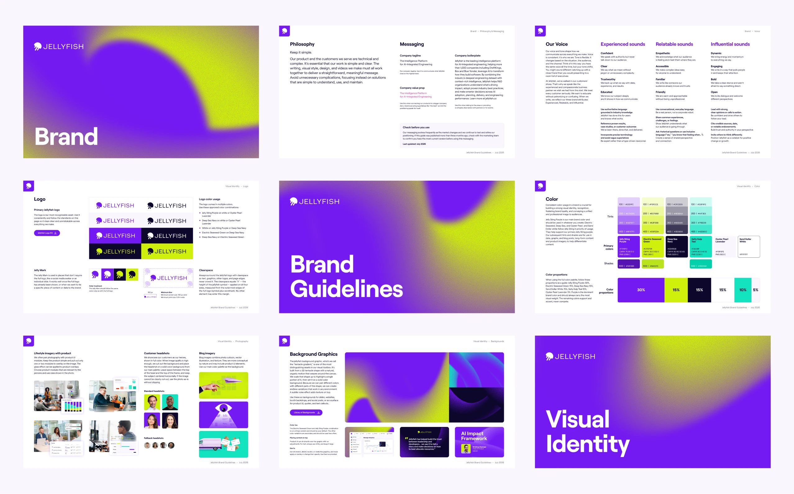
Everything you need to represent Jellyfish correctly. The guide covers our logo, color palette, typography system, voice and tone, messaging framework, and best practices for bringing the brand to life.
Logos
The Jellyfish logo is our most recognizable asset. It includes two elements: our brand mark (the Jelly) and our wordmark (JELLYFISH). Used consistently and correctly, it builds a unified and recognizable brand identity across every communication and touchpoint.
Always follow the standards in the brand guidelines for color usage, clearspace, and sizing. When in doubt, refer to the guide before placing the logo anywhere new.
Primary Jellyfish Logo









Jelly Mark








Colors
Color is one of the most powerful tools in our brand. Used consistently, it builds recognition and reinforces who we are across every touchpoint.
Jelly Sting Purple is our primary brand color and should always carry the most visual weight. Our remaining colors – Electric Seaweed Green, Deep Sea Navy, Sand Dollar White, Salty Kelp Teal, and Oyster Pearl Lavender – each play a role depending on the context and application.
For full details on color usage, proportions, tints, and shades, refer to the brand guidelines.
Primary Colors
Color Usage Proportions

Typography
We keep things simple here. Our brand typography is just one typeface: Roobert. Use it for both headlines and body copy, with bold weight for headlines and regular weight for body copy.
If Roobert isn’t available in a given program, default to Roboto. Roboto is a Google font, so you’ll find it in all Google Slides, Docs, and Sheets templates.
Roobert is a licensed typeface.
Roobert is a commercial typeface from Displaay Type Foundry. We can't redistribute the source files here — if you need Roobert for decks, partner assets, or internal docs, please purchase the appropriate license directly from the foundry. For a free Google Fonts alternative, use Roboto.