In this article
A typical engineering organization now pays for AI coding across Anthropic, OpenAI, Gemini, Cursor, Claude Code, and internal tools, with a separate bill and dashboard for each.
Each provider dashboard reports how many tokens you consumed and what they cost. What none of them shows is whether that spending translated into more shipped code.
Jellyfish measured exactly that. Across 12,000 developers, its heaviest spenders used about $1,822 of tokens a quarter and shipped 23 merged pull requests, while the lightest used $3 and shipped 11. That’s six hundred times the spend for roughly double the output.
This guide explains how to build an AI token spend dashboard that measures spending and output side by side, so you can see which tools and teams are worth the cost.
What Is an AI Token Spend Dashboard?
What Is an AI Token Spend Dashboard?
An AI token spend dashboard is a single reporting view that tracks how many tokens your teams consume and what that consumption costs across every AI tool you pay for.
It pulls usage and spend from providers like Anthropic, OpenAI, and Gemini, from coding assistants like Cursor and Claude Code, and from internal apps or agents built on them.
Instead of a dozen separate billing consoles, you read it all in one place. Some also connect that spend to engineering output, so leaders see which tools and teams turn tokens into shipped work.
Why AI Spend Is Harder to Manage Than Traditional SaaS Spend
Why AI Spend Is Harder to Manage Than Traditional SaaS Spend
Enterprises spent roughly $4 billion on AI coding assistants in 2025, and almost none of it behaves like a normal software line item.
Traditional SaaS is easy to budget because it bills by the seat. You know the headcount, you know the per-seat rate, and the yearly cost barely moves.
AI works the opposite way. It bills by consumption, so the same seat can cost a few dollars one month and a few hundred the next, depending on how hard someone leans on it.
That single change creates problems seat-based pricing never had to account for:
- A single developer working heavily with an agent can move the monthly bill on their own.
- An automated workflow left running can burn through tokens overnight, long before anyone checks a dashboard.
- Spend spreads across AI providers, coding assistants, cloud platforms, and internal tools, each with its own key, bill, and console.
- Rate limits and usage caps hold cost down, but they say nothing about whether the spend paid off.
- Pricing differs by token type, input, output, and cache, which makes two developers with similar usage cost very different amounts.
- Model choice moves the bill fast, since a heavier model can cost several times more per task than a lighter one for the same job.
This gap gets worse the higher up you go. Finance wants a defensible forecast, engineering wants operational context, and no single console delivers either. Provider consoles serve neither, so both sides reason from partial data.
Rising cost is manageable when you can see it clearly. AI spend rarely lets you, because it shows up fragmented and detached from any signal of engineering value.
Example → Say one engineer wires up an agent to triage tickets over a weekend. By Monday, it had burned more tokens than the rest of the team combined, and the spike showed up in the provider bill two weeks later with no name attached. Finance flags an anomaly, engineering has to reverse-engineer what happened, and nobody can say whether the experiment was worth it.
The Metrics Every AI Token Spend Dashboard Should Include
The Metrics Every AI Token Spend Dashboard Should Include
Below are the metrics a token spend dashboard should track. They range from basic cost and usage numbers to the output metrics that show whether the spend is paying off:
AI Spend
The first thing to track is total AI cost for the period, pulled across every provider and tool into one number. A single snapshot isn’t enough on its own, so the view should also show the trend and where spend is heading by year-end.
What to track →
- Spend for the current billing period
- Year-to-date spend
- Projected year-end spend
- Monthly run rate
- Spend broken out by team, developer, and tool
Why it’s important → Total spend shows the size of the bill and nothing about its source. Only the splits by team and tool point to where the cost is coming from.
How Jellyfish shows it → The AI token cost view shows year-to-date spend, projected year-end spend, and a monthly run rate side by side, so finance can forecast from live usage. Each figure updates as consumption comes in, so the projection stays accurate as you head into a planning cycle.
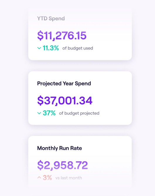
Read together, the three cover both position and direction. Year-to-date spend sets the baseline, the projection extends it to year-end, and the run rate shows how fast the number is moving. The same view breaks down by team, developer, and tool, so a jump in the total has a name attached to it.
AI Token Usage
Spend covers the cost. Usage covers the volume behind it, how many tokens your teams are consuming and where they are going. It’s the raw input every dollar on the spend view traces back to.
What to track →
- Input and output tokens, where the provider reports them separately
- Total tokens consumed for the period
- Tokens by provider, so you can compare where volume concentrates
- Tokens by developer and team
- Tokens by AI tool
Why it’s important → Usage explains why spend moved. A team’s cost can rise for two different reasons, more people using AI or a few people using much more of it, and the token breakdown is what separates the two.
How Jellyfish shows it → The usage view reports token consumption by developer across the period, so a rising bill traces back to specific people and workflows rather than a single lump figure. The same data rolls up by team and tool, which makes it easy to see whether volume is spreading across the org or concentrating in a handful of power users.
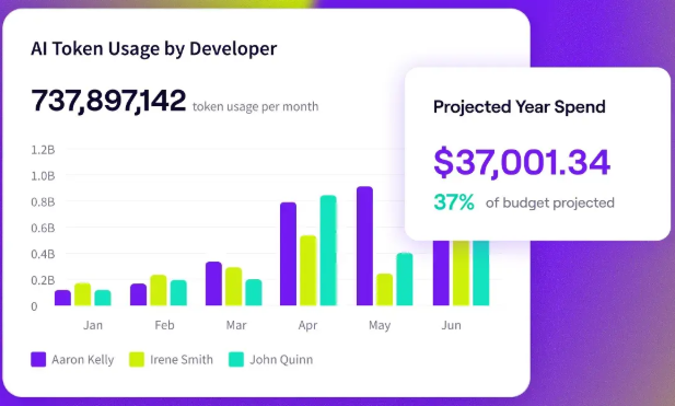
The per-developer breakdown makes the spread visible at a glance. An even set of bars means adoption is broad, while one or two tall bars mean a small group is driving most of the volume. You can then compare providers and tools to see where that usage concentrates.
Usage Trends
Direction matters as much as amount. Two teams at the same spend level can be on completely different paths, one holding steady and one accelerating fast, and only the trend view shows which is which.
What to track →
- Week-over-week usage data
- Month-over-month usage data
- Spend against usage on the same timeline
- Usage analytics before and after a tool rollout
- Changes in developer adoption over time
Why it’s important → A snapshot can look fine while the trend underneath it is a problem. Steady growth reads very differently from a sharp spike, and only the movement over time separates normal adoption from a cost that is about to run away.
How Jellyfish shows it → Jellyfish plots usage and spend across billing periods, keeping the weekly and monthly movement in view. When a team adopts a new tool, the before-and-after comparison shows whether AI consumption really moved.
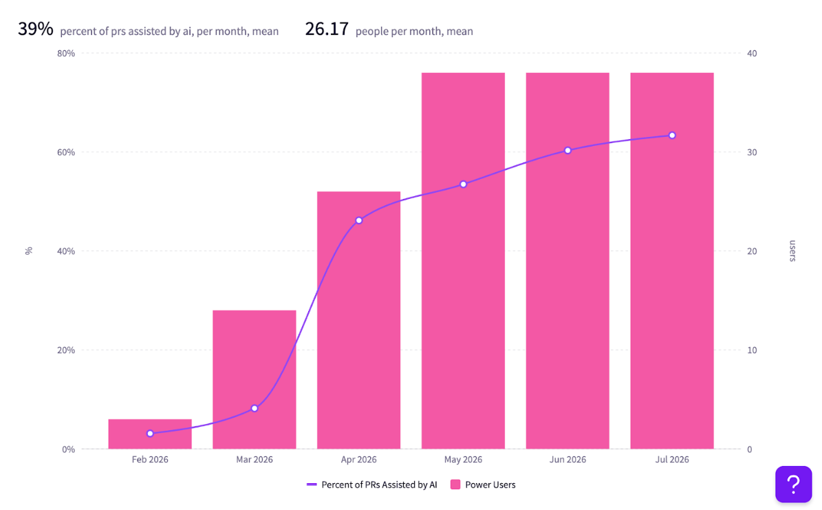
The pattern matters more than any single point. A gradual climb usually means adoption spreading as intended, while a sharp jump points to a rollout, a new agent, or a workflow worth a look before the next invoice.
Spend Versus AI PR Throughput
Cost and output finally meet in this view. By plotting AI spend against merged PRs over the same period, it answers whether the spending is producing work.
What to track →
- Spend against merged PRs over the same period
- PR throughput by team and by developer
- Review activity, so throughput isn’t just volume without quality checks
- Output relative to spend, per team and per tool
- How the spend-to-output ratio changes as usage grows
Why it’s important → Most dashboards report cost and leave the value question open. Comparing spend to PR output is what closes it, since a team can increase its token spend without shipping any more work, and only this view would show the gap.
How Jellyfish shows it → Because Jellyfish already reads engineering output through its connection to your git and project data, it can plot AI spend directly against merged PRs on one timeline. As spend rises, you see whether throughput rises with it or flattens out, and you can drill into the underlying PR events to understand what is driving the result.
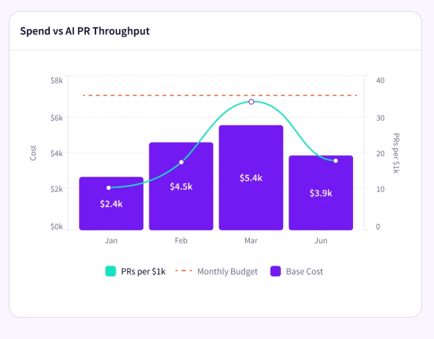
The relationship is rarely one-to-one. Early spend often buys real throughput gains, then the curve flattens as further spend produces smaller and smaller output increases.
Seeing the two lines together shows where a team stays on the productive part of that curve and where added spend has stopped paying off, which is exactly the call a budget owner needs to make at renewal or planning time.
ROI
Every AI tool has a cost and a contribution, and ROI is the ratio between them. A dashboard that reports it by tool and team shows which investments pull their weight and which are along for the ride.
What to track →
- Output per dollar of spend, by tool
- Output per dollar of spend, by team
- Which tools show rising cost without a matching rise in output
- Whether AI adoption is improving productivity over time
- Where spend is concentrated relative to the value it returns
Why it’s important → ROI is what moves the conversation from cost control to cost justification. A tool can look expensive on the spend view and still be the best value on the ROI view if the output behind it is high. The reverse is just as common, cheap tokens producing little.
How Jellyfish shows it → Jellyfish benchmarks token spend against engineering output, giving every tool and team a cost-to-output read alongside its raw spend. From there you can see which investments are producing returns, which have gone flat, and where usage is rising without the output to back it.
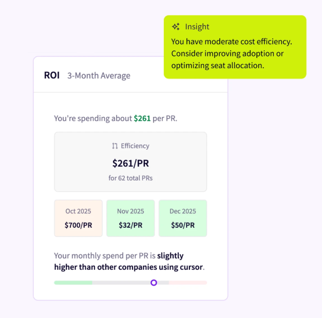
Cheapest and best-value are not the same thing. A team spending heavily might return more per dollar than one spending little, depending on what each ships. Cost and output have to be read together to see the difference, and that pairing is what gives leaders grounds to defend a budget or move it.
Investment Allocations
Every engineering org splits its time across roadmap, innovation, and maintenance, and AI changes how that split falls. This view tracks the movement, so leaders can see whether the capacity AI creates goes toward higher-value work or disappears into the same operational load as before.
What to track →
- Roadmap and new feature work
- Innovation and experimentation
- Keep-the-lights-on (KTLO) and maintenance
- Support and operational work
- How that mix moves as AI adoption grows
Why it’s important → This is the view that connects AI to strategy. When AI works, the time it saves should reappear as more roadmap and innovation work and less KTLO, and allocation is where that movement either shows up or doesn’t.
How Jellyfish shows it → Jellyfish maps engineering investment across roadmap, innovation, KTLO, and operational work, then reads AI adoption against that mix. As teams lean on AI, you can see whether the balance moves toward higher-value work or holds where it was, which connects AI spend to a strategic outcome and not only a cost line.
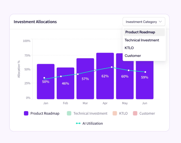
This is the view executives tend to care about most, because it speaks their language. A rising bill is easier to approve when the allocation data shows AI moving effort toward roadmap and innovation. If the mix hasn’t moved at all, that’s worth knowing too, since it means the productivity gains are being reinvested somewhere less visible, or not materializing yet.
What Most AI Spend Dashboards Miss
What Most AI Spend Dashboards Miss
Provider dashboards are good at the job they were built for. They report token spend, usage by model, cost by API key, provider-level totals, and they flag rate limits before you blow past them. For the finance side of the question, that coverage is enough, and for a while it’s all most teams think to ask for.
These tools cover costs well, but they don’t extend to what the cost produced. That leaves a set of questions unanswered:
- Whether the usage produced more output or just a bigger bill
- Which teams are getting good use out of AI and which aren’t
- Whether a high-spend tool is productive or simply expensive
- How AI is changing the balance of roadmap, innovation, and maintenance work
None of these show up in a billing console, because a billing console only knows what left your account. It has no line of sight into the Git history, the merged PRs, or the delivery data where the value of that spend would register. Connecting the two takes a system that already reads engineering output, which is the piece a pure spend tool doesn’t have.
That’s the change of frame worth making. A smaller token bill was never the point, a bigger return on it is. A cost-only view can lower the bill, though it can’t show you whether the spend is producing anything, and that gap is exactly what Jellyfish closes by tying spend to engineering output.
How to Benchmark AI Spend Against Engineering Output
How to Benchmark AI Spend Against Engineering Output
On its own, a spend figure has no context. You can’t say whether $80 per PR is reasonable or terrible without something to compare it to. That benchmark now exists in Jellyfish’s usage research.
Jellyfish studied 12,000 developers across 200 companies and found that heavier token use does produce more output, but the return drops off fast:
- The median developer used about 7 million tokens per merged PR. The top decile used roughly 69 million for the same result.
- PR throughput rose from under one per week at the low end to just over two at the high end.
- Estimated cost per merged PR climbed from about $0.28 in the lightest-usage tier to $89.32 in the heaviest, based on published Claude API pricing.
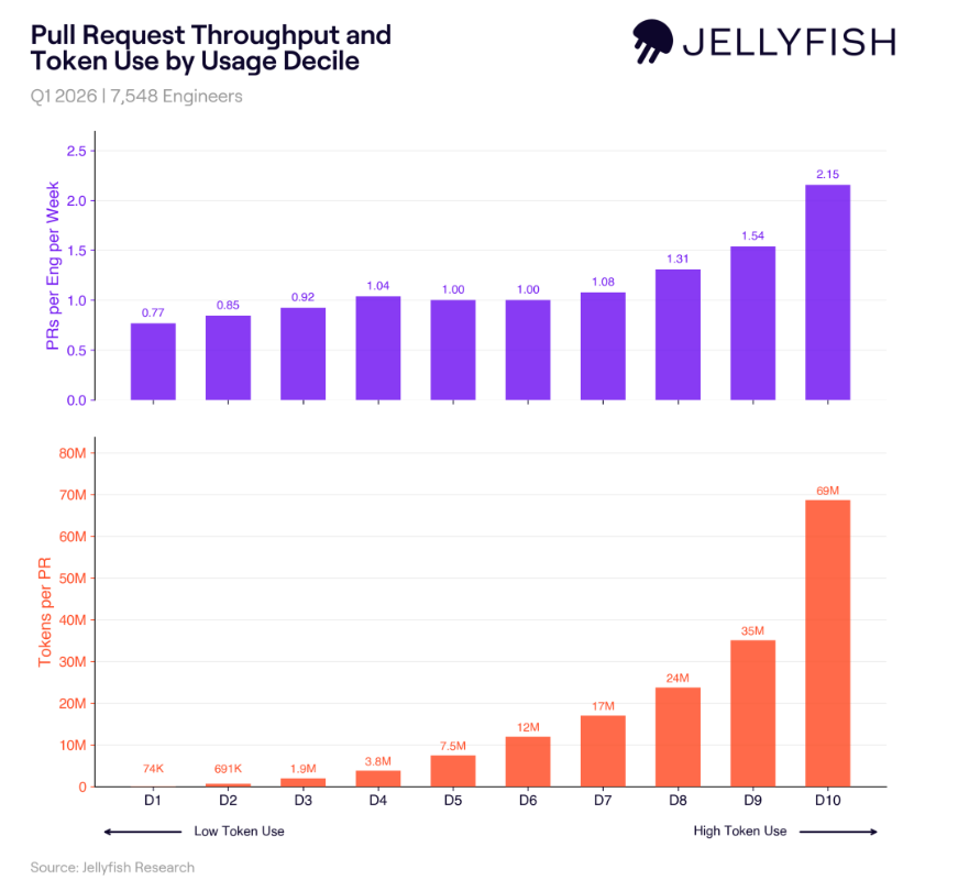
The two lines move at very different speeds. Throughput inches up across the deciles. Token use per PR accelerates hard, so the heaviest users burn close to ten times the tokens the median does for a couple of extra PRs a week. The spend keeps producing, but the price of each new unit of output keeps rising.
Main takeaway → The lesson for leaders is to aim for the efficient middle. Wide, steady adoption returns more than a handful of heavy users ever will, and it keeps cost per unit of output in check. Benchmarking against a pattern like this tells you whether your teams are in that middle or moving toward the costly extreme.
How to Use an AI Token Spend Dashboard
How to Use an AI Token Spend Dashboard
A spend dashboard is useful in proportion to how easy it is to act on. If the numbers are all there but nothing points to what changed, most people check it occasionally and move on. It helps when the dashboard does some of that reading for you and shows which figures moved and why.
The Jellyfish view below is set up this way. Spend is broken out over time, by category and by model, with an analysis panel across the top.
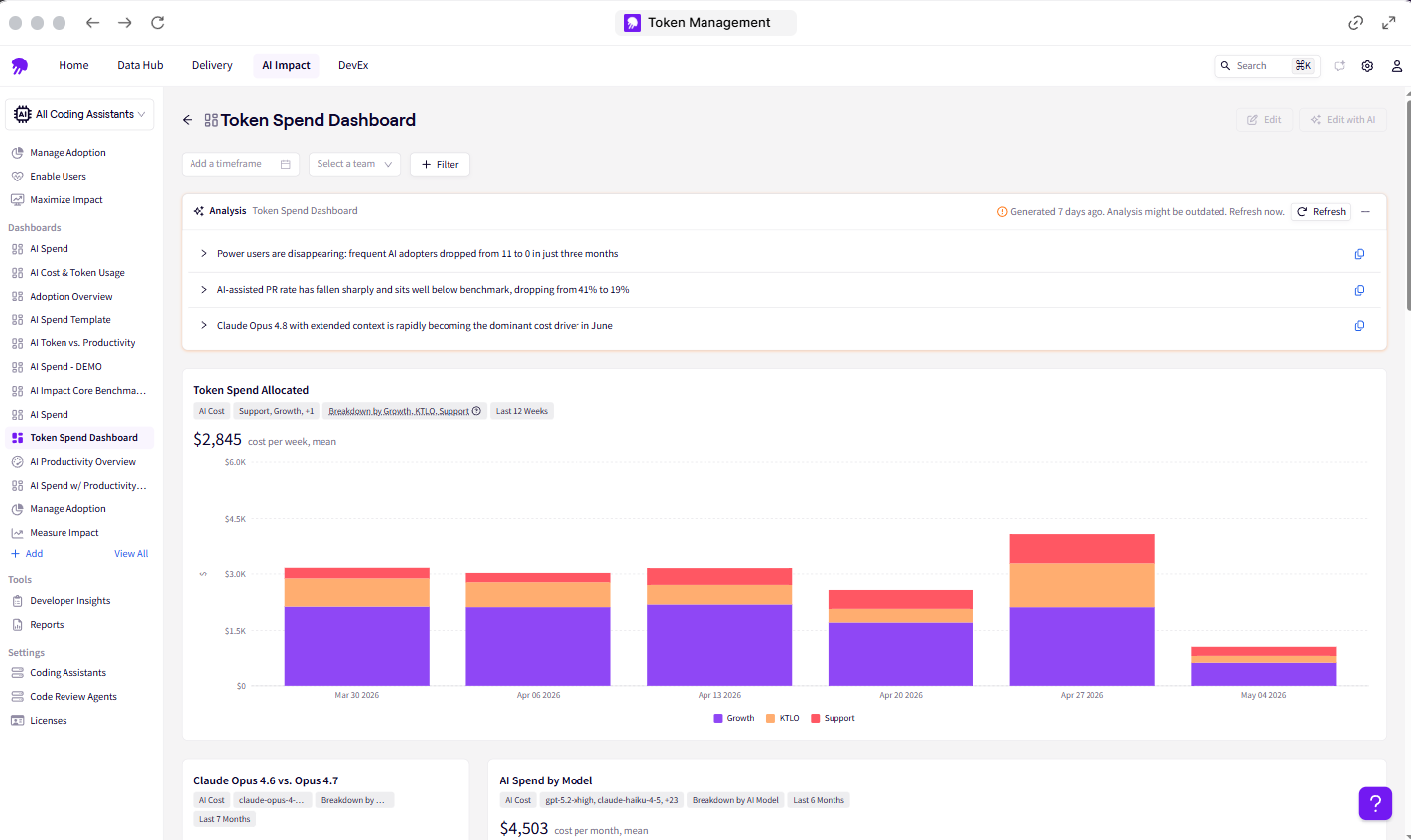
The panel at the top of that view is doing the interpretation for you. It reads recent activity and points out what moved, a drop in active AI users, a falling PR rate, one model taking over as the main cost driver.
Those are the signals you’d want to act on, and here is how each one maps to a decision:
- Find cost outliers: Jellyfish shows which developers, teams, and tools are spending far above the rest, and lets you check the output behind that spend.
- Compare tools and models: It compares spend and output across your assistants and providers in one place, so you can see which tools are worth their cost.
- Forecast budget needs: It keeps year-to-date spend, projected spend, and run rate in one view, which is what finance needs for forecasting.
- Close the adoption gaps: Flags teams with low usage, and shows when active users start to taper off, so you can respond with training if needed.
- Manage limits without stalling progress: You can set usage limits to control cost while still allowing room to experiment, and the output data shows whether the spend is working.
- Move investment toward higher-value work: Jellyfish tracks how spend is allocated across roadmap, innovation, and maintenance, so you can see if AI is changing the mix.
What ties them together is output. Because Jellyfish reads your engineering data, every one of these plays weighs against the work it produced.
How Jellyfish Helps Engineering Leaders Manage AI Spend
How Jellyfish Helps Engineering Leaders Manage AI Spend
AI spend is a permanent line in the engineering budget at this point. Managing it well means being able to connect that spending to the engineering work it produced and direct budget from there.
Jellyfish handles exactly this through its AI Impact platform. Because it already reads your git and project data, it can put token spend next to engineering output and give leaders the connection a billing console leaves out. In practice, that means:
- It compares what each tool and team spends on tokens with the output it produces, so you can see which ones are worth the cost.
- It shows AI spend and PR throughput on the same timeline, so you can tell whether more spending is leading to more delivered work.
- It lets you open the underlying PRs, so you can see what’s behind a change in throughput.
- It keeps year-to-date spend, projected spend, and run rate in one place, which is what finance needs to plan the budget.
- It tracks how AI is changing the split between roadmap, innovation, and maintenance work across your teams.
- It breaks token usage down by developer and team, so you can see where the spend is concentrated.
Token spend is only going one direction from here. The teams that stay ahead of it will be the ones who can show what that spending returned, in shipped work and not just usage. That’s the difference between a cost you report and one you can manage.
Book an AI Impact demo and get a clear view of the ROI on your AI spend.
About the author

Lauren is Senior Product Marketing Director at Jellyfish where she works closely with the product team to bring software engineering intelligence solutions to market. Prior to Jellyfish, Lauren served as Director of Product Marketing at Pluralsight.