In this article
Engineering leaders have more measurement tooling available now than at any point in the last five years, and the criteria for a decision have moved. AI adoption, R&D cost reporting, and developer experience all belong in the evaluation, which sends teams back to the market even when their current platform works fine.
LinearB comes up in most of those evaluations. It built its name on workflow automation, and teams rely on it to route reviews, enforce policies, and keep DORA metrics in front of engineering managers. The complaints on G2 vary from team to team. Setup runs on a per-team basis, so training takes longer as the org grows:
“With any tool, set-up is required. This can be difficult initially. LinearB does have settings which allow for quick set-up and then refining as needed, per team. But since these settings are per team, training needs can be time-consuming.”
Metric time windows differ across the product as well, with some views tied to sprints and others to weeks. Complaints like these rarely decide a purchase on their own, but they still deserve a place in your evaluation.
If you weigh LinearB alternatives right now, this article explains what LinearB offers today, which criteria matter most in this category, and how eight competing platforms measure up.
Overview of LinearB
Overview of LinearB
LinearB is an engineering productivity platform that gives engineering leaders visibility into their delivery process and gives their teams the automation to improve it.
It connects to your Git provider, project management tool, and CI/CD stack, maps the events those systems generate to each stage of the development cycle, and reports on where work slows down.
The product has grown well past its original delivery metrics scope, with capabilities that now reach into financial reporting and AI measurement. LinearB has repositioned around AI over the past year, with messaging built on proof that AI improves throughput without damage to delivery confidence or developer experience.
Key Features and Functionality
- Workflow automation: LinearB automates pull request work through programmable rules built on gitStream. Common examples include automatic reviewer assignment based on code ownership, estimated review time labels, missing test labels, and extra review triggers on sensitive files or directories.
- AI capabilities: The platform includes AI code reviews, AI-generated pull request descriptions, and an AI Insights dashboard that tracks AI commits, AI review impact, and tool usage by repository. Enterprise customers also get AI retros, which summarize sprint data in natural language. An MCP server lets teams query their own data through a chat interface.
- Delivery performance and DORA metrics: The platform reports deployment frequency, lead time for changes, change failure rate, and time to restore service in one dashboard, with cycle time breakdowns and throughput and quality metrics alongside them. Benchmarks are based on more than 6 million pull requests.
- Planning and forecasting: Enterprise plans add project delivery tracking, Monte Carlo forecasting against historic data, capacity planning, investment profiles, resource allocation, and R&D cost capitalization reports.
- Developer experience: In-platform developer surveys capture team sentiment and produce a DSAT baseline you can track against process changes.
- Dashboards and reporting: Teams get team goals, custom metrics and KPIs, and pull request impact tracking, with most planning and allocation views reserved for Enterprise.
- Integrations: LinearB connects with GitHub, GitLab, Bitbucket, and Azure DevOps on the Git side, Jira and Azure Boards for project management, and Slack and Microsoft Teams for notifications. The Essentials plan supports GitHub Cloud only, so most integrations require Enterprise.
- API: A declarative REST API handles data export to BI tools, team creation and updates from dev tools or HR systems, custom deploy phase reporting, incident management data from tools like PagerDuty, and external metrics import. API access comes with both plans.
Pricing
LinearB lists its prices publicly:
- Essentials: $29 per contributor per month, with a 50-contributor minimum. Supports GitHub Cloud only and includes 1,000 monthly AI credits per user.
- Enterprise: $59 per contributor per month, with a 100-contributor minimum. Adds the full integration set, planning and forecasting, cost capitalization, and on-prem agents, and includes 1,500 monthly AI credits per user.
- Custom plans: Available for larger deployments.
- Free trial: 45 days, full platform, no payment method needed.
Automations and AI actions consume credits. One automated pull request costs 100 credits no matter how many automations apply to it, and extra credits start at $0.015.
Why Look for an Alternative to LinearB?
Why Look for an Alternative to LinearB?
LinearB can support a wide range of engineering productivity use cases, but some G2 users note tradeoffs around setup, reporting, and day-to-day administration:
- Onboarding takes longer than expected: LinearB lets you configure quickly and refine settings afterward, and those settings apply team by team. G2 users point to the training effort as a result. How much that costs you depends on your structure, so a handful of teams will barely notice while a larger company plans meaningful onboarding time. [Read Full G2 Review]
- Team changes need manual updates: Leavers, joiners, and restructures need manual updates. One reviewer calls this a challenge for small teams and for teams empowered to reorganize freely, while noting that the GitHub teams integration has improved things. Orgs with stable structures may never hit it, while orgs that reshuffle often might feel the admin load. [Read Full G2 Review]
- Metric time windows are inconsistent: Some metrics display by sprint and others by week, so a like-for-like view across teams means manual work with a custom date picker to match sprint duration. Teams who report on a sprint cadence meet this more often than teams who report monthly. [Read Full G2 Review]
- The volume of metrics complicates the first few weeks: One user describes uncertainty about where to start and what to prioritize, while crediting LinearB’s customer success managers with sorting out which metrics deserve attention first. The platform gives you plenty, and you may lean on support to make it useful early. [Read Full G2 Review]
- Per-team analytics could go deeper: Other G2 users want an easier way to switch between mean and average values at the team level and describe it as a nice-to-have. This is minor for most buyers, though it’s important if your reporting depends on statistical precision at the team level. [Read Full G2 Review]
Key Features to Look for in a LinearB Alternative
Key Features to Look for in a LinearB Alternative
LinearB alternatives vary widely in scope, depth, and focus, so a like-for-like comparison is not always straightforward. These criteria give you a consistent basis for it:
- Depth and context behind engineering metrics: DORA metrics, cycle time, throughput, and pull request data come standard across this category. Platforms differ in how much detail they give you underneath those numbers. Stage-level cycle time shows you where in the process the delay happens, and the ability to click from a metric to the specific teams and pull requests behind it saves you from investigating on your own.
- Connection between engineering work and business priorities: Engineering leaders eventually have to explain where their budget and headcount went. A platform that only reports team output leaves you to work that out in a spreadsheet. The ones that map engineering capacity to products, initiatives, and strategic investments handle it directly, though they need project and cost data connected to do so.
- Quality of AI impact measurement: A seat count and an adoption percentage are the easiest AI metrics to produce and the least informative. Look for platforms that connect adoption to delivery speed, code quality, and developer experience. Check the attribution method too, since a platform integrated with Copilot, Cursor, or Claude Code has better evidence than one inferring AI involvement from commit size and timing.
- Balance between quantitative data and developer feedback: Operational data records what happened without explaining the cause. A team with a slower cycle time might have a broken pipeline, a reviewer on leave, or a morale problem, and the numbers look the same in each case. Platforms with built-in surveys give you the missing half, and the ones that display survey results alongside delivery data make the connection easier to see.
- Flexibility of the underlying data model: Teams split, developers work across several initiatives, and companies reorganize. Check how each platform handles those changes, and whether updates happen automatically through your Git or HR systems or manually through an admin panel.
- Support for action, not analysis alone: Platforms take different amounts of work off your hands. Some report and stop, some send alerts and recommendations, and some apply rules directly to pull requests by assigning reviewers or enforcing policy. More automation means faster improvement and more contact with developer workflow, so match the level to what your teams will accept.
8 LinearB Alternatives to Consider for Engineering Intelligence
8 LinearB Alternatives to Consider for Engineering Intelligence
Each platform here was assessed against the criteria above using vendor documentation, published pricing where available, and customer reviews from G2 and Gartner Peer Insights.
Some products have a much smaller review base than others, and we note that where it affects what we can say with confidence.
Here is how the eight compare at a glance, before the detailed breakdowns below:
| Platform | Best for | Key differentiator | Pricing | Free trial or plan |
| Jellyfish | Teams that want one platform covering operational, strategic, and financial questions | AI impact, allocation, forecasting, developer experience, and audit-ready R&D reporting on one data model | Quote-based, priced by seats and modules | Demo and product tour |
| Waydev | Teams that want depth in Git and code-level analytics | Code-level analysis with DORA, SPACE, and DX Core reporting, plus self-hosted deployment | Quote-based | Demo on request |
| Appfire Flow | Enterprises that need consistent metrics across mixed toolchains | Retrospective analysis with normalized definitions across Jira, GitHub, GitLab, and Azure DevOps | Quote-based | Demo on request |
| Allstacks | Teams under pressure to defend delivery dates | Machine learning forecasts trained on your own delivery history, with risk alerts | Quote-based | Demo on request |
| Code Climate | Enterprises buying a change program alongside software | Twelve-week engagements with forward-deployed engineers inside your teams | Custom engagement | Consultation |
| DX | Organizations where developer experience drives the evaluation | DevSat surveys, experience sampling, and the Developer Experience Index | Quote-based | Demo on request |
| Swarmia | Small and mid-sized teams that want engineers using the data too | Team-level transparency, working agreements, and modular pricing | Free up to 9 developers, then $45 per developer per month | Free plan and trial |
| Haystack | Small teams that want delivery metrics without a heavy setup | Delivery visibility from Git and Jira with minimal configuration | Tiered by repository and user count | 14-day trial |
1. Jellyfish
Jellyfish is a software engineering intelligence platform that takes the full range of signals an engineering organization produces and reports on all of it in one place.
That covers delivery performance and AI impact across teams, and carries the same data into capacity allocation, planning, and audit-ready R&D reporting. One data model serves engineering managers, executives, and finance.
How it compares to LinearB → LinearB goes deeper into pull request workflow automation. Jellyfish covers more ground outside the workflow, from AI impact and resource allocation through developer experience to audit-ready financial reporting.
When Jellyfish is the right choice for your team → Jellyfish makes the most sense when engineering leaders need a broader management platform than delivery analytics alone. It is especially well suited to companies that want to prove AI ROI, align engineering investment with business priorities, and automate software capitalization from the same data.
Key Features
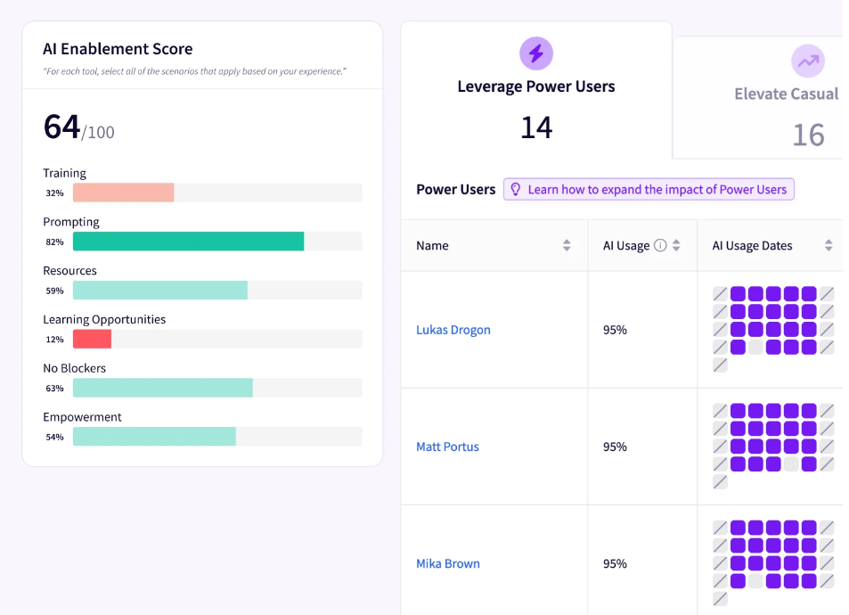
- AI Impact measures what changed after your teams adopted AI coding tools, and connects usage across Copilot, Cursor, and Claude Code to improvements in cycle time and throughput. Comparisons run between power users and idle users, benchmarked against more than 20 million pull requests. Token cost monitoring and vendor comparison cover the spend side of the decision.
- Business Alignment attributes engineering capacity to the products, initiatives, and investments it serves, with the mapping handled automatically by a patented data model. Leaders compare planned funding against where the work went, and delivery forecasting projects completion dates from historical signals. Scenario modeling shows how headcount or scope changes affect those dates.
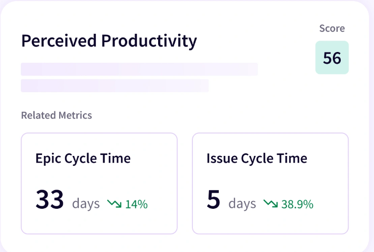
- Operational Effectiveness gives managers the detail underneath their delivery numbers, with stage-level analysis through Life Cycle Explorer and pattern detection through Workflow Analysis. Team Benchmarks compare performance against peer organizations and your own history.
- DevEx collects research-backed survey responses on tooling, review quality, and the obstacles engineers hit daily, then correlates them with quantitative signals like pull request cycle time. Recommended Actions point to what to take care of first.
- Jellyfish Assistant answers questions about your engineering data in plain language, from why an epic is at risk to what would improve a team’s predictability. Query Builder handles custom metrics through natural language or SQL, including analysis that combines Jellyfish data with third-party signals.
Why Do Companies Choose Jellyfish Over LinearB?
- One dataset covers both engineering and finance: Jellyfish maps commits, tickets, and deployments to the products and initiatives they serve, which makes resource allocation and R&D reporting possible from the same data that produces cycle time. LinearB reserves its cost capitalization, resource allocation, and investment reporting for Enterprise.
- Developer experience is part of the same analysis: Jellyfish combines qualitative DevEx surveys with quantitative engineering signals, so leaders can compare what developers report against what delivery data shows. LinearB has developer survey capabilities of its own. Jellyfish currently goes deeper on correlating sentiment with workflow data and producing recommended actions from the combination.
- More complete AI impact measurement: Both platforms track AI adoption, but Jellyfish connects usage with delivery metrics, resource allocation, surveys, cost, and executive-level ROI reporting. This gives teams more context when they need to compare tools or prove whether AI spend translates into measurable gains.
- Stronger planning and delivery predictability: Jellyfish brings delivery forecasting, scenario planning, capacity modeling, and deliverable status tracking on top of engineering performance data. That gives product and engineering leaders more support for questions around scope, staffing, priorities, and likely completion dates.
- A more mature finance workflow: Both platforms support software capitalization. Jellyfish extends that into a wider DevFinOps workflow with audit-ready reporting and SOC-1 Type II controls, which helps in organizations where engineering data also serves finance, audit, and R&D capitalization processes.
A side-by-side view helps once you know what you need the data for. The table below covers where the two platforms take different approaches.
| Area | LinearB | Jellyfish |
| Delivery metrics | DORA reporting, cycle time breakdowns, benchmarks from millions of pull requests | DORA and SPACE metrics, stage-level lifecycle analysis, benchmarks against peers and historical trends |
| Workflow automation | Core strength. Programmable gitStream rules route reviews, label risky changes, and auto-merge on defined criteria | Lighter emphasis. Focus stays on analysis and recommended actions |
| AI measurement | Adoption tracking, AI Insights dashboard, AI code reviews, token usage by repository | Adoption connected to cycle time and throughput lift, multi-tool evaluation, token spend metrics, AI DevEx analysis |
| Business alignment | Resource allocation dashboards and investment profiles on the Enterprise plan | Investment allocation insights through the Developer Productivity module, mapped automatically by a patented data model |
| Developer experience | In-platform surveys producing a DSAT baseline | Research-backed surveys correlated with delivery signals, with recommended actions |
| Financial reporting | R&D cost capitalization on the Enterprise plan | Software capitalization, R&D tax credits, and audit-ready reports through DevFinOps, backed by SOC-1 Type II compliance |
| Pricing | Published. Essentials $29 per contributor with a 50-contributor minimum, Enterprise $59 with a 100-contributor minimum | Quote-based, priced by seats and modules selected |
What Real Customers Are Saying About Jellyfish
Manual reporting cost CHG Healthcare twenty hours of work every Friday, and the results still varied from week to week. Jellyfish replaced that process, and the team caught a problem on one project two weeks into development, which saved $130,000 on that initiative.
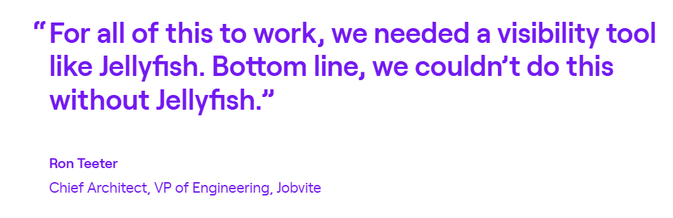
Fragmented tooling created a different problem at Jobvite, where a series of acquisitions left four engineering teams each working in its own stack. Jellyfish gave leadership one view across all work in progress, and delivery throughput climbed 80%, SLAs dropped by 60 days, and resolution times on P2 and P3 tasks improved by 72%.
Scale was the obstacle at Five9, where a merger of DevOps, Engineering, and Operations produced a single organization of more than 400 engineers with no reliable way to measure how any of it performed. Jellyfish broke sprint predictability out team by team, which gave leadership specific improvement plans for the teams that needed them instead of a vague sense that things were uneven.
2. Waydev
Waydev is a Git-first engineering intelligence platform that has been in the market since 2017 and holds a USPTO patent for its Git analytics. It combines code-level analysis with DORA, SPACE, and DX Core reporting.
How it compares to LinearB → Both platforms report on delivery, though Waydev invests in analytical depth at the code level while LinearB puts its weight behind automation that acts on pull requests directly.
When Waydev is the right choice for your team → Waydev fits engineering organizations that want detailed code-level analytics and already work with a specific measurement framework. The self-hosted option also makes it a practical choice for companies with data residency requirements.
Key Features
- Git-level code analysis: Waydev looks closely at commit and pull request activity, including code churn, rework, review depth, and contribution patterns. Engineering managers get a more detailed read on code health than metadata-only reporting allows.
- Multiple metric frameworks: DORA, SPACE, and DX Core all appear in the product, so teams already committed to one of those models can adopt Waydev without redefining their metrics.
- AI-assisted analysis and recommendations: AI agents analyze delivery data and produce recommendations, and the product also includes developer experience features and snapshot reporting on a set schedule.
Advantages
- More context behind delivery metrics: Teams can track delivery speed, review cycles, and quality together, then work out why a number moved. The AI-driven querying is a related benefit, since it removes some of the manual dashboard construction that this category usually demands. [Read Full G2 Review]
- Good visibility into AI ROI: AI measurement is a strength that customers mention specifically. The platform shows adoption by developer and team, and pairs it with delivery speed, review times, and throughput so the adoption number carries some meaning. [Read Full G2 Review]
- More structure for individual discussions: Waydev’s contributor-level views appear to be valuable for teams that want more data behind coaching and goal setting. They can help frame conversations around patterns and trends, although organizations will still need to interpret those metrics in context. [Read Full G2 Review]
Limitations
- Team and data configuration may take time: Users note that mapping team members correctly and configuring data views to match expectations takes time at the start. This is normal for platforms with this much configurability, though it does mean you need to invest some setup work before the reporting matches how you want to see your data. How long depends on your team count and how complex your structure is. [Read Full G2 Review]
- Your definitions and the platform’s may differ: There is a learning curve early on, and users say the harder part concerns definitions. Working out how your own understanding of productivity or impact maps to the platform’s metrics takes discussion inside your team. Organizations without an existing measurement vocabulary will feel this more than those who already have one. [Read Full G2 Review]
- AI views could be more customizable: Some users want more customization in the AI-related insights, especially when tailoring views for different audiences. An engineering manager and an executive need different cuts of the same data, and the out-of-the-box flexibility does not always stretch that far. [Read Full G2 Review]
Learn more → 14 Waydev Competitors & Alternatives for 2026
3. Appfire Flow (formerly Pluralsight Flow)
Appfire Flow is an enterprise engineering intelligence platform built around retrospective analysis of how work moves through your development process. Pluralsight sold it to Appfire in February 2025, and the product kept its own identity within the Appfire portfolio.
How it compares to LinearB → The clearest difference is timing, since Flow helps you understand what already happened while LinearB intervenes in the process directly.
When Appfire Flow is the right choice for your team → Flow suits engineering organizations that want structured retrospective analysis and consistent metric definitions across teams using different tools. Companies already invested in other Appfire products have an additional reason to look at it.
Key Features
- Retrospective and team health reporting: Two named report types cover process retrospectives and team collaboration health. These give managers a structured read on workload distribution and delivery risk before those problems affect outcomes.
- Standardized metrics with benchmarks: Flow pulls data from Jira, GitHub, GitLab, and Azure DevOps and normalizes it into consistent metric definitions. That consistency helps when teams work in different toolchains and leadership needs one view across all of them.
- Flow metrics alongside DORA: The product measures flow efficiency and work distribution in addition to the four DORA measures, which shows how much capacity goes to features, defects, debt, and risk.
Advantages
- Low barrier to entry: Ease of use comes up regularly in customer feedback. The setup process is described as uncomplicated, and users say they could start working with the data without a long orientation period. Teams who want a fast start have a reasonable case for Flow on this basis alone. [Read Full G2 Review]
- Solid analytics on agile delivery: Teams report good visibility into workflow efficiency. The analytics engine produces specific data about the delivery process, which makes bottleneck identification more practical than a general trend line allows. Users describe the output as concrete enough to support process changes. [Read Full G2 Review]
- Individual-level insight for managers: Some managers use Flow daily for coaching individual contributors, with the data pointing to specific areas where a developer can improve. The logic they describe is that individual process improvements accumulate into better team performance. Engineering cultures differ on person-level measurement, so consider where your leadership stands before relying on this. [Read Full G2 Review]
Limitations
- Too many parameters per report: Generating a workflow report involves a long list of parameters, and users say that it’s a tedious process. This is the cost of flexible reporting, though it does mean pulling a custom view takes more time than a few clicks. Those who build reports often will notice this more than those who rely on defaults. [Read Full G2 Review]
- Limited support for some languages and IDEs: Coverage of programming languages and IDEs has boundaries, and users working with less common tooling report running into them. Teams on mainstream stacks will likely never notice, and teams with unusual toolchains should check compatibility before committing. [Read Full G2 Review]
- Some team process metrics feel thin: A few users question how much practical guidance they get from measures around knowledge sharing, review collaboration, or project timelines. Those metrics can still add context, but teams may need to define how each one connects to a specific management or process decision. [Read Full G2 Review]
A note on sourcing → The G2 reviews for Flow almost all predate the February 2025 acquisition, and the only newer ones describe a different product with the same name. Read the points above as a picture of Flow under Pluralsight ownership.
Learn more → 9 Best Appfire Flow (Pluralsight Flow) Alternatives for Engineering Leaders in 2026
4. Allstacks
Allstacks is a value stream intelligence platform for engineering and product teams that combines delivery forecasting, risk detection, productivity measurement, and cost capitalization in a single product.
How it compares to LinearB → Allstacks looks forward with delivery forecasts and risk alerts, and LinearB works in the present through automation applied to pull requests as they open.
When Allstacks is the right choice for your team → Consider Allstacks if you manage a portfolio of initiatives and need early warning when one of them drifts off schedule. It suits teams who report dates upward more than teams focused on daily developer workflow.
Key Features
- Machine learning delivery forecasts: Allstacks predicts completion dates from portfolio initiatives down to individual Jira stories, and shows how far the forecasts are from your target date. The model trains on your organization’s own delivery history, so accuracy improves with the data you feed it.
- Multi-dataset linking and traceability: The platform connects project management data, commits, pull requests, pipelines, and deployments into one chain. That lets leaders trace a high-level business initiative down to the code written for it.
- Framework-based productivity measurement: Reporting is based on DORA, the SPACE framework, and Flow signals across commits, reviews, and delivery instead of a single output score. Allstacks also measures how AI-assisted work moves through the delivery lifecycle.
Advantages
- Makes it easy to connect engineering work to business goals: Users like that Allstacks pulls delivery data from tools such as Azure DevOps and GitHub into one place and gives it more business context. That makes it easier for engineering leaders to explain where effort is going, which initiatives are consuming capacity, and how team activity connects back to larger company priorities. [Read Full G2 Review]
- Weekly read on team health: Team health reporting has a place in some managers’ weekly routine. An engineering manager at iCIMS checks it every week to assess how their team is performing. Regular use like that suggests the data holds up between reporting cycles, which is not always true of tools in this category. [Read Full G2 Review]
- Forecasting that replaces manual work: For teams who commit to delivery dates, forecasting is one major advantage of Allstacks. Users call it critical in the delivery space and point to the manual calculation it replaced. The practical benefit depends on how much of your week currently goes to projections. [Read Full G2 Review]
Limitations
- There is some upfront work to find the right setup: The platform’s breadth can be a double-edged sword at the start. Teams may need a little trial and error before they settle on the custom dashboards, metrics, and integrations that fit their workflow. [Read Full G2 Review]
- Global dashboards may need to be broken down by team: A broad organizational view can be useful for leadership, but individual teams may need something more focused. That usually means extra filtering or configuration so each group sees only the data tied to its own work. [Read Full G2 Review]
- Data refreshes only once a day: The data updates on a daily cycle in some cases, so the reporting is not always current to the minute. This isn’t as important for weekly reviews or forecasting work, but it does affect anyone who wants to watch delivery activity as it happens. Ask about refresh frequency for the specific metrics you plan to rely on. [Read Full G2 Review]
Learn more → The Top 7 Alternatives to Allstacks for 2026
5. Code Climate
Code Climate now operates as a consulting-led engagement supported by an engineering data platform. Its earlier product, Velocity, sold as a self-serve SEI platform for cycle time, throughput, and workflow metrics, and that documentation has been moved to a legacy path on the company site.
Today, the company scopes twelve-week programs with two or three of your teams, using forward-deployed engineers to work on your specific tools and processes.
How it compares to LinearB → The main difference is structural, since LinearB competes on features and Code Climate competes on the combination of software and people.
When Code Climate is the right choice for your team → Choose Code Climate if you have executive sponsorship for an AI transformation program and the budget to match. This is a change initiative with software attached, so it needs a sponsor at the leadership level. An engineering manager’s tooling budget will not cover it.
Key Features
- Twelve-week scoped engagements: Code Climate starts with two or three teams for a fixed twelve-week period before any wider commitment. The company positions this as a way to get a before-and-after picture without a multi-quarter program.
- Forward-deployed engineers: Consultants work inside your organization on your specific tools and processes. This is the part of the model that separates it from every other product in this article.
- AI impact measurement: Reporting covers token consumption per developer, cumulative AI spend across the organization, and adoption over time, with the argument that adoption numbers alone cannot show whether teams changed how they work.
Advantages
- Straightforward GitHub and Jira integration: Connecting GitHub and Jira is described as straightforward, with cycle time, review time, deployment frequency, and throughput available once the data is flowing. One user credits it with locating problems in the pull request process and pinpointing where work slowed down. [Read Full Gartner Review]
- Workflow trends without manual data gathering: The integration setup appears relatively straightforward, and users value not having to stitch engineering data together by hand. Once connected, the platform gives teams a clearer view of delivery patterns across multiple systems without relying on separate reports. [Read Full Gartner Review]
- Responsive, knowledgeable support: Support quality comes up as a major strength. Users find the technical team quick to respond and knowledgeable about the platform, which helps during the period when teams are still working out which metrics matter to them. [Read Full Gartner Review]
Limitations
- Metrics can feel disconnected from the work: Certain metrics are difficult to interpret and occasionally feel removed from what a team is genuinely working on. One user notes that a single unusual pull request can skew the data enough to require manual investigation before anyone acts on a trend. [Read Full Gartner Review]
- Documentation could be clearer: Users want clearer documentation on what specific metrics measure. They also ask for a way to record events that affect performance data, including PTO, training, and organizational changes, so a dip in the numbers carries an explanation. [Read Full Gartner Review]
- Responsiveness drops at scale: Teams would like better dashboard responsiveness on larger datasets. This is a scale-dependent issue, so how much it affects you comes down to the size of your engineering organization and how much history you pull in. [Read Full Gartner Review]
A note on these reviews → Review coverage for Code Climate Velocity is thin, with only a few ratings on Gartner Peer Insights and no active G2 listing. The points above come from 2026 reviews of the platform and say nothing about the consulting engagement the company now sells.
Learn more → The Top 7 Alternatives to Code Climate Velocity for 2026
6. DX (Atlassian)
DX is a developer intelligence platform that combines quantitative data from your SDLC tools with qualitative feedback collected directly from developers.
Atlassian acquired the company in November 2025 and has folded it into its Software Collection alongside Bitbucket, Compass, and Rovo Dev.
How it compares to LinearB → LinearB acts on your pull requests through automation rules, and DX stays out of the workflow and concentrates on measurement and research-backed frameworks.
When DX is the right choice for your team → Choose DX if developer experience is a major part of how you evaluate engineering effectiveness. It works particularly well for organizations that want to measure AI adoption and delivery performance alongside direct feedback from developers.
Key Features
- DX Core 4 and the Developer Experience Index: Measurement follows two published frameworks that cover speed, effectiveness, quality, and impact, with a separate index for developer experience. Teams already familiar with DORA and SPACE will recognize the research lineage behind both.
- Experience sampling and developer surveys: DevSat surveys and experience sampling collect qualitative input from developers on a regular cadence. This is the capability DX is best known for, and not many competitors match its depth here.
- DX AI for engineering leaders: An assistant produces continuous insights, builds custom reports from written prompts, and recommends where leaders should focus. It works as an alternative to static dashboards.
Advantages
- Strong visual context around developer experience: The visualization work is what users notice first. Reviewing each driver in Snapshots against company and industry benchmarks helps teams decide what to prioritize, and results show up at the next Snapshot. Teams who want fast feedback on a process change will find the cadence useful. [Read Full G2 Review]
- Practical suggestions attached to the data: The platform pairs its data with concrete suggestions on how to respond. During driver prioritization, users get recommendations across short, medium, and long-term horizons, along with AI-generated insights. [Read Full G2 Review]
- Evidence for conversations with peers and leadership: One user describes the data working in both directions. They explain what they believe is happening with a team or individual and check it against the numbers, and they also spot data points worth investigating that may show a problem or a breakthrough. The same data helps make a case with peers and managers who see a situation differently. [Read Full G2 Review]
Limitations
- Certain metrics feel disconnected: Interpretation is uneven across the platform. The Insights tab reads clearly while the Overview page takes more effort, and certain metrics like fail percentage and innovation ratio have not matched the mood of a team in practice. [Read Full G2 Review]
- No workspace for tracking actions: One request comes up around action tracking. Users would like a space inside the platform to write comments, attach files, log improvement points, and follow the status of items over time. Without it, the loop between what the data showed and what the team did happens somewhere else. [Read Full G2 Review]
- Inconsistent team and group filtering: The Teams and Groups concept works well in principle and behaves inconsistently in practice. Some reports support group selection, and others do not, and default selections do not always persist. Users want a single global team filter applied across every report and dashboard. [Read Full G2 Review]
Learn more → 12 Best GetDX Alternatives for Engineering Teams Heading Into 2026
7. Swarmia
Swarmia is an engineering intelligence platform built around team-level measurement and transparency. It combines DORA and delivery metrics with working agreements, Slack notifications, and developer experience surveys.
How it compares to LinearB → The biggest difference is who the product serves, since LinearB reports upward to leadership while Swarmia keeps most of its data open to everyone in the organization.
When Swarmia is the right choice for your team → Swarmia works well for small and mid-sized companies that want capitalization, surveys, and delivery metrics without separate tools, and for organizations willing to buy modules individually as their needs grow.
Key Features
- AI adoption, cost, and impact: Separate metric sets cover which licenses go unused, how engineers engage with AI tools across suggestions, chat, and agent mode, and how AI-assisted pull requests compare against unassisted ones on cycle time, throughput, and batch size. Coding agent metrics cover Copilot, Cursor, and Claude Code specifically.
- Working agreements and chat notifications: Teams set numeric targets and get digests and alerts in Slack or Microsoft Teams. This is the mechanism Swarmia uses to change behavior, and it works at team level instead of through central policy.
- Software capitalization: Capitalization reports connect Swarmia data with team and salary information, and the FTE model is built to hold up under audit. Investment balance and initiative tracking come with the same module.
Advantages
- Clear access to delivery metrics that usually take more digging: One of Swarmia’s main advantages is how clearly it presents delivery metrics that can be awkward to pull from separate systems. Teams can review PR activity and Jira context together, which saves time and makes workflow analysis more straightforward. [Read Full G2 Review]
- Custom views through “Explore Data”: Explore Data gives teams a way to assemble their own view without waiting on the vendor. Users like that the result is saveable and exportable, so a view built once serves both regular reporting and one-off analysis. [Read Full G2 Review]
- AI chat for management summaries: Users find the AI chat practical for management summaries. Asking a question in plain language beats working through several dashboards when you want a quick read on how a period went. [Read Full G2 Review]
Limitations
- No cross-referencing of metrics in charts: Cross-referencing metrics graphically is not available. That’s particularly important for leaders who want to see two measures on the same chart to check a relationship, and the workaround involves taking the data out of the platform first. [Read Full G2 Review]
- AI chat overstates what it can do: The AI assistant claimed features the user did not have access to, including data export, and the attempted workaround through chat was awkward. It also failed on a direct question about MCP integration, and then mentioned MCP as a last option when the same user asked about export alternatives from a different angle. [Read Full G2 Review]
- Trial limits may make value harder to prove internally: The free plan covers companies with fewer than ten developers, and users describe the trial period as too short to demonstrate value to leadership. One user prepared a presentation on the platform and still lost the internal argument because the trial expired before they could make the case. Larger organizations with slower approval cycles will feel this most. [Read Full G2 Review]
Learn more → 13 Swarmia Alternatives Worth Considering for Engineering Team Optimization
8. Haystack
Haystack is an engineering analytics tool built around delivery visibility. It reads from your version control and project management tools without asking teams to change how they work, and covers DORA measures alongside boards, risk alerts, and developer surveys.
How it compares to LinearB → LinearB has built out AI measurement, capitalization, and forecasting over the past two years, and Haystack has kept a narrower product focused on delivery visibility.
When Haystack is the right choice for your team → Haystack suits smaller engineering teams that want delivery metrics quickly and would find a full platform excessive. Teams under 50 developers also have fewer options here, since several competitors set minimums above that.
Key Features
- Delivery metrics from Git and Jira: Haystack reports cycle time, deployment frequency, lead time for changes, change failure rate, and throughput from your existing tools. Setup asks nothing of your development workflow, which is the main appeal.
- Developer surveys: Surveys collect feedback from engineers on blockers, experience, and burnout risk, with trend tracking on sentiment and engagement over time.
- Transparent access: Engineers see what executives see. Haystack positions this deliberately against tools that measure people from above, and customers cite it as a reason team trust stayed intact after adoption.
Advantages
- Broad delivery metrics with code review data: Haystack covers change lead time, deployment frequency, change failure rate, MTTR, throughput, and bug resolution time. Code review statistics came later and let engineers see how much review work they personally handle. However, expect the metric set to have grown since this feedback was posted. [Read Full G2 Review]
- Risk alerts make high-level metrics easier to act on: Haystack combined organization-level engineering metrics with straightforward risk alerts, which helped teams move from broad performance monitoring to more focused investigation. That was a clear strength in older reviews, though the exact alerting experience may look different in the current product. [Read Full G2 Review]
Limitations
- Filtering does not apply per DORA metric: When this review was written, only global pull request filters were available, so you could not isolate a single DORA metric. That became a problem for one team who needed stage-by-stage measurement during a continuous delivery transition. Check the current state before you rule it out. [Read Full G2 Review]
- The web interface could feel slow: Users reported the web interface working slowly on occasion and would have preferred a more current interface. Interface work is among the most likely things to have changed in the intervening period. [Read Full G2 Review]
A note on these reviews → Haystack has a small review footprint, with roughly a dozen on G2 and most of the substantive feedback dating from 2021 and 2022. The points above are older than the rest of this article’s evidence, so verify anything that matters to you directly with the vendor.
Learn more → 8 Haystack Competitors & Alternatives for 2026
How to Choose the Right Alternative to LinearB
How to Choose the Right Alternative to LinearB
Comparing eight platforms feature by feature takes longer than it needs to. Start with what you need the data for, and the field narrows quickly.
The table maps each priority to the platforms that handle it best:
| If your priority is… | Start with | Why |
| Engineering and business alignment | Jellyfish, Allstacks | Jellyfish attributes engineering capacity to products, initiatives, and investments through a patented data model, so allocation reporting happens without manual tagging.Allstacks connects project management data, commits, and deployments into one chain, which lets leaders trace an initiative down to the code written for it. |
| AI impact measurement | Jellyfish, Waydev | Jellyfish connects adoption across Copilot, Cursor, and Claude Code to changes in cycle time and throughput, with token spend metrics and multi-tool evaluation alongside.Waydev pairs adoption by developer and team with delivery speed and review times, and its users single out this capability specifically. |
| Workflow automation | LinearB | gitStream rules act directly on pull requests, handling reviewer routing, risk labeling, and merge policies from YAML you define.No alternative on this list matches that depth, so a team that wants automation inside the workflow has a genuine reason to stay. |
| Delivery forecasting | Allstacks, Jellyfish | Allstacks trains machine learning forecasts on your own delivery history and alerts on risk before a date slips.Jellyfish projects completion dates from historical signals and models how headcount or scope changes move those dates. |
| Developer experience | DX, Jellyfish | DX built its reputation here, with DevSat surveys, experience sampling, and the Developer Experience Index behind its measurement.Jellyfish correlates survey responses with delivery signals like pull request cycle time, then recommends what to address first. |
| Deployment analytics | Waydev, Haystack | Waydev covers DevOps performance across its metric catalog, with code-level analysis underneath the DORA numbers.Haystack reports deployment frequency, lead time, and change failure rate from Git and Jira with minimal setup. |
| Enterprise customization | Waydev, Appfire Flow | Waydev offers self-hosted deployment, three measurement frameworks, and more than 130 metrics for organizations that want control over both data and definitions.Appfire Flow normalizes data from Jira, GitHub, GitLab, and Azure DevOps into consistent definitions, which helps when teams work in different toolchains. |
| Financial planning and software capitalization | Jellyfish, Swarmia | Jellyfish DevFinOps generates audit-ready capitalization reports and R&D tax credit documentation, backed by SOC-1 Type II compliance.Swarmia builds capitalization reports from delivery data and team salary information, with an FTE model designed to hold up under audit. |
Where your requirements cross several of these categories at once, Jellyfish covers the most ground from a single data model and gives finance, product, and engineering leadership the same underlying numbers to work from.
The narrower requirements point elsewhere. Choose LinearB if pull request automation is the whole problem, DX if developer experience drives your evaluation, Allstacks if delivery dates are what you defend most often, and Waydev if you need the platform on your own infrastructure.
Jellyfish – The Ideal Alternative to LinearB
Jellyfish – The Ideal Alternative to LinearB
The case for Jellyfish is built earlier in this article. Allocation reporting, delivery forecasting, correlated developer surveys, and SOC-1 compliant capitalization all appear in the comparison, and each one addresses something LinearB either reserves for its top tier or does not handle at all.
In short, here’s a recap of what Jellyfish brings to an engineering organization:
- Engineering and financial reporting come from the same data, so allocation and R&D figures need no separate tracking process.
- Developer surveys correlate with delivery signals, so a slow cycle time comes with an explanation attached.
- AI adoption connects to cycle time, throughput, token spend, and executive ROI reporting across Copilot, Cursor, and Claude Code.
- Delivery forecasting and scenario planning answer questions about scope, staffing, and completion dates before a deadline is at stake.
- DevFinOps produces audit-ready capitalization reports and R&D tax credit documentation, backed by SOC-1 Type II compliance.
Take the product tour for a quick look at how Jellyfish handles AI impact, allocation, and financial reporting, or book a demo when you want to see it against your own data.
About the author

Lauren is Senior Product Marketing Director at Jellyfish where she works closely with the product team to bring software engineering intelligence solutions to market. Prior to Jellyfish, Lauren served as Director of Product Marketing at Pluralsight.