In this article
Reporting on AI coding assistants has become one of the more difficult measurement problems in engineering leadership, and the first decision is whether to solve it in-house or buy something already built for it.
The difficulty comes from how the evidence is spread out. Vendor dashboards from GitHub Copilot or Cursor describe usage within their own boundaries and have no visibility into what happened to the code afterward. At the same time, issue trackers and source control hold the delivery signals without any record of which work involved AI.
Leaders who attempt to close this gap through developer surveys run into a separate problem, since a 2025 METR trial found that developers estimated a 20% speedup from AI assistance during a period when they were measurably 19% slower.
That leaves two options. You can build the reporting on the warehouse and BI tools your company already runs, or buy a platform designed for engineering data. This guide covers what belongs in an AI coding tool reporting dashboard and which path makes sense for your organization.
General BI vs. Engineering Intelligence Platforms
General BI vs. Engineering Intelligence Platforms
Most teams try to solve this with the BI stack they already own, and the logic is sound enough. Engineering data is data, the company already pays for Power BI or Tableau, and nobody wants to buy another platform.
What that logic misses is that Git, Jira, and Copilot exports arrive as raw events, and someone has to define what a pull request is, which developer records belong together, and how cycle time gets calculated before any of it can be charted.
Take a fairly modest example. You want to see whether Copilot usage correlates with PR cycle time. Before a BI platform can draw that comparison, someone has to:
- Export usage data from Copilot
- Work out which GitHub account belongs to which Copilot seat
- Join that against commit and PR history
- Agree on how cycle time gets calculated, including reopened PRs and draft states
- Keep all of it running when GitHub changes a response format, or Copilot revises its export schema
And that covers one tool and one metric. Most organizations run three AI assistants alongside Jira, a CI/CD pipeline, and code review data, and each system added to the model has to be matched against every system already in it.
Engineering intelligence platforms come at this from the opposite direction. The data model was built around software delivery, so pull requests, issues, reviews, deployments, and cycle time are already defined, and developer identity gets resolved across Git, issue trackers, SSO, and AI vendors during setup. The joins that consume most of a BI project are handled before you log in.
The differences come down to what each approach expects your team to own:
| General BI tools | Engineering intelligence platforms | |
| Data preparation | Your team builds and models the pipelines | Handled through prebuilt connectors to engineering systems |
| Developer identity | Mapped manually across Git, Jira, SSO, and AI vendors | Resolved as part of the integration |
| Metric definitions | Written and maintained by your team | Cycle time, throughput, and DORA metrics defined out of the box |
| Schema and API changes | Break the pipeline until someone fixes it | Absorbed by the vendor |
| Scope | Broad flexibility across all business reporting | Focused on software delivery and engineering performance |
| Ongoing ownership | Stays with your data team indefinitely | Reduced to configuration |
Adoption reporting is the part every team already has. Any vendor export gives you weekly active users, and none of them can tell you what happened to the code once it left the editor. That limitation is worth understanding on its own terms, since native dashboards are where most engineering leaders start.
What Should Be Included in AI Coding Reporting Dashboards
What Should Be Included in AI Coding Reporting Dashboards
Most AI reporting stops at the first of these four categories, which is why so many programs have adoption numbers and no ROI case. The sections below cover what to track in each, what the numbers tend to mean, and where each one misleads.
Adoption & Engagement
Adoption covers who is using the tools, how often, and where usage clusters across your organization. Every vendor reports some version of it, which makes this the first category most teams have working and the one leadership asks about first.
What to track →
- Weekly and monthly active users – whether usage held after rollout or decayed once the novelty wore off.
- Usage by team, language, and IDE – the distribution of that activity across your organization.
- Usage cohorts – developers who have built AI into their daily workflow, separated from those who open the tool occasionally.
- Percentage of PRs with AI involvement – how much of the work reaching review had assistance behind it.
- Suggestion acceptance rate – does the output survive contact with the developer.
What leaders can do with it → Adoption data helps leaders make better decisions about licenses, rollout, and enablement. It also gives them the context they need before comparing AI-heavy users with lighter users on delivery or quality.
One important caveat ❗ → Do not read adoption metrics in isolation. More active users can look positive on paper while the downstream impact stays flat or moves in the wrong direction.
Delivery & Throughput
Delivery covers what happens to code after it leaves the editor. It tracks work through review, merge, and deployment, which is where the time saved during authoring either shows up or gets absorbed.
What to track →
- Cycle time – how long work takes from first commit to production
- PR throughput – merged pull requests per developer over a set period
- Time to first review – how long a PR waits before anyone opens it
- PR size – lines changed per pull request, which tends to grow once assistants enter the workflow
- Deployment frequency – how often that work reaches users
What leaders can do with it → These numbers give leaders something defensible to report upward, and something specific to act on internally. A cycle time improvement is a business outcome, and a review bottleneck is a staffing decision.
One important caveat ❗ → Faster authoring often relocates the delay into review. Pull requests have grown noticeably larger since assistants entered the workflow, and a bigger PR takes longer to read, so time saved at the commit stage can be spent again before merge.
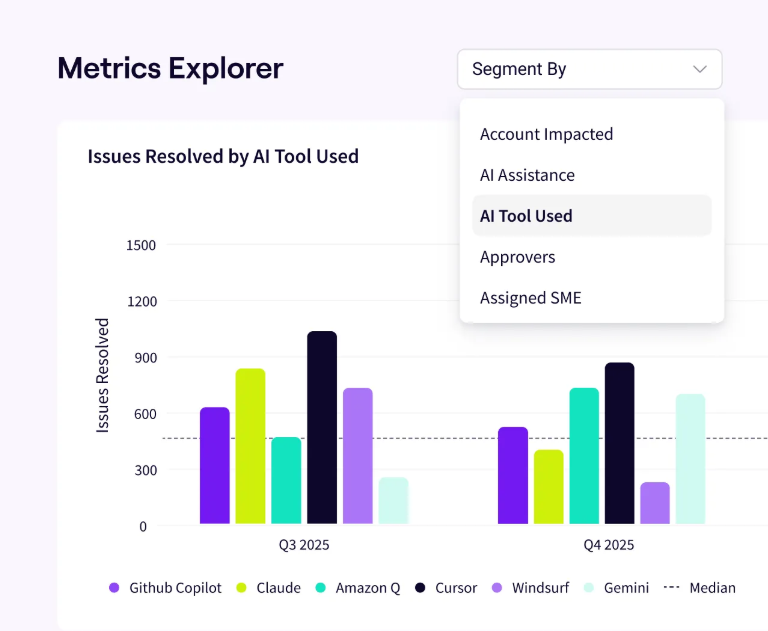
PRO TIP 💡: Comparing AI-heavy teams against lighter users is the fastest way to see whether the tools changed delivery, and it requires both groups measured on identical definitions. Jellyfish Impact Insights links AI usage to throughput, cycle time, and quality using SDLC signals, which makes that comparison hold up when someone questions it.
Quality & Risk
Quality metrics show whether faster code creation comes with a cost later in the development process. AI can help developers move faster, but that gain means very little if teams spend more time fixing defects, rewriting code, or dealing with failed changes afterward.
What to track →
- Bug rate – whether AI-assisted work is linked with more defects after merge or release.
- Rework rate – how often developers need to revisit or substantially change recently completed work.
- Review burden – whether AI-heavy pull requests need more comments, revisions, or review rounds.
- Change failure rate – how often releases lead to incidents, rollbacks, or urgent fixes.
- Time spent on fixes – how much engineering time goes into correcting problems after the original work is done.
What leaders can do with it → Quality metrics determine what a leader can honestly claim. They also inform the policy decisions that follow a rollout, including review requirements, test coverage thresholds, and which parts of the codebase stay off limits to AI-assisted changes.
One important caveat ❗ → A faster PR is not automatically a better PR. If AI-assisted work moves through development quickly but creates more rework or production issues, the apparent productivity gain may disappear later in the cycle.
Cost & Token Management
Cost covers what the tools are charging you and where that money goes. It has become the least predictable category as agentic tools took hold, since a per-seat license produces a fixed bill and token consumption does not.
What to track →
- Spend by tool – how much you pay for each AI coding assistant across licenses, usage, or both.
- Token usage – how much usage different teams, projects, or tools consume over time.
- Cost per active user – whether spend is concentrated among developers who use the tool regularly or spread across mostly idle licenses.
- Cost by team or project – where AI spend is accumulating across the organization.
- Cost relative to delivery impact – whether higher spend lines up with faster delivery, greater throughput, or other measurable gains.
What leaders can do with it → Cost data supports the decisions that follow a rollout, including which licenses to reclaim, which tools to consolidate, and where to set consumption limits before the bill arrives. Each of those requires spend attributed to teams and workloads instead of a single monthly figure.
One important caveat ❗ → Cost per developer means nothing on its own. A team spending twice the org average may be running agents on complex refactors that would have taken weeks by hand, so read spend against delivery and quality data before treating a high number as waste.
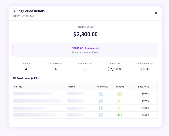
PRO TIP 💡: Agentic workflows can consume more in a week than a team spends in a quarter, and a consolidated invoice hides that entirely. Jellyfish AI Token Cost Management attributes consumption to the teams and initiatives driving it, which is what makes overruns visible while there is still time to act.
The Limitations of Native AI Coding Tool Dashboards
The Limitations of Native AI Coding Tool Dashboards
Native reporting has become standard across the category. Copilot, Cursor, and Claude Code all expose active users, acceptance rates, and usage breakdowns to team administrators, which covers the enablement question most leaders have first.
Once the question moves past usage, the limits become structural, since the data a vendor would need to answer exists within systems it has no connection to.
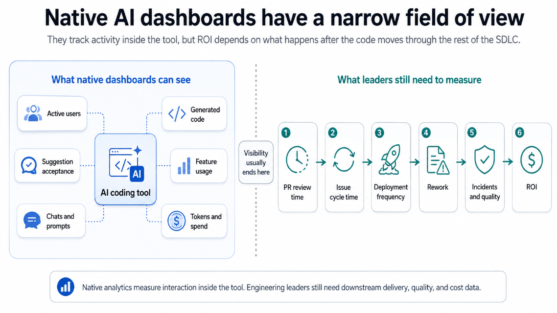
That creates five specific limitations for engineering leaders:
- Reporting ends where the IDE ends: The reporting boundary matches the product boundary. An assistant observes suggestion and acceptance, and reviews latency, merge time, deployment outcomes, and defect rates are recorded elsewhere by systems the vendor does not integrate with.
- Three tools mean three different portals: Multi-tool stacks are now the norm, and native reporting assumes a single vendor. Comparing Copilot usage against Cursor usage means reconciling two different definitions of an active user, two different acceptance methodologies, and two export formats that were never designed to sit in the same table.
- Everything reported is an input: These numbers measure inputs. A team can raise acceptance rate by accepting more suggestions, which says nothing about whether the resulting code shipped sooner or was held up in production, and that distinction is the whole of what leadership is asking about.
- The data has boundaries you inherit: GitHub’s metrics API retains 28 days of history and suppresses automated reporting for teams below a minimum size, so year-over-year comparisons require you to export and store the data yourself. Schema changes on the vendor side break whatever you built on top, usually without notice.
- The vendor sets the definitions: The numbers are accurate within their own definitions, and those definitions belong to the vendor. Whether a developer counts as active after one session or ten, and whether an edited suggestion counts as accepted, are choices made by the company selling the tool.
Keep in mind → Nothing here suggests turning them off. Native reporting answers the enablement question accurately and cheaply, which is a notable contribution to any AI program. The problem appears when those same numbers get carried into a budget review, since adoption data was never built to support a claim about return.
Build vs. Buy: AI Coding Tool Reporting Options
Build vs. Buy: AI Coding Tool Reporting Options
Most organizations weigh a custom build against a purpose-built platform. The build makes sense in a narrow set of circumstances, and the number of organizations that fit those circumstances shrinks as AI tooling spreads across more teams.
The comparison below covers what each path asks from your team:
| Build with BI | Buy an engineering intelligence platform | |
| Setup | Custom connectors, warehouse modeling, metric definitions written from scratch | Existing integrations and a prebuilt engineering data model |
| Time to first report | One to two quarters | Days to weeks |
| Maintenance | Owned internally, indefinitely | Handled by the vendor |
| Adding a new AI tool | New connector, new identity mapping, new joins | Configuration step |
| AI attribution | Inferred from before and after comparisons | Detected at the pull request level |
| Control over definitions | Complete | Standardized, with limited customization |
| Benchmarks | Unavailable | Included |
Control is the one row where building wins outright, and it matters when your org measures delivery in a way no platform supports.
That requirement is rarer than teams expect, since cycle time, throughput, and DORA metrics have settled into fairly standard definitions. For everyone else, the control comes at the price of owning the pipeline.
1. Building Custom Dashboards with BI Tools
The build path routes AI vendor exports, Git history, and issue tracker data into the warehouse you already run, then models it for reporting in Power BI, Looker, or Tableau.
The project breaks into connectors, identity resolution, and metric definitions, plus storage for the history your vendors do not retain. Most teams reach a working dashboard in one to two quarters, depending on how much data engineering capacity they can commit.
What you gain →
- Metric definitions written to match how your organization already measures delivery
- Nothing leaves the warehouse, so security review covers ground your team has already cleared
- Engineering metrics joined to budget, headcount, and R&D capitalization in one model
What you take on →
- A permanent maintenance line, since vendor APIs change and new AI tools keep arriving
- Identity mapping updated with every hire, departure, and username change
- No alerting by default, so someone has to check whether the data is current before using it
Best fit → Organizations running a single AI tool, with data engineering capacity to spare and reporting requirements no platform covers. Each additional tool weakens the case, since every vendor brings another identity mapping and another set of joins to maintain.
2. Buying an Engineering Intelligence Platform
SEI platforms connect to your Git provider, issue tracker, CI pipeline, and AI vendors through prebuilt integrations, then apply a data model that already understands pull requests, cycle time, and deployments.
The work at your end is configuration. Developer identity gets resolved across systems during onboarding, metric definitions arrive already written, and most teams have working reporting inside a few weeks.
What you gain →
- Attribution at the pull request level, which no BI build recovers from Git alone
- Benchmark data from a population of organizations measured the same way
- Vendor API changes absorbed by the platform, so schema updates stay off your backlog
- Coverage that extends as your teams adopt new AI tools
What you take on →
- A vendor contract with the security review and procurement cycle that comes with it
- Metric definitions set by the platform, which may differ from how your organization measures today
- Engineering data held outside your own infrastructure
Best fit → Organizations running more than one AI tool, with delivery data spread across several systems and no data engineering capacity to spare. This describes most engineering orgs above a few hundred developers, where the number of tools and the number of systems both keep growing. The case is weakest for small teams on a single assistant, where native reporting covers the enablement question well enough.
Manage AI Coding Tool Reporting With Jellyfish
Manage AI Coding Tool Reporting With Jellyfish
Everything covered so far points to the same requirement. AI usage, delivery outcomes, and cost have to be measured together and resolved to the same developers and the same units of work, and no single system in your stack holds more than one of those.
Jellyfish’s AI Impact product was built to hold those three together. It connects to Git, Jira, Linear, and Azure DevOps alongside your AI vendors, then applies a data model that already understands pull requests, issues, cycle time, and deployments. AI signals get derived from Git and workflow data directly, so adoption and impact reporting arrives without tagging, migrations, or changes to how your teams work.
For AI coding tool reporting specifically, six capabilities do the work:
- Vendor comparison: One measurement model covers every assistant and agent in your stack, which removes the reconciliation work that three vendor portals create. Deciding which tools deserve next year’s budget becomes a comparison rather than a judgment call.
- Drive adoption: Usage gets detected automatically from Git and workflow signals, so you see who uses AI, where, and through which tool without asking teams to self-report. Developers are grouped by how heavily they lean on the tools, which shows where the rollout took hold.
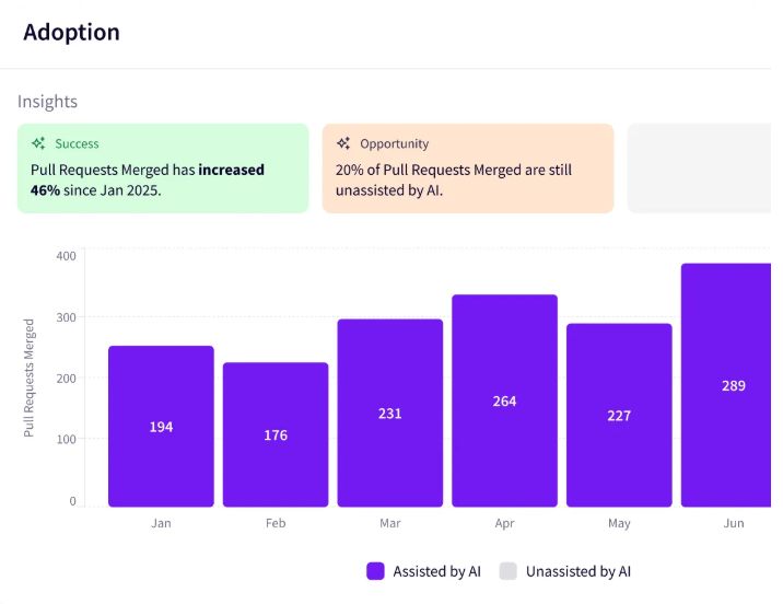
- Impact insights: Usage data connects to cycle time, PR throughput, and quality signals from your source control and issue tracker. Leaders can see whether AI-heavy teams ship sooner than lighter users and whether that speed came with a quality cost.
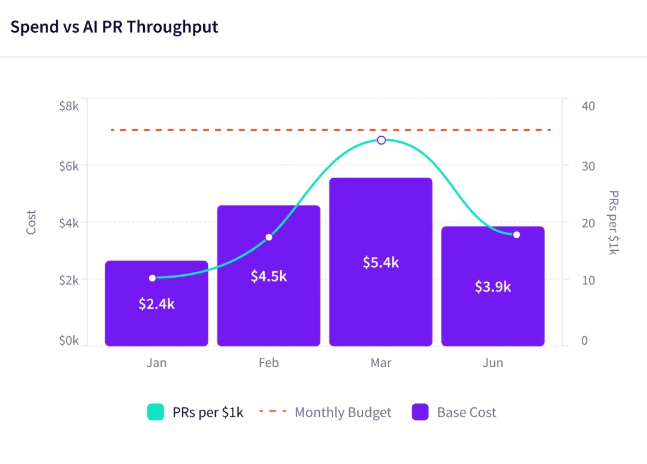
- AI token cost management: Cost data arrives broken out by tool, team, and initiative, so a spike gets traced to its source in the same session it gets noticed. Read alongside throughput, it answers whether heavy spend produced heavy output.
- Enable teams: Learning from power users is the practical path to raising adoption elsewhere. The platform identifies who those users are, what they do differently, and which teams would benefit most from the same workflows.
- Report builder: The board-facing version of this data gets produced without anyone building it. Reports cover adoption, impact, and spend in the format leadership expects, updated as the underlying numbers change.
AI spend keeps growing, and the reporting around it has to keep pace. Jellyfish gives engineering leaders adoption, delivery, quality, and cost in one view, pulled from the systems where the work already happens.
Book an AI Impact demo to see the platform against your own delivery data.
FAQs
FAQs
Can general AI reporting tools track software engineering performance?
AI reporting tools and enterprise analytics platforms like Qlik, Looker Studio, and Microsoft Fabric handle data visualization and data analytics well, and none of them were built for the software development lifecycle.
Reporting on AI coding assistants requires data integration across source control, issue trackers, and vendor APIs, plus the ETL work to move it into a warehouse like Snowflake and the data governance to keep it trustworthy.
Teams that go this route usually need a dedicated Power BI developer to build the semantic model and custom visuals from scratch. Engineering intelligence platforms handle that groundwork by default.
Do AI coding dashboards use predictive analytics or machine learning?
Yes. Engineering intelligence platforms apply machine learning and predictive analytics to spot capacity gaps, delivery risks, and anomaly detection on PR cycle times, along with predictive forecasting on delivery dates.
Generic BI tools can support the same techniques, and they require your data team to build and maintain the underlying model first. Engineering platforms provide self-service analytics that engineering managers can use without a data team in the loop.
How does natural language processing fit into engineering reporting?
Conversational analytics has become common across BI platforms, with tools like Zia in Zoho Analytics helping business teams parse revenue data.
In engineering intelligence, natural language processing lets leaders use natural language queries to ask about team flow, AI adoption, and delivery trends.
NLP removes the dependency on SQL queries and turns real-time reporting into something a director can pull without waiting on the data team.
What is the difference between embedded analytics and an AI impact dashboard?
Embedded analytics describes reporting built into a custom software application, usually for the people using that product.
An AI impact dashboard is a standalone, no-code tool for R&D organizations that measures software delivery and the return on generative AI coding tools.
The two solve different problems, since one extends a product you sell and the other measures how your engineering org works.
About the author

Lauren is Senior Product Marketing Director at Jellyfish where she works closely with the product team to bring software engineering intelligence solutions to market. Prior to Jellyfish, Lauren served as Director of Product Marketing at Pluralsight.