In this article
Google’s 2024 DORA report found that a 25% increase in AI adoption came with a 1.5% drop in throughput and a 7.2% drop in stability. It showed that heavier AI use did not translate into faster or more stable delivery, and in some cases went along with the opposite.
That result points to a measurement problem. Most engineering leaders can pull usage data without any trouble, since every tool reports active seats, accepted suggestions, and code generation. But what those numbers leave out is whether cycle time, lead time, code quality, or developer experience improved.
An AI adoption dashboard closes that distance. It connects AI usage to how work moves through the SDLC, so leaders can see who uses AI, how that use changes their engineering work, and whether the investment produces measurable results.
The rest of this guide covers the metrics to track, the mistakes to avoid, and how to build the dashboard into how the engineering team already works.
What Is an AI Adoption Dashboard?
What Is an AI Adoption Dashboard?
An AI adoption dashboard is a single view of how an engineering organization uses AI coding tools and how that use affects delivery.
It reads activity from the AI coding tools and from the systems that already record engineering work, like Git, Jira, and developer surveys. With both in one place, leaders can follow AI use from a single seat through to delivery.
Most engineering leaders want the dashboard to answer three questions:
- Who uses the tools, and on which teams?
- Is that use growing, holding steady, or falling off?
- Does it move delivery speed, code quality, and developer satisfaction?
Native tool reports can cover the first question and part of the second. A dashboard covers all three, and ties the answers together so leaders can see how usage connects to delivery.
Here’s what that looks like in Jellyfish, where AI assistant activity and engineering data share one view:
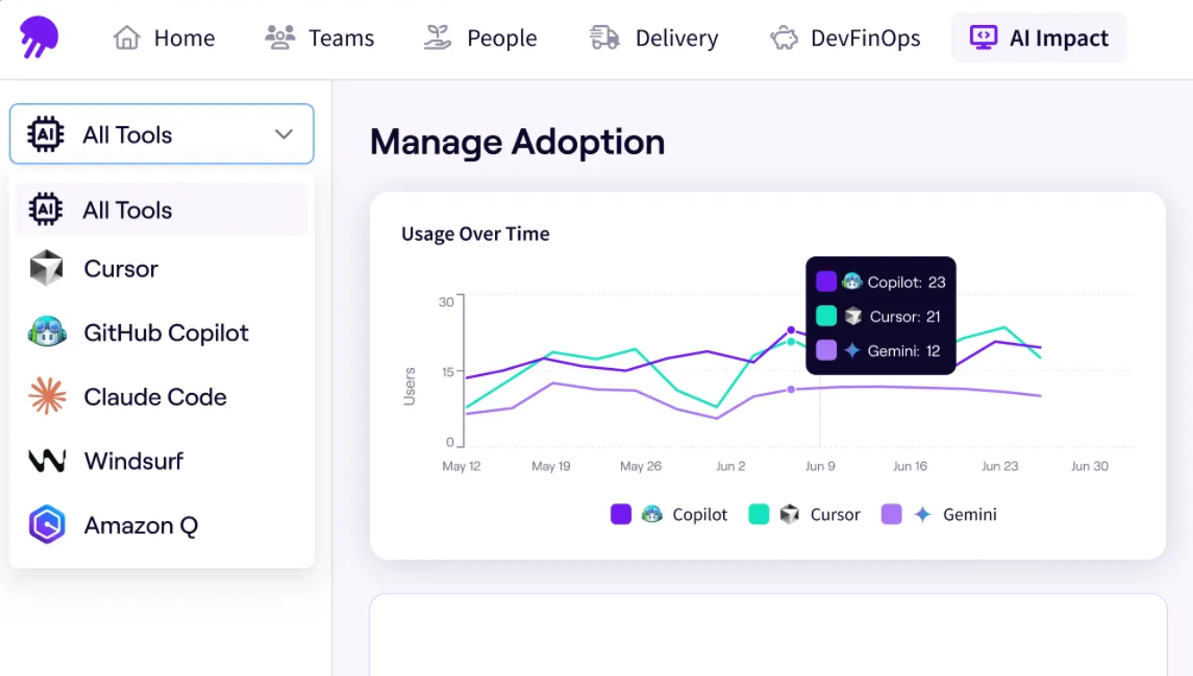
It pulls activity from every AI tool in use, lines it up with engineering data, and shows adoption and delivery in the same place. Native tool dashboards stop well short of that, and the next section covers why.
Why Native Tool Dashboards Aren't Enough
Why Native Tool Dashboards Aren’t Enough
Most AI coding tools come with a built-in dashboard, and it handles the basics well. GitHub Copilot, Cursor, and Claude Code can each show how many people use the tool, how many suggestions get accepted, how much code is generated, and how usage breaks down by team or language.
If you just want to know whether people picked up the tool, that’s usually enough.
The limit is that each tool only sees its own activity. None of them can see Git history, Jira tickets, or how a change moved from commit to production. So the more tools you add, the more separate reports you have to reconcile.
The table lists the questions engineering leaders usually ask and marks how far each type of dashboard gets on each one:
| Question | Native tool dashboard | AI adoption dashboard |
| Who uses the tool | ✔️ | ✔️ |
| Usage by team or language | ✔️ | ✔️ |
| Activity across multiple AI tools | One tool at a time | All tools in one view |
| Effect on cycle time and lead time | ❌ | ✔️ |
| Effect on code quality and rework | ❌ | ✔️ |
| Effect on review burden | ❌ | ✔️ |
| Developer experience signals | ❌ | ✔️ |
| Capacity moved to roadmap work | ❌ | ✔️ |
Rule of thumb → Treat native dashboards as the input side of AI adoption and delivery data as the output side. You need both to know whether the input produced anything.
AI Adoption Metrics Engineering Leaders Should Track
AI Adoption Metrics Engineering Leaders Should Track
You could track a dozen different things about how a team uses AI, but only a few are worth keeping on the dashboard. Each one answers a clear question about either usage or delivery, and they’re easier to make sense of in that order.
Adoption metrics come first. They answer the simplest questions on the dashboard, who uses AI and how widely, and they set the baseline for everything else you’ll measure.
Here’s what to look at:
- Adoption rate: The share of eligible engineers actively using AI tools. Break it down by team, role, or department to see where AI has caught on and where usage is still thin.
- Active users: The count of engineers active in the tools over a given week or month. Regular activity signals adoption, while a one-time spike usually signals curiosity.
- Depth of use: How heavily active developers lean on AI. Two teams can show the same active-user count while one reaches for AI now and then and the other builds most of its work around it.
- Adoption momentum: The trend line behind the headline number. Rising usage points to habits forming, and flat or falling usage points to teams that tried AI and moved on.
- Usage by tool and team: How adoption compares across Copilot, Cursor, Claude Code, and any other tools in use. It shows which tools are getting traction and which teams are ahead of or behind the rest.
- Friction zones: The teams, roles, or workflows where adoption has stalled. These are the places to focus training and enablement.
The other half is whether it shows up in the work, and that’s where impact metrics come in. They tie AI use to delivery speed, code quality, and developer experience.
The main ones to track include:
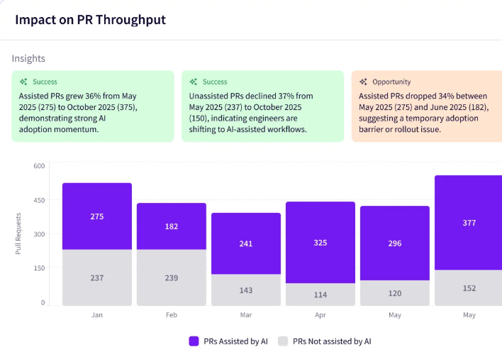
- PR throughput: The number of pull requests merged over a set period. A rise alongside AI use suggests the tools are helping the team ship more, though it’s worth checking that quality held at the same time.
- Cycle time and lead time: How long a change takes to move from first commit to merge, and from start to production. If AI is helping, these should trend down, since the tools take work off each stage.
- Code quality: The health of what gets shipped, measured through defect rates, escaped bugs, and rework. It tells you whether AI is producing more good code or just more code.
- Change failure rate: The share of releases that fail or need a fix after they ship. It’s the counterweight to throughput, since AI that speeds up delivery but breaks more often isn’t a benefit.
- Review burden: Whether review keeps pace as AI increases how much code gets written. A growing review backlog points to a bottleneck moving downstream.
- Developer experience: The developer’s own read on whether AI makes the work better or just different. It’s worth tracking because tools can post strong usage for a while even when the people using them are frustrated.
- Agent impact: How much work AI agents do on their own, and whether it’s any good. This gets more important as teams give agents full tasks instead of single suggestions.
Key takeaway → Track adoption to run the rollout and impact to prove it worked. A dashboard that shows only one side will either flatter the tools or undersell them.
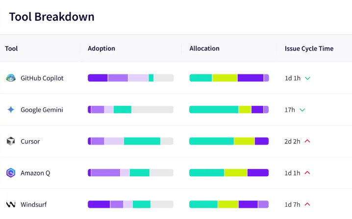
PRO TIP 💡: Tracking these metrics across Copilot, Cursor, and Claude Code means three separate reports that don’t line up. Jellyfish AI Impact measures every tool on one vendor-neutral model, so you can compare adoption and impact side by side instead of reconciling exports.
How to Avoid Misleading AI Adoption Metrics
How to Avoid Misleading AI Adoption Metrics
The trouble with a lot of AI metrics is that they go up whether the work improved or not. That makes them easy to trust and easy to get wrong.
Six rules help you read them right:
- Don’t treat lines of code as output: This is the number AI inflates fastest, and the one most likely to get read as productivity. Every extra line still has to be reviewed, tested, and kept working, so a higher count can quietly mean more load for the team.
- Don’t trust acceptance rate on its own: A high acceptance rate can mean the suggestions are good, or that developers wave them through and fix them after. On its own, it can’t tell the two apart, so check what holds up in review and in the codebase.
- Don’t call usage productivity: Active users measure how many people use AI, and stop short of what they got done. A team can be fully active in the tools and ship at the same pace, so pair the usage number with a delivery one before calling it progress.
- Don’t measure speed without measuring quality: Faster delivery only holds up if the code does, so cycle time on its own can hide a problem. Put change failure rate and rework next to it, or you’ll cheer a speedup that’s seeding defects downstream.
- Don’t scale pilot numbers to the whole org: The people in a pilot chose to be there, which makes their adoption and impact numbers a best case. Treating those figures as the target sets up the wider rollout to look like a failure.
- Don’t rank teams on raw adoption: A payments team and a greenfield team will post different AI numbers for reasons that have nothing to do with how well they use the tools. Compare a team against its own trend over time, since cross-team leaderboards just push people to game the metric.
PRO TIP 💡: Every trap here comes from reading a usage number on its own. Jellyfish AI Impact pairs adoption data with throughput, cycle time, and code quality, so an acceptance rate or active-user count never stands alone without the delivery numbers behind it.
How to Operationalize Your AI Adoption Dashboard
How to Operationalize Your AI Adoption Dashboard
Different questions suit different intervals, so a weekly review catches things a quarterly one would miss, and the reverse holds too. Here’s how the three cadences divide the work.
Weekly: Identify Adoption and Workflow Friction
The weekly review is a quick check on how adoption is going and where work is slowing down. Team leads and engineering managers run it, since they’re closest to the signals that move week to week.
What to look at:
- Active users and adoption rate by team, to see who’s picking the tools up and who isn’t
- Adoption momentum week over week, for the first sign of a rollout losing steam
- Pockets of low usage that need a closer look this week
- First signs of quality trouble, such as more rework or slower reviews where AI use is high
- Review queues, to catch AI-generated code piling up faster than it gets reviewed
The goal: Find the teams that are struggling and get them support quickly. At this cadence, the fix is usually small, some training, a workflow change, or a quick check-in with whoever’s stuck.
Watch for ❗: A review queue that grows faster than usual on AI-heavy teams. It’s the first sign that faster code generation is creating a bottleneck further down the line.
Monthly: Review Delivery and Quality Impact
The monthly review moves from adoption to impact. Directors and engineering leaders use it to see whether a month of usage translated into faster, steadier delivery, on metrics that take time to stabilize.
What to look at:
- Cycle time and lead time, for whether work is moving through the pipeline any quicker
- PR throughput, for the volume of work reaching merge
- Code quality and change failure rate, to check that faster delivery isn’t costing stability
- Review load and queue size, since more generated code can pile up on reviewers
- Developer experience, collected from surveys, on whether the tools are helping or wearing people down
The goal: Judge whether AI is pushing delivery forward across the team. A month of data separates a lasting improvement from a short-term bump, and shows which teams have found value worth spreading.
Watch for ❗: A team that looks faster on paper but is failing more often in production. Throughput and cycle time can improve while stability drops off in the background, so read them together before calling the month a win.
Quarterly: Evaluate Business Outcomes and Investment Decisions
The quarterly review is the one that touches spending decisions. VPs of engineering and finance look at a full quarter of data to decide whether AI investment should grow, hold, or shrink.
What to look at:
- AI spend by team and tool, to see where the money is going and what it returns
- Business outcomes, like delivery speed and quality trends across the quarter
- Roadmap versus maintenance capacity, to check whether AI freed up time for new work
- Tool-level value, so tools that aren’t pulling their weight can be cut or swapped
The goal: Decide which AI investments are worth continuing. A quarter of data is enough to back the tools and teams that are delivering, trim the ones that aren’t, and set the direction for the next few months.
Watch for ❗: A heavily used tool that hasn’t moved delivery or freed up any capacity. Usage alone can make a tool feel necessary, so a full quarter of flat results is the point to question whether it’s worth the spend.
How Jellyfish Helps Leaders Track AI Adoption and Impact
How Jellyfish Helps Leaders Track AI Adoption and Impact
Plenty of teams start with spreadsheets, pulling exports from each tool and matching them against delivery data by hand. That approach holds for one or two tools and a few teams.
Once the organization grows past that, keeping it accurate takes more time than it’s worth, and a platform does the job automatically.
This is what Jellyfish AI Impact is built to do. It measures how tools like Copilot, Cursor, and Claude Code are used across teams and connects that usage to throughput, code quality, and delivery speed.
The platform brings this together in a handful of ways:
- Adoption Insights: Shows who’s using AI, on which teams, and through which tools, using signals Jellyfish picks up automatically. Nothing depends on developers logging their own activity, which keeps the data clean. It’s the baseline the rest of the dashboard builds on.
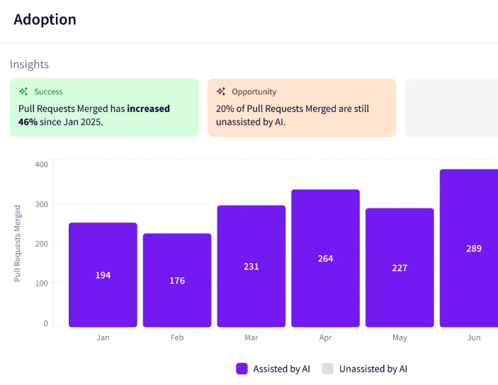
- Impact Insights: Ties adoption data to delivery outcomes, so a rise in usage can be read against what happened to cycle time and quality. It uses live SDLC signals, which gives leaders a trustworthy view of AI’s effect.
- Multi-tool comparison: Measures every AI tool on one vendor-neutral model, so Copilot, Cursor, and Claude Code can be judged side by side. This replaces the stack of separate tool reports with a single consistent view.
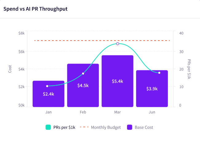
- AI token spend dashboard: Tracks what each tool and team costs, down to token usage. This is what makes the quarterly investment review possible, since spend can be read next to the delivery it produced. Leaders can fund what works and trim what doesn’t.
- Enablement Insights: Points to where adoption is stalling and what to do about it. It highlights power users worth learning from and enablement gaps worth closing, so support goes where it helps most.
- Auto report builder: Generates executive-ready AI reports on what’s working, what isn’t, and where to invest next. It saves leaders from rebuilding the same summary every reporting cycle. This is what makes the monthly and quarterly rhythms easy to sustain.
The result is a single view leaders can bring to any review, weekly, monthly, or quarterly, without building it by hand.
Book an AI Impact demo to see it working with your teams and tools.
About the author

Lauren is Senior Product Marketing Director at Jellyfish where she works closely with the product team to bring software engineering intelligence solutions to market. Prior to Jellyfish, Lauren served as Director of Product Marketing at Pluralsight.