In this article
AI coding assistants make code cheap to produce. GitHub Copilot, Cursor, and Claude Code push more commits into the pipeline, and throughput charts reward you for it.
But more output does not mean a better week for the people who write and review that code. Pull requests get bigger, reviews drag, and part of the time saved upstream may come back as rework.
Research points the same way. Google’s 2025 DORA report surveyed nearly 5,000 technology professionals and found 90% use AI at work, yet 30% place little or no trust in the code it generates.
That lack of trust is invisible in standard engineering metrics. AI sentiment tracking measures how developers experience their tools and workflows, then reads those answers next to throughput, cycle time, and rework rates.
What Is AI Sentiment Tracking in Modern DevEx?
What Is AI Sentiment Tracking in Modern DevEx?
AI sentiment tracking measures how developers experience the AI coding tools they use, through recurring surveys and analysis of internal text, reported as a metric you can segment by team and track over time.
Two definitions are in circulation, and they describe different work:
- Sentiment about AI is the subject. Developers report how the tools affect their day, which covers everything from suggestion quality to review load to how much generated code they trust without a second pass. Those answers give your usage numbers a meaning they cannot supply on their own.
- AI applied to sentiment is the method. Natural language processing reads the text your teams already write in surveys, retros, and pull request threads, then classifies tone and groups the themes that repeat. A quarterly survey gives you a few hundred structured answers. This gives you every complaint an engineer typed into a review, sorted by topic and traceable to a tool.
Developer perception has been part of engineering measurement for years. SPACE opens with satisfaction and well-being, and the DevEx framework organizes everything around feedback loops, cognitive load, and flow state, none of which appear in system logs.
Artificial intelligence changes each of those dimensions, and often in more than one direction at once:
- Feedback loops get faster during code generation and slower during review, so the overall effect varies by team.
- Cognitive load moves from producing code to verifying it, and verification carries its own mental cost that adoption metrics never record.
- Flow state depends on how much of the generated output a developer trusts, since heavy verification interrupts work in the same way an unclear ticket does.
Example → A team merges 40% more pull requests in a quarter, and the delivery chart reads as a clear improvement. That same chart appears when engineers accept AI output faster than they can review it, and the cost comes up later as rework and larger diffs.
Sentiment data separates the two cases. If merge volume climbs while developers report higher cognitive load, the team is absorbing review fatigue and the throughput number is misleading. If volume climbs while the same developers report shorter feedback loops and fewer interruptions, the improvement is real, and the investment deserves more budget.
Key Sentiment Signals to Measure in an AI-Augmented Team
Key Sentiment Signals to Measure in an AI-Augmented Team
AI sentiment tracking works best when teams measure specific parts of the developer experience instead of asking whether engineers simply “like” or “dislike” AI.
The signals below cover the parts of the workflow AI touches most, and each one maps to a different decision about tooling, enablement, or review policy:
- Trust in generated output: Developers who verify every suggestion spend time that no adoption metric records. A trust score per tool shows you where that verification cost concentrates, and it usually varies more by codebase than by team.
- Review burden: Reviewers absorb the downstream cost of AI adoption, so their experience needs to be measured separately from the authors’. When authors report faster work and reviewers report strain, the effort moved to a different part of the team, and delivery metrics will look healthy the whole time.
- Cognitive load: Evaluating generated code is different work from writing it, and often more demanding, since the developer has to reconstruct intent they never formed. A load score tracks whether that trade is working out for a given team.
- Flow state and interruption: Developers need uninterrupted stretches to work through complex problems, and AI tools affect that in both directions. The result depends on task type, since a tool that clears boilerplate can still fragment deep work on unfamiliar systems.
- Confidence in the codebase: This measures whether engineers expect the code they ship to remain maintainable six months out. It finds technical debt while it accumulates, well before change failure rate or incident volume registers anything.
- Enablement quality: Covers whether developers feel equipped to use the tools well, and low scores here often explain low adoption more accurately than resistance does. Jellyfish research found that only 10% of the 636 engineering leaders surveyed reported both strong enablement and high adoption.
Segment every signal before you read it → A company-wide score averages teams that had opposite experiences with the same tool. Trust varies by language and codebase, cognitive load varies by seniority, and flow varies by how much legacy code a team maintains. Reading the segments separately shows you which teams need enablement and which ones are ready for wider rollout.
PRO TIP 💡 → Segmentation only works when your sentiment data and your delivery data share a team structure. Jellyfish reports survey results against the same org hierarchy it uses for cycle time and throughput, which means a team-level trust score lines up with that team’s actual review turnaround without any manual mapping.
How to Build an AI Sentiment Tracking Framework
How to Build an AI Sentiment Tracking Framework
The five steps below cover the full setup, from the first baseline through the point where sentiment data changes a decision. Each step depends on the one before it, so the order is important as well.
Step 1: Establish Your Baseline Diagnostic and Telemetry Sources
The baseline gives you a fixed reference point for every comparison that follows. You collect one round of sentiment data alongside the delivery metrics you already track, before any change to tooling or review policy, and you confirm which system each metric comes from.
How to do it →
- Run the full survey once across every team. Cover all six signals instead of a subset, since a partial baseline cannot support the segment comparisons you will want two quarters from now.
- Collect delivery metrics for the same period and the same teams. Cycle time, PR size, review turnaround, and rework rate give you enough to work with, and pulling them from a different window makes the comparison unreliable.
- Confirm which system supplies each metric. Your Git provider, issue tracker, CI, and AI tool APIs measure things differently, and definitions that do not match will distort every comparison that follows.
- Note the tooling situation for every team. Which assistants they use, how many seats they hold, and how long they have had them.
- Write down the current review rules. If you change approval thresholds or reviewer assignments mid-year, the sentiment shift will be hard to attribute without a record of what the rules were before.
Example → A backend team records a 3.1 trust score, a four-day median cycle time, and a 12% rework rate in the first week of the quarter. When trust reaches 3.9 two quarters later and cycle time holds steady, the improvement in confidence came without a delivery cost, which is a defensible case for expanding the license pool.
Watch out ❗️ → Anonymous responses cannot be segmented after the fact. Decide which fields you need attached to each response before collection starts, since adding team, seniority, or codebase later means running the survey again.
Step 2: Deploy Multi-Modal Feedback Capture Mechanisms
This step builds the collection module. Developer surveys, in-workflow prompts, and text analysis each produce a different kind of signal, and running only one of them leaves you with either stale data, thin data, or unstructured data.
How to do it →
- Keep the quarterly survey short and fixed. Ten to fifteen questions is enough to cover all six signals, and any rewording between quarters breaks the comparison you built the survey to produce.
- Place a one-question prompt inside the workflow. A single question after a merge or at sprint close records reactions while the work is recent, and response rates hold because answering takes one click.
- Run text analysis on what teams already write. Pull request comments, retro notes, and internal channels produce feedback continuously, and NLP classification groups the themes without asking anyone for more time.
- Give developers a way to raise things unprompted. A standing form or a dedicated channel picks up the specific complaints your question set never anticipated.
- Decide the frequency for each method up front. Quarterly surveys, continuous text analysis, and one workflow prompt per sprint keep the total ask small enough that people keep responding.
Example → A quarterly survey shows trust holding steady at 3.6, while text analysis of pull request comments picks up a rise in mentions of hallucinated imports over the same six weeks. The survey missed it because nobody thought to ask, and the review threads recorded it as it happened.
Watch out ❗️ → Survey fatigue is how this step fails most often. Response rates drop below the point where segment comparisons hold, and the teams that stop answering first tend to be the ones under the most pressure, which skews the results toward teams with time to spare. Keep the total ask under a few minutes per developer per sprint across all methods.
Step 3: Segment Sentiment Data by Team, Language, and AI Tool Usage
Segmentation shows you which teams had which experience. A company-wide average combines teams with opposite results into a single number, and segmented data points to the teams that need enablement, the teams that need a different tool, and the teams ready for a wider rollout.
How to do it →
- Attach segment fields to every response at collection time. Team, primary language, codebase, tenure, and role in review, since these cannot be added retroactively to anonymous answers.
- Split authors from reviewers. The same person occupies both roles in a given week, so ask which role the answer refers to instead of assigning one per person.
- Group by AI tool and by adoption maturity. A team six months into Cursor and a team three weeks into Copilot answer the same questions from different positions.
- Set a minimum segment size before you report anything. Five to eight responses is a common floor, and anything smaller identifies individuals and invites people to stop answering honestly.
Example → Two teams both report a 3.4 on cognitive load. One maintains a legacy monolith in Java, the other runs a greenfield TypeScript service, and both use Copilot. The identical scores look like agreement until segmentation shows that the first team spends its effort reconstructing intent in unfamiliar code while the second spends it on prompt iteration, which are two different problems with two different fixes.
Watch out ❗️ → Segments multiply fast and thin out the data. Team by language by tool by tenure produces dozens of cells, most holding two or three responses, and none of them reliable. Pick three segment dimensions to report on, keep the rest as fields you can filter when a specific question comes up.
Step 4: Correlate Qualitative Sentiment with Quantitative SDLC Telemetry
This step connects the two data sets you have been collecting. Each sentiment signal maps to specific delivery metrics, and reading them together shows whether a change in output came from better working conditions or from work that moved somewhere else.
How to do it →
- Pair each signal with the metrics it should move. Trust against review turnaround, review burden against PR size and queue depth, cognitive load against cycle time, flow against interruption frequency and context switching.
- Compare quarter over quarter within each segment. A trust score of 3.4 means little on its own, and a move from 2.6 to 3.4 in the same team over two quarters means a great deal.
- Look for divergence first. Teams where sentiment analysis and delivery data point in opposite directions are the ones worth investigating, since agreement between the two usually confirms what you already knew.
- Hold tooling changes constant when you can. A team that switched assistants mid-quarter produces a correlation you cannot attribute, so record the change and read that segment separately.
Example → A team’s merge volume rises 30% across a quarter while its review burden score falls from 3.5 to 2.7. The delivery chart alone reads as a productivity increase, and the pairing shows that reviewers absorbed the additional volume without additional capacity, which puts the sustainability of that increase in question.
Watch out ❗️ → The two data sets move on different clocks. A survey captures one moment and cycle time covers weeks of work, so expect a lag of one to two sprints before a sentiment change appears in delivery data.
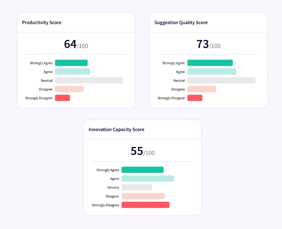
PRO TIP 💡 → Manual correlation between a survey export and a delivery dashboard eats a day per cycle and breaks the moment your team structure changes. Jellyfish AI Impact does this automatically, with sentiment on AI enablement and suggestion quality reported next to adoption, throughput, and spend for the same period.
Step 5: Execute Closed-Loop Action and Transparent Communication
This closes the loop between what developers reported and what leadership did about it. The output is a small number of changes per cycle, a summary sent back to every team that answered, and a measurement of whether the change moved the score.
How to do it →
- Pick one or two changes per cycle. A reviewer reassignment, a training session for the lowest-scoring segment, or a policy adjustment on approval thresholds beats a list of twelve intentions nobody owns.
- Report the results back before you act. Share the scores by segment, name the pattern you saw, and state what you plan to do about it, so the connection between the survey and the change is visible.
- Assign an owner and a date to each change. Sentiment findings stall more easily than other engineering metrics, since no team’s roadmap depends on them and nobody is accountable by default.
- Track the same signal in the next cycle. Whether the change moved the score is the only way to know if the intervention worked, and it also demonstrates to developers that their answers produce results.
Example → Three teams report that approval requirements slow their review cycle. The org changes the threshold for low-risk changes, announces the change alongside the data that prompted it, and watches both the sentiment score and review turnaround over the next two quarters.
Watch out ❗️ → Changing too much at once makes the next cycle unreadable. If you adjust review policy, add reviewers, and run training in the same quarter, the score moves, and no one can say which action moved it.
Top 5 Engineering Analytics Tools with AI Sentiment Tracking Capabilities
Top 5 Engineering Analytics Tools with AI Sentiment Tracking Capabilities
The tools below differ in where sentiment comes from. Survey-first platforms ask developers directly, code-first platforms read repository patterns like rework and rollback rates, and the broader platforms cover feedback, delivery data, and spend together.
The table compares them across those differences.
| Tool | Best for | Sentiment method | Pricing |
| Jellyfish | Leaders who need sentiment, delivery data, AI adoption, and cost in one platform | DevEx surveys built into AI Impact, correlated with DORA and SPACE metrics | Custom |
| DX | Enterprise orgs above a few hundred engineers that want a research-backed survey framework and industry benchmarks | Survey-first, built on the Developer Experience Index across 14 drivers, plus experience sampling | Custom, one-year minimum term |
| Span | Teams running several AI tools that need code-level AI detection alongside feedback | Built-in surveys read against code-level AI attribution and behavioral context | $45 per contributor per month |
| Swarmia | Mid-market teams that want survey and delivery data together with a low-commitment start | Research-backed 35-question survey framework, results as a team-level heatmap | Free under 10 developers, published paid tiers, modules sold separately |
| Exceeds AI | Teams that already collect sentiment and want to verify it against code outcomes | None. Infers signals from repository behavior including rework and rollback rates | Outcome-based, no per-seat charge |
1. Jellyfish
Jellyfish is a software engineering intelligence platform that connects developer sentiment, delivery metrics, AI adoption, and engineering cost on one data model.
Research-backed DevEx surveys pair with system data from your existing tools, which shows where teams lose time and explains why.
How it relates to AI sentiment tracking → The platform puts developer surveys inside the AI measurement itself, which means questions about tool support and suggestion accuracy report next to the usage and delivery data from the same period.
When Jellyfish is the right choice for your team → Jellyfish works for engineering leaders who need one platform covering AI sentiment, AI adoption, delivery metrics, and cost. If the same conversation has to satisfy your VP of Engineering and your CFO, few other tools cover both ends.
Key Features
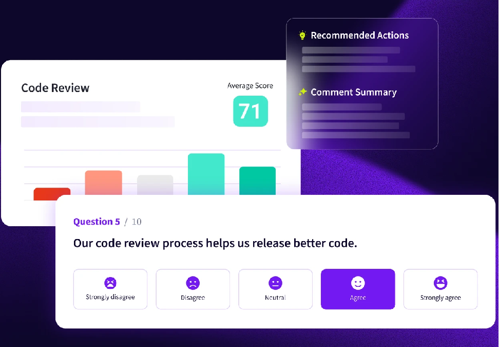
- DevEx surveys: Validated survey templates launch in minutes across the topics that drive developer experience, including code review, documentation, tooling, and context switching. Responses roll into a single comparable score you track over time, so you see whether an improvement effort moved anything.
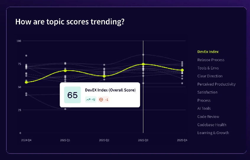
- Sentiment integrated into AI Impact: Jellyfish collects developer feedback in the same module that tracks adoption and output, so you never reconcile two data sets. The questions cover tool support, suggestion accuracy, and creative capacity, and the results carry directional signal early in a rollout when the delivery numbers are still too thin to read.
- Sentiment correlated with delivery metrics: Survey responses map against DORA, SPACE, and system metrics, which lets you separate a genuine productivity problem from a perception the evidence contradicts. Teams can stack sentiment on productivity, quality, and innovation data on top to see how AI changes individual and team workflows.
- Autonomous agent insights: Coverage extends past coding assistants to the agents opening pull requests on their own, with visibility into volume, contribution share, and merge success across every major agent your teams use. Reviewing agent-written code differs from reviewing a colleague’s work, and your survey should account for that.
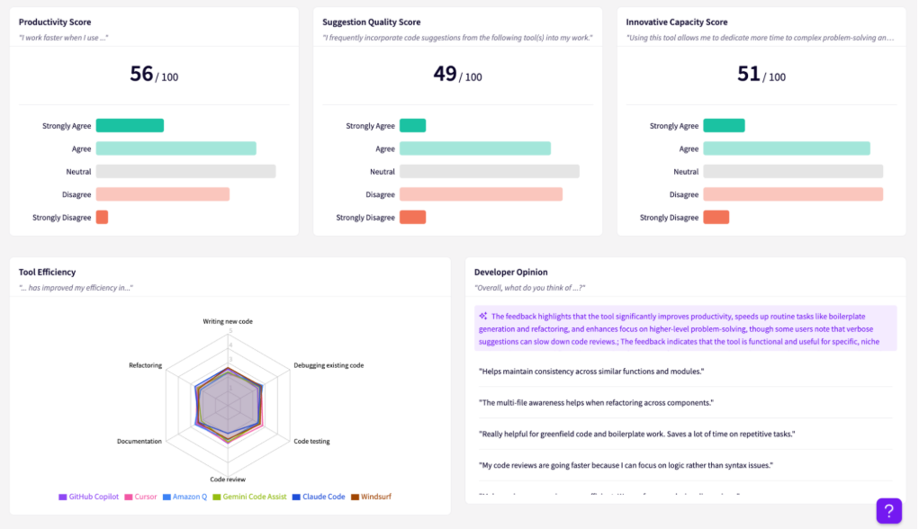
- AI spend visibility: Jellyfish connects AI spend with usage and delivery outcomes so teams can compare the cost and impact of different tools. Read alongside developer feedback, that helps leaders see whether expensive tools are delivering enough value to justify broader adoption.
What This Looks Like for a Real Engineering Organization
With engineering teams across Asia, Europe, and the Americas, Kaleris needed sentiment data broken down by location. A company-wide score would have averaged away the differences that matter, and DevEx surveys give their leaders a view per region.
When Copilot became a priority, Kaleris put Copilot questions into the existing survey. Three things came out of it:
- A sentiment read on the tool. Early findings pointed the same direction on both measures, with engineers reporting higher productivity and more satisfaction once they had AI access.
- A financial answer for the executive team. Engineering leaders used Jellyfish delivery data to calculate total cost savings from Copilot, which the executives wanted for their own reporting.
- Visibility that changed behavior. Survey results and metrics together brought engineering-level concerns in front of executives, and engineers noticed that the problems they raised led to actual changes.
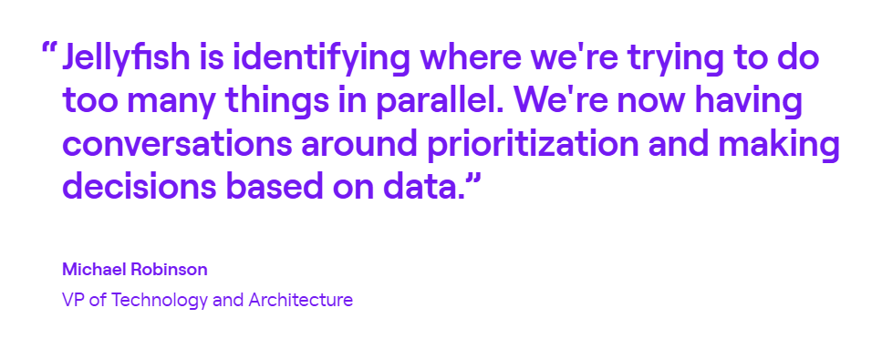
Michael Robinson, VP of Technology and Architecture, describes the method as taking subjective information from engineers and corroborating it with objective information in Jellyfish.
2. DX (Atlassian)
DX measures developer productivity through two inputs, which are periodic developer surveys and metadata pulled from your existing SDLC tools.
The platform was built by the researchers behind the DevEx and SPACE frameworks, and its DX Core 4 model consolidates DORA, SPACE, and DevEx into a single set of metrics.
When DX is the right choice for your team → DX fits organizations that want survey-based measurement as their primary instrument and have the headcount to run a formal developer productivity function. Enterprise contracts start at a one-year term, so it suits teams committed to a multi-quarter program.
Key Features
- Developer Experience Index (DEI): DX scores 14 drivers of engineering efficiency and rolls them into one number. The whole index comes from developer responses, and DX reports that each point of movement equals roughly 13 minutes of developer time per week.
- DX AI Measurement Framework: The framework measures AI across utilization, impact, and cost. A team can score high on utilization and low on impact, and that combination points to an enablement problem your license data would never notice.
- Experience sampling and targeted studies: Short in-workflow prompts collect reactions close to the work. Targeted studies let you send a focused question set to one team without a full survey across the organization.
Advantages
- Survey mechanics stay out of the way: The path from writing questions to sending them takes minutes, and trends update while the survey is still open. People who have run these programs manually tend to notice the difference immediately. [Read Full G2 Review]
- Built-in improvement suggestions: DX pairs each driver with suggested actions across different time horizons, which helps when a team knows a score is low and has no clear starting point. Users going through the prioritization process describe this as one of the more practical parts of the tool. [Read Full G2 Review]
Limitations
- Free-text analysis leans on the reader. The platform does summarize survey comments, and feedback suggests the output is not yet strong enough to circulate without editing. Teams that expect AI to hand them a finished report will do more manual synthesis than they planned, though this is an area vendors are shipping against quickly and worth checking against the current build. [Read Full G2 Review]
- Team and group filters behave differently across reports: Some reviewers report that the Teams and Groups concept works well in principle, and that support for group selection varies from one report to the next. Default selections do not always persist, which means re-applying filters when moving between dashboards. [Read Full G2 Review]
Learn more → 12 Best GetDX Alternatives for Engineering Teams Heading Into 2026
3. Span
Span is an AI-native developer intelligence platform that unifies signals from code repositories, tickets, incidents, and development tools into one view of how work moves through the lifecycle.
It combines system metrics with built-in surveys and an inference engine that categorizes work without requiring standardized processes.
When Span is the right choice for your team → Span suits teams that want sentiment and code data in the same platform without running two separate programs. Surveys are built in, and the results attach to the same repositories and pull requests the system metrics come from.
Key Features
- Built-in surveys tied to system data: Span collects qualitative feedback inside the platform and reads it against delivery metrics from the same teams. Every insight traces back to specific code and work artifacts.
- AI inference over imperfect data: The platform categorizes work and finds patterns without clean Jira tickets or standardized labels. Teams avoid the data hygiene project that usually precedes a measurement rollout.
- Role-specific views: Managers get coaching signals, individual contributors get a record of their own impact, and executives get portfolio-level reporting. The same sentiment data reaches each group in a form that matches the decisions they make.
Advantages
- The platform connects people, projects, and cost: Span lets you attribute individual engineers to specific projects and apply their pay rates, then aggregate the result. The output is a straightforward comparison, such as eight engineers on one initiative at a known cost against eleven on another, which supports resourcing decisions. [Read Full G2 Review]
- Navigation stays consistent screen to screen: Span’s interface gets positive feedback for clarity across the product, especially in activity-level views. That can make the platform easier to use for people outside engineering as well, such as finance or operations leaders who need visibility without learning a complex analytics workflow. [Read Full G2 Review]
Limitations
- Some numbers come without a clear derivation: A limitation mentioned in user feedback is that some of Span’s metric calculations can feel like a black box. That does not necessarily mean the numbers are inaccurate, but buyers who want to audit or explain a metric internally may need more documentation or context behind it. [Read Full G2 Review]
- More aggregation options would help: Users have asked for more control over which metrics appear together in a top-level dashboard. For buyers who want a compact view of three or four KPIs for leadership reporting, that can mean more navigation between individual reports instead of one fully customized rollup. [Read Full G2 Review]
4. Swarmia
Swarmia is an engineering intelligence platform that keeps delivery metrics and developer feedback on the same data model.
Surveys, DORA and SPACE metrics, AI adoption, and cost data all report against one org structure, so a team’s survey scores and its throughput numbers describe the same group of people.
When Swarmia is the right choice for your team → Swarmia works for organizations where engineers are wary of measurement. The platform reports at the team level, keeps individual survey responses confidential, and gives teams their own metrics, which lowers the resistance you get when people read a new dashboard as surveillance.
Key Features
- Research-backed survey framework: The platform includes a 35-question framework based on existing developer experience research, which removes the design work that usually delays a sentiment program. You choose the cadence, and the platform handles the rest.
- Survey results pair automatically with system metrics: Because both data types report against the same teams, you can read a survey finding against cycle time, batch size, or AI adoption for the same period.
- Team-level reporting with individual confidentiality: Swarmia reports at the team level and preserves the confidentiality developers expect from an internal survey. Response rates depend heavily on people trusting that a critical comment cannot be traced back to them.
Advantages
- Survey and metric data read well together: Feedback consistently mentions the clarity of the interface and the way survey results appear alongside delivery numbers. For a leader reviewing a team’s quarter, that means one view instead of a manual comparison between two systems. [Read Full G2 Review]
- A standing view of how development is going: Teams use the overview to spot what needs attention and what to watch, with the metrics updating on their own. The company’s active output on productivity and leadership topics comes up frequently in feedback as an additional reason people stay engaged with the tool. [Read Full G2 Review]
Limitations
- The survey and metric link could go deeper: Teams looking for automated correlation between survey responses and system metrics have found the current version places the two together without going further. Accounts from bigger organizations add that some dashboard features handle large multi-team data sets poorly, so it is worth testing at your org size before committing. [Read Full G2 Review]
- Configuration takes longer than the setup suggests: Swarmia connects to your stack quickly, and the breadth of options behind that means teams describe a moderate learning curve well past the first week. Budget time for someone to own the platform instead of expecting each manager to work it out alone. [Read Full G2 Review]
Learn more → 14 Best Swarmia Alternatives & Competitors on the Market Today
5. Exceeds AI
Exceeds AI detects AI-generated code at the line and commit level, then tracks what happens to that code over the following 30 days or more. The platform connects through GitHub, GitLab, or Azure DevOps and extracts actionable insights without permanent storage of source code.
When Exceeds AI is the right choice for your team → Teams that already collect sentiment and want an objective check on it get the most from Exceeds AI. If developers report low trust in AI output, code-level data shows whether that caution matches the defect and rework numbers.
Why this one is on the list → Some of Exceeds AI’s own material positions it as a sentiment tool, but the product does not collect sentiment. It analyzes code diffs, identifies AI-generated lines, and tracks what happened to that code over the following weeks. The company’s position is that repository behavior reveals more than survey scores do, which deserves scrutiny before you take it at face value. What the platform does well is verification, so use it alongside your survey data.
Key Features
- AI versus non-AI outcome analytics: Cycle times, review iterations, rework rates, and incident rates get compared between AI-generated and human-written code. That comparison supports or contradicts what developers reported about review burden.
- Tool-agnostic detection: Multi-signal heuristics cover Cursor, Claude Code, Copilot, Codex, and Windsurf without vendor telemetry. Teams that use different assistants for different tasks get one view across all of them.
- AI usage diff mapping: Line-level attribution shows exactly how much of a given commit came from an assistant. That granularity matters when you read a low trust score, since a team that distrusts the tool and merges 60% AI code is a different problem from a team that distrusts it and merges 10%.
Advantages & Limitations
Exceeds AI has no verified reviews on G2 or Capterra yet, which is normal for a platform this early, and anything you find under a similar name likely refers to Exceed.ai, an unrelated sales automation product.
Based on the platform’s documented capabilities, the clearest advantage is speed. Setup runs through a standard OAuth connection, first insights arrive within about an hour, and historical analysis finishes within four, which compares well against survey platforms that take weeks to produce anything.
The main limitation is that attribution accuracy rests on heuristics no outside party has audited. The platform infers AI authorship from code patterns and commit message signatures, and that inference gets harder as assistants improve and their output becomes less distinguishable from human code.
Optimize Developer Experience and Prove Your AI ROI with Jellyfish
Optimize Developer Experience and Prove Your AI ROI with Jellyfish
More pull requests does not mean AI made your engineering teams better off, and delivery metrics alone cannot prove otherwise.
Jellyfish keeps sentiment and system data on one model, so what developers report about a tool arrives next to the cycle time, throughput, and spend for those same teams. Your executives see both sides in one place.
What you get in one place:
- DevEx surveys launch in minutes with validated templates and produce a single comparable score you track quarter over quarter.
- AI sentiment inside AI Impact collects feedback on enablement, suggestion quality, and productivity where adoption and output already get measured.
- Correlation with DORA and SPACE metrics shows you whether a low score points to a workflow problem or a mismatch between what a team believes and what the data records.
- Autonomous agent insights track agent-generated code, agent pull requests, and merge rates across every major AI agent your teams use.
- AI spend visibility breaks cost down by tool, team, or initiative, which turns a poor trust score on an expensive assistant into a straightforward call.
- Industry benchmarking compares your results across teams, roles, and industry peers, which tells you whether a score is a company problem or an industry-wide one.
You can measure how AI changes your engineering teams without changing how they work. Book a demo to see what your sentiment and delivery data look like together.
FAQs
FAQs
How does aspect-based sentiment analysis work for engineering teams?
Aspect-based sentiment analysis applies machine learning algorithms to technical text and scores each topic on its own. One pull request comment can praise suggestion quality and criticize build times at once, so a single positive or negative label loses most of the signal.
The method separates emotional tone by subject, whether that subject is flaky tests, review turnaround, or code quality from an AI assistant.
LLM-based analysis handles engineering language better than older keyword methods. The technique started in product reviews and customer satisfaction work, where companies needed to know which feature a complaint targeted.
What data sources feed AI sentiment tracking?
Surveys supply the structured half. The rest comes from text your teams already write, including pull request threads, retro notes, and internal channels.
For the quantitative side, pull data from your version control platform, your issue tracker, and your CI/CD pipelines across the same period. Add usage telemetry for each AI assistant, since self-reported adoption rarely matches what the tools record.
Together, these sources show how development cycles change as adoption climbs, and where debugging work concentrates once AI-generated code reaches review.
About the author

Lauren is Senior Product Marketing Director at Jellyfish where she works closely with the product team to bring software engineering intelligence solutions to market. Prior to Jellyfish, Lauren served as Director of Product Marketing at Pluralsight.