In this article
Plandek’s sweet spot is value stream management and predictive delivery analytics, and within that space, it’s one of the more mature platforms on the market. And for teams that want to forecast timelines and track how work moves through the pipeline, there’s a lot to like.
But G2 reviews paint a more complicated picture. Customizing dashboards to focus on your team’s priorities takes more effort than it should, the default workspace view gets noisy fast in larger orgs, and some features that should be available to everyone are gated behind admin permissions. The cost can also be hard to justify if you’re running a leaner team.
Whether you’re outgrowing Plandek or just exploring the engineering intelligence market, this list should help.
We compared 8 alternatives across features, pricing, and user feedback – from direct VSM competitors to platforms that approach the problem from a completely different angle.
Why Look for an Alternative to Plandek?
Why Look for an Alternative to Plandek?
Plandek checks a lot of boxes for engineering analytics, but G2 user reviews reveal some common complaints:
- Limited filtering options for metrics: Users report that iteration metrics pull in work item types like test cases and test steps alongside features and bugs, and there’s no easy way to exclude them. This can skew your numbers and make it harder to get an accurate read on team performance. [Read Full G2 Review]
- Dashboard customization feels clunky: The platform gives you a lot to work with, but customizing dashboards to focus on what your team members care about isn’t straightforward. Users report spending too much time sifting through data. [Read Full G2 Review]
- Overwhelming onboarding: With so many configuration options from day one, new users often feel lost before they’ve even built their first dashboard. The learning curve hits hardest during those first few weeks. [Read Full G2 Review]
- The UI could use some work: Once you have more than a handful of teams, the workspace view starts to feel crowded. The grouping logic doesn’t scale cleanly, and finding the right team often takes more clicks than it should. [Read Full G2 Review]
- Admin-locked features slow teams down: Locking certain features behind admin access makes sense for governance, but users say it goes too far in some cases. In larger companies, this can turn into a major workflow blocker. [Read Full G2 Review]
- Cost can be a barrier for startups: Users mention that Plandek’s pricing is hard to justify when you’re working with a small engineering team and a tight budget. Smaller orgs may find themselves paying for capabilities they don’t fully use. [Read Full G2 Review]
Key Features and Functionalities to Look For in a Plandek Alternative
Key Features and Functionalities to Look For in a Plandek Alternative
Here’s what to measure alternatives against, starting with Plandek’s most common pain points and working outward from there:
Granular Metric Filtering
Plandek users report that sprint metrics mix features and bugs in with test cases and test steps, with no way to exclude the work item types that don’t belong. If you can’t exclude what’s irrelevant, you can’t trust the data you’re looking at.
Whatever tool you switch to should give you full control over what gets included in your metrics, down to the work item type, sprint, or team level.
Smarter, More Customizable Dashboards
Plandek gives you customizable dashboards and an AI assistant (Dekka) that flags risks and interprets your metrics. On paper, that covers the “proactive insights” box.
In practice, reviewers say it takes more effort than expected to find the metrics that matter and build views that fit how their teams work.
Look for an alternative that balances depth with usability. A platform full of metrics loses its value if teams default to pulling data manually because the dashboard was too much work to set up.
A UI That Scales with Your Organization
As your engineering team scales, so does the complexity of navigating your analytics platform.
Plandek users say that the default workspace view gets cluttered fast, and the grouping logic doesn’t hold up well once you’re managing dozens of teams.
An alternative should handle that growth gracefully with clean navigation, logical grouping, and a layout that doesn’t punish you for having a large organization.
Quick Time to First Insight
The first few weeks with any analytics platform set the tone for adoption, and Plandek’s onboarding doesn’t always make a great first impression.
Users describe feeling lost in the sea of available engineering metrics before they’ve even built their first dashboard.
If fast time-to-value matters to your team, prioritize tools that offer sensible defaults and guided setup paths so you’re not starting from a blank slate.
AI Coding Tool Impact Measurement
AI coding tools like GitHub Copilot, Cursor, and Devin are becoming line items on engineering budgets, and leadership wants to know if the investment is paying off.
Plandek does offer the ability to track how these tools impact delivery metrics like velocity, quality, and predictability, which puts it ahead of platforms that ignore AI entirely.
But if your leadership team is asking deeper questions, like which teams have adopted AI tools, how usage patterns vary, or whether the productivity lift justifies the per-seat cost, you may find Plandek’s current approach too high-level.
Correlating delivery metrics against AI tool adoption is a good start, but some alternatives, like Jellyfish, go further with granular usage analytics, cost-per-output breakdowns, and adoption tracking at the individual or team level.
Developer Experience and Sentiment Data
Plandek stays mostly on the quantitative side – flow, velocity, delivery predictability – without capturing how engineers feel about their workflows, tools, or workload.
A more complete alternative should combine hard data with developer surveys and sentiment signals, so you can spot burnout risks and team health issues before they show up in your delivery metrics.
Automated R&D Financial Reporting
If your finance team needs to classify engineering work as capex vs. opex, Plandek can help. It offers analysis tools for finding which resources and activities qualify for R&D capitalization, and supports similar workflows for R&D tax credit submissions.
Where the gap shows up is in full automation. If what you need are audit-ready capitalization reports generated on a recurring schedule (with minimal manual intervention), Plandek’s approach leans more toward enabling the analysis than producing the finished output.
For organizations that want a hands-off reporting pipeline from engineering data to financial statements, alternatives like Jellyfish offer tighter end-to-end automation that reduces the manual lift each cycle.
Top Alternatives to Plandek on the Market Right Now
Top Alternatives to Plandek on the Market Right Now
Here’s a high-level breakdown to help you zero in on the right fit before we get into the details:
| Solution | Key Differentiator | Best For | Pricing |
| Jellyfish | Covers more ground than any other alternative – from DORA metrics to capacity planning to automated capitalization | Teams that have outgrown single-purpose engineering analytics tools | Contact sales |
| Swarmia | Slack-native alerts and working agreements that work out of the box with minimal configuration | Small-to-mid teams that value fast setup and lightweight workflows | Free under 10 devs; from €28/dev/mo |
| DX (Atlassian) | Survey-driven developer sentiment insights backed by 4M+ benchmark samples | Orgs prioritizing developer experience over delivery metrics | Contact sales |
| Typo | Built-in AI code review and auto-fix that most engineering intelligence platforms don’t offer | Smaller teams that need code review help alongside SDLC metrics | Free up to 5 contributors; from $20/dev/mo; 14-day trial |
| LinearB | PR automation that fixes bottlenecks, not just flags them | Teams that want to automate PR workflows, not just measure them | From $29/contributor/mo |
| Faros AI | 100+ continuous integrations with custom connector support for complex toolchains | Enterprises with sprawling, heterogeneous dev stacks | From $29/contributor/mo |
| Appfire Flow | Granular cycle time breakdown into queue, rework, and backflow components | Orgs focused on workflow diagnostics and executive reporting | From $38/user/mo (annual) |
| Allstacks | ML-powered risk scoring and predictive forecasting beyond standard delivery analytics | Teams where predictive timelines are the primary concern | From $400/year; 30-day free trial |
1. Jellyfish
Jellyfish is an all-in-one software engineering intelligence platform that spans more use cases than any other tool in the category, from delivery metrics to capacity planning to automated capitalization.
The platform’s edge is scope – it handles capacity planning, DevEx, AI tool measurement, and capitalization without needing separate tools. Hundreds of engineering companies, including Priceline, BlueYonder, and PagerDuty, already rely on it.
Plandek and Jellyfish share common ground on DORA and delivery performance, but Jellyfish covers a much wider surface area. Where Plandek specializes in value stream mapping, Jellyfish is built for the full picture with engineering operations, business alignment, and everything in between.
Key Features
- Automated R&D financial reporting: DevFinOps handles software capitalization and R&D tax credit reporting automatically using data from your existing dev tools. Finance gets audit-ready reports that meet US GAAP standards without the usual back-and-forth.
- Capacity Planner and Scenario Planner: Capacity Planner looks at how your teams have performed historically and forecasts what they can realistically take on next. Scenario Planner lets you model trade-offs before you commit to anything. Together, they make roadmap planning easier than ever.
- AI Impact measurement across multiple coding tools: Jellyfish tracks adoption, usage, and productivity impact for tools like GitHub Copilot, Cursor, Claude Code, Amazon Q, Gemini Code Assist, and similar agentic workflows. You can compare tools side by side, benchmark AI-assisted vs. non-assisted teams, and tie usage data to delivery outcomes like cycle time and throughput.
- Built-in DevEx surveys: The platform includes research-backed developer experience surveys that connect how engineers feel about their tools, workflows, and workload to what the system metrics show.
- DORA, SPACE, and team benchmarking: The platform covers DORA and SPACE metrics out of the box and lets you benchmark your teams against industry data from Jellyfish’s dataset of 700+ engineering organizations.
- Resource allocation with patented data model: The platform automatically categorizes engineering work into business-relevant buckets using a patented data model. You can see how effort breaks down across features, tech debt, maintenance, or any custom category.
Why Do Companies Choose Jellyfish Over Plandek?
Here’s where Jellyfish pulls ahead:
- AI tool measurement that goes deeper than Plandek’s: Plandek can show how tools like Copilot, Cursor, and Devin affect delivery metrics, which is a solid starting point. Jellyfish takes it further with granular adoption tracking, per-tool spend analysis, multi-tool comparison, and measurement built for agentic workflows. [Read Full G2 Review]
- Hands-on ramp-up vs. Plandek’s steep learning curve: Several G2 teams mention getting lost in configuration during onboarding. Jellyfish pairs a guided onboarding experience with a dedicated customer success team, which is a big reason it scores a 9.4+ on G2’s Mid-Market Relationship Index. [Read Full G2 Review]
- DevEx surveys where Plandek stays quantitative-only: Plandek tracks flow, velocity, and delivery predictability without understanding how engineers feel about their tools and workflows. Jellyfish includes research-backed DevEx surveys that connect qualitative feedback to system metrics, so you can see burnout risks and team health issues before they show up in your numbers. [Read Full G2 Review]
- More automated R&D financial reporting: Plandek can help your finance team find capitalizable engineering costs and support tax credit claims. Where Jellyfish separates itself is in automation – its DevFinOps module pulls signals from your systems and generates audit-ready outputs without requiring engineers to track time. [Read Full G2 Review]
- Team structures and views that don’t break at scale: Plandek works fine at a smaller scale, but G2 users note the UI gets cluttered as teams multiply. Jellyfish was architected for large engineering orgs from the start with clean navigation, flexible team structures, and benchmarking that holds across 25 to 10,000+ engineers. [Read Full G2 Review]
What Real Customers Are Saying about Jellyfish
Five9 brought together 400+ engineers from DevOps, Engineering, Programs, and Production Ops after a major reorg. Jellyfish gave them a shared view of allocations and sprint predictability across the combined org – a metric they’d never been able to track company-wide before.
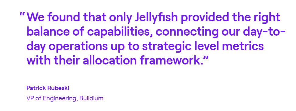
Buildium had no reliable way to measure where engineering time was going. Jellyfish’s allocation framework made it clear. Within three months, the team distributed 24% more resources to roadmap work without hiring anyone.
Precisely needed predictable delivery during a legacy-to-SaaS transition. With Jellyfish velocity metrics, sprint predictability climbed from 55% to 76.5%, making engineering the most predictable business unit in the company.
2. Swarmia
Swarmia is an engineering intelligence platform that pulls signals from your code repositories, project boards, and CI/CD pipelines to measure productivity, track business outcomes, and understand developer experience data in one place.
Plandek and Swarmia share a similar philosophy around being team-friendly rather than surveillance-heavy. The difference is that Swarmia treats developer experience as a core product pillar, while Plandek stays focused on delivery metrics and value stream analytics.
Key Features
- Working agreements and automated feedback loops: Teams can set their own targets (e.g., PR review time, WIP limits, and code quality thresholds) and Swarmia tracks progress automatically. If something slips, Slack notifications point it out in real-time.
- DORA and SPACE metrics with CI/CD visibility: Swarmia covers all four DORA metrics and SPACE framework dimensions out of the box. On top of that, it gives teams visibility into CI pipeline health.
- Developer experience surveys: The platform includes a built-in survey framework with 32+ research-backed questions around areas like team focus, tooling satisfaction, and technical debt management.
Advantages
- Quick onboarding with minimal setup: Swarmia populates meaningful data as soon as you connect your dev tools, and guided workflows help you clean up any misaligned data during onboarding. [Read Full G2 Review]
- Metrics work at every level: Spotting engineering blockers is straightforward, which helps managers have more grounded conversations about what’s working and what isn’t. [Read Full G2 Review]
- Slack-native notifications: Swarmia routes GitHub activity (PR reviews, comments, and CI failures) directly into Slack so your team can act on updates without leaving their chat tool. Users on G2 keep calling this out as one of the features they rely on most day to day. [Read Full G2 Review]
Limitations
- Limited individual-level customization: Individual contributor metrics exist in the platform, but users say they’re not quick or easy to access. There’s no straightforward way to configure the specific individual-level views you’re looking for. [Read Full G2 Review]
- Overlapping data ownership can get confusing: If your team treats its existing issue tracker as the source of truth, Swarmia’s parallel view of the same data can create confusion. It’s not always clear where to make categorization changes. [Read Full G2 Review]
- Not ideal for mobile development teams: Teams working outside typical software development processes – mobile app development in particular – may find that Swarmia’s default KPIs don’t quite fit. [Read Full G2 Review]
Pricing
Teams under 10 developers can use Swarmia for free. Paid plans are structured around modules – pick one for €28/dev/month or get all three (business outcomes, developer productivity, developer experience) at €49/dev/month.
Enterprise organizations can work out custom pricing that includes volume discounts and on-prem options.
Learn more → 14 Best Swarmia Alternatives (Updated for 2026)
3. DX (Atlassian)
DX is a developer intelligence platform, now owned by Atlassian, that combines developer surveys with system metrics to measure productivity through its proprietary DX Core 4 framework.
While Plandek measures how work flows through the delivery pipeline, DX measures how developers experience that pipeline and whether the conditions exist for them to be productive.
The two platforms approach engineering intelligence from different angles, with DX leaning heavily into survey-driven insights and research-backed benchmarking that Plandek doesn’t offer.
Key Features
- Developer Experience Index (DXI): The DXI scores 14 survey-based dimensions and rolls them into a single benchmarkable number. DX’s dataset covers four million+ samples from 350+ organizations, and they report that each one-point improvement saves roughly 10 hours per developer per year.
- AI impact measurement: The platform measures AI tool usage, productivity impact, and cost in one place. You can compare users against non-users, track time savings, and tie AI adoption to your Core 4 metrics.
- DX Core 4 framework: The DX Core 4 combines DORA, SPACE, and DevEx into a single framework that measures speed, effectiveness, quality, and business impact. It deliberately balances output metrics with developer experience data to avoid the fear and gaming that come with tracking throughput alone.
Advantages
- AI-powered custom reporting: DX includes an AI query builder that makes it easier to pull custom data without having to manually configure reports every time. [Read Full G2 Review]
- Clean, intuitive dashboard design: The user-friendly interface is one of DX’s strongest points. People across engineering and leadership can look at the same data and reach the same conclusions without extra translation. [Read Full G2 Review]
- Built for teams, not surveillance: The platform is intentionally designed to help teams find what’s slowing them down, not to monitor individuals. That approach earns buy-in from engineers, which is half the battle with any productivity tool. [Read Full G2 Review]
Limitations
- Insights lack actionable guidance: The platform tells you what’s slowing teams down, but doesn’t always help you figure out how to fix it. Teams mention wanting more built-in guidance, such as use cases, suggested next steps, or example playbooks. [Read Full G2 Review]
- Surveys could be more engaging: DX depends on regular developer surveys to power its qualitative insights, which means participation rates directly affect data quality. Some users say that the survey experience itself could be more polished to keep developers engaged and reduce the fatigue that comes with filling them out quarter after quarter. [Read Full G2 Review]
- Risk of optimizing for scores: Without strong engineering leaders interpreting the data, it’s easy to fall into the trap of optimizing scores rather than handling the problems behind them. DX flags the “what”, but the “why” and “what next” still depend on your team. [Read Full G2 Review]
Pricing
Pricing isn’t available on the DX website.
The platform uses a modular structure where you pay based on the features you select and the number of developer seats, so you’ll need to go through sales to get a quote tailored to your organization.
Learn more → 12 Best GetDX Alternatives for Engineering Teams Heading Into 2026
4. Typo
Typo is a software delivery intelligence platform that connects to your dev stack within seconds and combines SDLC visibility, AI-driven code reviews, and DevEx measurement into a single lightweight tool.
Plandek mainly targets larger enterprises with deep value stream management and delivery forecasting. Typo takes a different approach with a lighter setup, broader feature coverage, and pricing that works for teams that aren’t ready to commit to a full enterprise platform.
Key Features
- AI-powered code reviews: Typo reviews pull requests automatically using a mix of LLM and static code analysis. Most engineering intelligence platforms don’t touch code review at all, so this is a genuine differentiator, especially for teams where senior engineers are already stretched thin on reviews.
- DORA and sprint metrics with real-time alerts: Typo covers all four DORA metrics plus sprint-level data like scope creep, throughput, and cycle time. When something stalls, you get a Slack alert right away instead of finding out in next week’s standup.
- Investment distribution tracking: The platform auto-categorizes PRs into buckets like features, bugs, tech debt, and maintenance. It gives leadership a real-time view of how effort is distributed.
Advantages
- One-click code fixes: Typo offers one-click fixes you can apply inline. You’ll still want to review what it’s proposing before merging, but it saves time by giving developers a starting point instead of just a description of what’s wrong. [Read Full G2 Review]
- Real-time feedback for developers: The platform gives individual developers real-time insights into their own performance without waiting for a sprint retro or a manager to point it out. [Read Full G2 Review]
- Responsive customer support and fast iteration: The support gets high marks on G2 for being responsive and hands-on. The team also ships new features regularly, often based on direct customer feedback. [Read Full G2 Review]
Limitations
- Reporting isn’t flexible enough for complex teams: The dashboards work well for common setups, but users with more complex workflows want more flexibility. Reporting customization in particular feels limited – if the default views don’t match how your team thinks about its data, you don’t have many options to change them. [Read Full G2 Review]
- Work log and Jira integration could go deeper: The work log feature pulls data from Jira, but users say it doesn’t go deep enough. There’s no easy way to compare ticket-level detail with actual commits side by side, which makes it harder to track progress. [Read Full G2 Review]
- Web UI has rough edges: If your session has expired, you have to log in again and get redirected to the homepage instead of the code review you came from. It’s the kind of UX issue that won’t block adoption but will annoy developers who expect tighter tool-to-tool flow. [Read Full G2 Review]
Pricing
Pricing is straightforward and more accessible than most competitors:
- Small teams can start free with up to 5 contributors and basic DORA and PR insights
- Starter ($20/dev/month) opens up sprint analytics, deployment tracking, and investment distribution
- Pro ($28/dev/month) adds the AI code review engine, auto-fix suggestions, and unlimited data retention
- Enterprise plans are quote-based and include on-prem deployment, multi-org support, and software capitalization
All paid plans come with a 14-day free trial.
5. LinearB
LinearB is an SEI platform that pulls data from GitHub, GitLab, Jira, and CI/CD tools to provide engineering metrics, PR workflow automation, and project delivery tracking in a single correlated view.
It competes head-to-head with Plandek on delivery metrics and DORA tracking, but it goes further by automating the workflows those metrics expose.
Where Plandek shows you that cycle time is too high, LinearB tries to fix it automatically through PR automation, smart reviewer assignment, and real-time developer alerts.
Key Features
- gitStream policy-as-code engine: You can automate PR workflows with rules directly in your Git repo. The platform assigns reviewers based on what the code touches, labels PRs with context, and fast-tracks low-risk changes.
- WorkerB developer bot: WorkerB operates within Slack or Teams and nudges developers when PRs are stalled, reviews are overdue, or process agreements are slipping. LinearB claims it cuts idle time by up to 60%.
- Monte Carlo project forecasting: LinearB uses Monte Carlo simulation to model delivery timelines based on how your team has performed historically. You also get risk signals and resource insights, making this one of the few tools on the list that directly competes with Plandek’s forecasting capabilities.
Advantages
- Hands-on customer success team: LinearB’s support team works closely with customers through implementation and ongoing optimization. Users say that hands-on support makes a real difference in how quickly the platform starts paying off, especially for teams that are new to engineering intelligence. [Read Full G2 Review]
- Drill-down insights that save manual digging: One of the most common pieces of G2 feedback is how much time LinearB saves on manual investigation. You can drill from an org-level metric straight down to the at-risk tasks and PRs causing the issue, without opening Jira or GitHub separately. [Read Full G2 Review]
- Slack integration that developers use: LinearB pushes outstanding reviews and PR status updates into Slack, and developers can query their own review queue with simple commands. It’s one of those features that sounds minor but quickly becomes part of the daily routine. [Read Full G2 Review]
Limitations
- Project forecasting could go deeper: LinearB offers project forecasting, but users say it doesn’t go deep enough on delay analysis. Being able to see how individual delays ripple through a project timeline and affect downstream deliverables would make the feature more useful for teams managing complex roadmaps. [Read Full G2 Review]
- Fewer third-party connections than competitors: If your stack runs on GitHub and Jira initiatives, LinearB connects smoothly. But teams using tools outside that core pairing say the integration options could be broader. [Read Full G2 Review]
- Permissions model needs more flexibility: LinearB’s permission model works for straightforward team setups, but users flag that it lacks granularity. If you need fine-grained control over who sees what (at the individual or group level), the current options may feel too blunt. [Read Full G2 Review]
Pricing
LinearB runs on a per-contributor pricing model with two standard tiers:
- Essentials ($29/contributor/month) gives you performance metrics, DORA tracking, and 1,000 workflow automation credits
- Enterprise ($59/contributor/month) comes with forecasting, cost capitalization, resource planning, and a higher credit allocation
Custom pricing is available for larger or more complex deployments.
Learn more → 8 Best LinearB Alternatives Heading Into 2026
6. Faros AI
Faros AI is an AI-native engineering intelligence platform that normalizes data from 100+ tools across the SDLC, HR, and financial systems into a single analytics layer for measuring productivity, delivery, and AI tool impact.
Both pull from similar SDLC data sources, but Plandek focuses on VSM and delivery forecasting, while Faros AI takes a wider platform approach with modular intelligence you can buy piece by piece and deploy on SaaS, hybrid, or on-prem.
Key Features
- AI copilot evaluation with causal analysis: The AI Copilot Evaluation module tracks adoption, usage, and downstream productivity impact for tools like GitHub Copilot, Cursor, and Windsurf.
- Lighthouse AI for automated insights and natural language queries: Lighthouse AI combines statistical analysis, machine learning, and GenAI to generate template summaries and explain chart trends.
- 100+ integrations with flexible deployment options: Faros connects to tools across the full software development lifecycle – Git providers, CI/CD, task management, incident response, HR systems, and financials – and supports custom connectors for homegrown tools.
Advantages
- Hands-on partnership from onboarding through support: Teams appreciate the hands-on approach from the support team. They mention direct communication during onboarding, fast turnarounds on technical issues, and a willingness to work through edge cases together. [Read Full G2 Review]
- Broad integration library plus custom connector support: With 100+ pre-built integrations and the ability to build custom connectors, Faros works with most toolchains without forcing software development teams to consolidate. [Read Full G2 Review]
- Centralized data that’s easy to report on: Many users value how Faros pulls scattered engineering data into one place, so it’s straightforward to track productivity and build reports without stitching dashboards together manually. [Read Full G2 Review]
Limitations
- Dashboard load times can lag with larger datasets: There are some reports about delays when pulling up dashboards. If you’re pulling up numbers during a standup or exec meeting, it can be frustrating. [Read Full G2 Review]
- Initial configuration takes some thought: Setting up org structures across multiple levels can be tricky early on, especially for teams with complex hierarchies. The Faros team helps, but expect some back-and-forth during setup. [Read Full G2 Review]
- Self-service reporting has been limited but is improving: Earlier users had to lean on support for custom dashboards and report changes, though Faros has been closing that gap with recent updates. [Read Full G2 Review]
Pricing
Faros AI offers three tiers with pricing starting at $29/contributor/month:
- Professional covers the core functions with productivity benchmarks, SaaS connectors, SSO, and Lighthouse AI
- Enterprise expands with custom connectors, hybrid deployment, SAML, and API access
- Ultimate removes the guardrails entirely with unlimited connectors and full schema access
Tier-specific pricing is available through a demo.
Learn more → 8 Faros AI Competitors & Alternatives for 2026
7. Appfire Flow
Appfire Flow (formerly Pluralsight Flow) is an enterprise SEI platform that pulls data from GitHub, GitLab, Azure DevOps, and Jira and normalizes it into benchmarked engineering productivity metrics.
The overlap with Plandek is in DORA and delivery metrics, but the two platforms pull in different directions.
Plandek doubles down on value stream mapping and predictive timelines, while Flow is more oriented toward workflow diagnostics and bridging the gap between engineering data and the C-suite.
Key Features
- Workflow diagnostics with built-in recommendations: The platform breaks cycle time into components like queue time, rework, and backflow so you can pinpoint where work gets stuck. Plus, each metric includes contextual guidance on what to do about it.
- DORA metrics with team health context: Flow tracks all four DORA metrics and ties them into a Team Health Insights report that connects delivery numbers to team-level patterns. You can drill from something like deployment frequency down into the PR delays or scope changes behind it.
- Review workflow and PR visibility: Flow’s Review Workflow report gives you a color-coded map of every PR (open, merged, reviewed, and unreviewed), filterable by team, repo, or timeframe.
Advantages
- Multi-dimensional analytics with clear visualizations: Flow tracks a wide range of engineering metrics and presents them as trend comparisons that are easy to understand at a glance. [Read Full G2 Review]
- Self-serve performance insights for developers: Individual contributors can pull up their own reports to see how they’re performing without waiting for a manager to explain the data. It gives developers a way to self-assess and course-correct on their own terms. [Read Full G2 Review]
- Work distribution visibility through contribution tracking: The contribution chart makes it easy to see how work is spread across the team. Managers can plan capacity and spot imbalances before they turn into burnout. [Read Full G2 Review]
Limitations
- Repo-level analytics are limited: The platform is heavily oriented around team-level views, which means you can’t easily explore metrics like code churn or activity trends for specific repositories independent of who’s working on them. [Read Full G2 Review]
- Some team process metrics feel underdeveloped: Features like knowledge sharing, review collaboration tools, and project timeline tracking exist in the platform, but the data they outline isn’t always actionable. [Read Full G2 Review]
- Jira integration makes assumptions about user identity: The platform assumes the user who sets up the Jira integration is the same person Flow should attribute activity to, which can create mismatches. For teams where an admin handles integrations on behalf of others, this can mean messy data from the start. [Read Full G2 Review]
Pricing
Flow offers two annually-billed tiers:
- Core at $38/user/month includes unlimited repos, major Git and Jira integrations, 36 months of data import, and baseline reporting on PRs, tickets, and work logs.
- Plus at $50/user/month layers on team health insights, investment profiles, sprint tracking, retrospective reports, and API access.
Learn more → 9 Best Flow Alternatives for Engineering Teams (2026)
8. Allstacks
Allstacks is an ML-powered SEI platform that pulls from Git, CI/CD, and project management tools to predict delivery dates, detect at-risk projects, and map engineering output to business priorities.
While both tools offer DORA metrics and delivery forecasting, Allstacks branches into risk scoring, capitalization, developer surveys, and GenAI measurement. Plandek sticks to value stream analytics.
Key Features
- DORA Scorecards with customizable targets: The platform provides visual scorecards for all four DORA metrics, with the option to set org-wide benchmarks or tailor targets per team.
- R&D software capitalization reporting: Allstacks automates the process of categorizing and tracking capitalizable engineering work using data already flowing through your dev tools.
- GenAI usage and adoption tracking: The platform tracks GitHub Copilot adoption and usage at the org level, and breaks contributors into active and inactive categories so you can see who’s using AI tools and who isn’t.
Advantages
- Less prep time for leadership meetings: The platform pulls enough context together that updating stakeholders doesn’t come with a last-minute scramble across multiple tools. [Read Full G2 Review]
- Configurable tracking views: The platform doesn’t pull you into a rigid reporting structure. You can configure dashboards around your team’s specific needs, which makes the data more relevant from day one. [Read Full G2 Review]
- Simple setup across data sources: Connecting your tools takes minimal effort, and the platform makes it easy to share data across teams without manual exports or workarounds. [Read Full G2 Review]
Limitations
- Customization options feel capped: Dashboards and metrics are solid out of the box, but the customization options for reports and alerts don’t stretch far enough for teams with more complex tracking needs. [Read Full G2 Review]
- Dashboard setup takes some hand-holding: Building your first set of dashboards isn’t as plug-and-play as you’d expect. The customer success team helps bridge that gap, but it’s worth knowing that the first few weeks involve some configuration overhead. [Read Full G2 Review]
- No real-time data refresh: The once-a-day data sync covers high-level tracking well enough, but teams that want near-real-time visibility will find themselves waiting until the next refresh to confirm updates. [Read Full G2 Review]
Pricing
Paid plans are billed annually per contributor:
- Premium at $400/year — multitenant hosting, SSO, up to 500 contributors, and onboarding assistance.
- Enterprise at $600/year — single-tenant hosting, data export API, unlimited data retention, and dedicated customer success.
- R&D Cap at $200/year — just the capitalization module with automated reporting built for audits.
You can also start with a 30-day free trial with no credit card required.
How to Select the Right Plandek Alternative for Your Business Needs
No single tool wins on every front, so the best choice comes down to what matters most to your team. Here’s where each platform stands out:
- For teams that want the broadest engineering intelligence coverage, Jellyfish hits the most boxes with delivery metrics, capacity planning, DevEx surveys, AI tool measurement, and automated R&D financial reporting. It’s where most of the competitors on this list overlap with one or two features but don’t match the full scope.
- For orgs where developer experience is the top priority, DX leads with survey-driven insights and its proprietary DX Core 4 framework. Jellyfish covers similar ground with its own DevEx surveys, but DX goes deeper on benchmarking qualitative sentiment data across organizations.
- For teams that want lightweight productivity metrics with minimal setup, Swarmia is a strong pick. Working agreements, Slack-native alerts, and a free tier for small teams make it easy to get going – though it doesn’t extend into financial reporting or capacity planning the way Jellyfish does.
- For teams where AI-powered code review is a dealbreaker, Typo is the only platform on this list that includes it. It’s a more affordable option for smaller teams, though it trades off the strategic reporting depth you’d get from a platform like Jellyfish.
- For orgs that care about PR workflow automation as much as metrics, LinearB combines analytics with a policy-as-code engine and a developer bot that nudges stalled work forward.
- For complex enterprise toolchains that need broad integration coverage, Faros AI connects to 100+ SDLC, HR, and financial systems. Jellyfish covers fewer integrations but offers more depth on planning and allocation.
- For teams focused on workflow diagnostics and executive-facing delivery reports, Appfire Flow is a mature enterprise option. It doesn’t offer the capacity planning or DevEx surveys that Jellyfish does, but it’s well-suited for cycle time optimization and investment distribution tracking.
- For orgs where predictive forecasting and ML-powered risk detection are the main concerns, Allstacks is purpose-built for that. It also handles R&D capitalization and GenAI adoption tracking, but for broader intelligence that includes team health and scenario planning, Jellyfish gives you more to work with.
There’s a solid fit on this list for almost any use case. But if you’re making a long-term bet on one platform, Jellyfish gives you the most room to grow into.
Jellyfish – The Ideal Plandek Alternative
If you need more than delivery metrics, Jellyfish is the clearest upgrade from Plandek. It brings delivery, planning, DevEx, AI impact, and R&D financial reporting under one roof, and 700+ engineering teams already run on it.
Here are just some of the features that set it apart:
- AI coding tool measurement that tracks adoption, spend, and productivity impact across Copilot, Cursor, Claude Code, Amazon Q, and agentic workflows
- Built-in DevEx surveys that tie developer sentiment directly to DORA and SPACE metrics, so you catch burnout and friction before they hit delivery
- Automated R&D financial reporting that streamlines software capitalization and tax credits using your existing dev tool data
- Capacity and Scenario Planner that forecasts realistic delivery and lets you model headcount and scope trade-offs so you can make data-driven decisions
- 70+ native integrations that unify data across your development tools, project management, HR, and finance systems without custom pipelines
- Industry benchmarking from 700+ orgs that gives context to your DORA scores, allocation splits, and cycle times
Choosing the right engineering intelligence platform is a lot easier when you can see it working with your own workflows.
Book a demo and find out if Jellyfish is the right fit.
FAQs
Can engineering intelligence platforms integrate with tools like Bitbucket, Jenkins, and Wrike?
Most platforms on this list connect to Git providers, CI/CD pipelines, and project management tools, but the specific integrations vary. Bitbucket and Jenkins are supported by several options, including Jellyfish and Faros AI.
Wrike is less common as a native integration, so if your team relies on it for project tracking, you should check each vendor’s integration page before committing.
Do these platforms support agile project management methodologies like Scrum and Kanban?
Yes, but the depth varies.
Most engineering intelligence platforms pull data from Jira or similar tools and can track sprint-level metrics relevant to Scrum workflows – things like velocity, scope creep, and sprint predictability.
Kanban-style teams get visibility into cycle time, WIP limits, and throughput. Swarmia’s working agreements feature is particularly well-suited for Kanban teams that want to enforce flow-based targets automatically.
How do engineering intelligence tools help CTOs with product development decision-making?
These platforms give CTOs and engineering leaders a data-backed view of where effort is going, what’s blocking delivery, and how to allocate resources across competing initiatives.
Instead of relying on gut feel or status updates, you can see how code changes move through the pipeline, where bottlenecks form, and whether teams are spending time on features, tech debt, or maintenance.
Tools like Jellyfish go further with scenario planning, so leadership can model trade-offs before committing to a roadmap.
About the author
Jellyfish is the leading Software Engineering Intelligence Platform, helping more than 700 companies including DraftKings, Keller Williams and Blue Yonder, leverage AI to transform how they build software. By turning fragmented data into context-rich guidance, Jellyfish enables better decision-making across AI adoption, planning, developer experience and delivery so R&D teams can deliver stronger business outcomes.