In this article
Engineering organizations have moved past the trial stage with AI coding tools. The tools are in daily use, the invoices are large, and the people approving those invoices want a clearer view of what they bought.
Engineers themselves report good results. Jellyfish surveyed more than 600 engineering professionals for its 2026 State of Engineering Management report, and 64% believe AI has given them at least a 25% increase in developer velocity and productivity.
But that figure describes what engineers believe about their own output. Finance teams work from delivery data, so the same claim has to hold up against cycle times, deployment frequency, and code quality.
An AI investment vs. engineering output dashboard closes that distance. It pulls financial data from AI vendors and delivery data from the pipeline, and then presents the two against each other so leaders can report on AI investment with evidence.
This guide covers what the dashboard tracks, which KPIs matter at the executive level, and where the underlying data comes from.
What Is an AI Investment vs. Engineering Output Dashboard?
What Is an AI Investment vs. Engineering Output Dashboard?
An AI investment vs. engineering output dashboard reports AI tool spend and software delivery performance in a single view, measured across matching time periods.
- The cost side covers license fees, seat counts, and API consumption from tools like GitHub Copilot, Cursor, and Claude Code.
- The output side covers cycle time, pull request throughput, deployment frequency, and change failure rate from the systems engineering already runs on.
The value comes from how the two sides line up. They follow the same monthly or quarterly cycle, spend maps to the teams that hold the licenses, and every metric keeps the same definition across every row.
Vendor dashboards feel like the natural starting point. They come free with the tool, and they already track what happens inside it. The problem is that each one sees only its own product, and only up to the point where a suggestion gets accepted.
Four problems come from that:
- No cross-vendor view: AI tools rarely arrive one at a time. Most engineering orgs run three or four AI tools at once, and every vendor reports on its own product with no view of the others. That makes it impossible to compare cost per outcome across the stack or spot the tools that duplicate each other. Doing it by hand means exporting from four admin consoles into a spreadsheet that goes stale within a week.
- Distance from the SDLC: The vendor’s view ends when a developer accepts a suggestion. Everything executives care about happens after that point, in review, in the pipeline, and in production, where the vendor has no visibility.
- Vanity metrics: Acceptance rate and lines of AI-generated code measure engagement with the product, and both go up with more usage. A team can push them higher while cycle time gets worse, and the vendor panel still reads as a win. Targeting these numbers also pushes engineers to accept suggestions they would otherwise reject, which adds review burden and defect risk downstream.
- Vendor-defined success: Each provider picks its own metrics, time windows, and definition of an active user. Those definitions change with product releases and differ enough between vendors that the numbers cannot be added together. A CFO who asks two vendors for developer productivity data gets two incompatible answers.
What executives get from it → One set of numbers that finance and engineering both accept. Those numbers answer whether AI spend accelerated delivery, which teams get results from their licenses, and whether the return justifies renewal at the current level.
The Core Pillars of an AI Investment vs. Engineering Output Dashboard
The Core Pillars of an AI Investment vs. Engineering Output Dashboard
The dashboard organizes its data into four pillars. Any one of them read alone produces a misleading picture, since spend without delivery data says nothing about return, and delivery data without quality metrics rewards speed that creates rework later.
Financial Inputs
Financial inputs cover the full cost of AI-assisted development, from seat licenses to model usage. Most of it comes from procurement records and vendor usage APIs, and the variable portion needs the closest attention, because token consumption moves month to month.
What to track →
- Total AI spend: Combined monthly or quarterly cost across seat licenses, model usage, and API calls for every AI tool in the stack.
- Token consumption: Token usage broken out by provider, model, and team, which shows where variable costs concentrate.
- Seat utilization: The share of paid licenses in active use, measured against the total provisioned.
- Cost per merged pull request: Total AI spend divided by pull requests merged over the same period, which produces a unit cost for delivered work.
Why this matters for AI investment → Cost data on its own does not prove business value, and no ROI figure exists without it. Getting the fixed and variable portions right early means the throughput and quality metrics later in the dashboard have something concrete to be measured against.
Adoption & Usage
Adoption and usage data shows how far AI tools have reached into daily engineering work. The data comes from vendor APIs alongside commit and pull request records, since a license count says nothing about whether anyone opens the tool.
What to track →
- Weekly and daily active users: Engineers who use an AI tool in a given period, counted against the total with access.
- Adoption cohorts: Teams and individuals grouped by usage intensity, which separates heavy users from those who logged in once.
- Feature and model usage: Which capabilities engineers reach for, from inline autocomplete to chat-based refactoring to multi-file agentic AI work.
- AI code footprint: The share of merged production code that came from AI assistance, measured across additions and modifications.
Why this matters for AI investment → This pillar tells you whether the spend reached the people it was meant for. Seat counts and usage rates rarely match, and the difference between them is usually the first place to look when AI investment fails to show up in delivery results.
Throughput & Velocity
Throughput and velocity cover the volume and speed of delivered work. Version control and the deployment pipeline supply the data, and it spans every stage from first commit to production, since a gain in one stage can be lost in the next.
What to track →
- Cycle time: Elapsed time from first commit to production deployment, compared across AI-assisted and unassisted work.
- Pull request throughput: Volume of pull requests opened, reviewed, and merged per team over a set period.
- Deployment frequency: How often code reaches production, which confirms that completed work leaves staging.
- Review turnaround: Time from pull request creation to first review and to approval, which exposes queue pressure on senior engineers.
Why this matters for AI investment → Throughput data is the closest thing to a direct answer on AI return, since it measures output in the same terms the business already uses. It also locates the constraint, because faster code generation with unchanged PR cycle time means the gain gets absorbed somewhere between the editor and production.
Quality & Rework (Health Guardrails)
Quality and rework track whether delivered work held up after release. The data comes from version control history, incident records, and deployment logs, and it runs on a longer time horizon than the other pillars, since most rework appears weeks after a merge.
What to track →
- Rework rate: The share of merged code modified, refactored, or reverted within 30 to 90 days of release.
- Change failure rate: The percentage of deployments that cause an incident or require a hotfix.
- Defect origin: Where production bugs entered the codebase, traced back to the commits and pull requests that introduced them.
- Review queue latency: Delays in code review, which flag oversized or complex AI-generated pull requests before they reach production.
- Developer experience: Survey data on focus time, tool friction, and developer satisfaction, read alongside the system metrics.
Why this matters for AI investment → Speed that produces rework costs the organization twice, once in AI spend and again in the engineering hours needed to repair the output. Reading this pillar against throughput separates real productivity from work that comes back as maintenance the following quarter.
Critical KPIs and Metrics for Evaluating AI Investment Against Engineering Output
Critical KPIs and Metrics for Evaluating AI Investment Against Engineering Output
Not every metric in the four pillars belongs in an executive report. The eleven below are the ones that hold up in an executive setting, where the audience needs a small number of figures they can interpret without an engineering background.
| KPI | What to compare it against | How it can mislead |
| Total AI spend | The same period a year earlier, and the engineering headcount cost over the same window | Seat licenses stay flat while token consumption climbs, so a quarterly total hides the trend that matters for forecasting |
| Token consumption | Consumption per active engineer, held against the prior month | A small group of heavy agentic users can drive most of the bill, which an organization-wide average conceals entirely |
| Seat utilization rate | Licenses in weekly active use, measured against total provisioned | Occasional logins register as active use, so a healthy-looking rate can cover engineers who open the tool once a week and close it |
| Cost per merged pull request | The same figure from the quarter before the tool rolled out | AI splits work into smaller pull requests, so cost per PR improves while cost per delivered feature stays where it was |
| AI code footprint | The share of code merged into production, not the share suggested or accepted | AI-assisted pull requests run larger by lines added, so a footprint measured by volume overstates the real contribution |
| Adoption cohort distribution | Cohorts defined by commit and PR evidence, not by seat assignment or self-reported use | Teams classified from vendor login data show stronger adoption than commit history supports |
| Cycle time delta | AI-assisted pull requests against the team’s own pre-AI baseline, not against an industry benchmark | Cycle time falls because pull requests got smaller, which shortens review without changing the pace of delivered scope |
| PR throughput | Throughput per team over a fixed period, read alongside average PR size | A rising count with falling PR size means the same work now arrives in more pieces |
| Deployment frequency | The team’s release cadence before and after AI rollout | Frequency climbs from smaller and more frequent releases while lead time for a complete feature holds steady |
| 30-day rework rate | Code merged in the current period, measured 30 to 90 days after release | The measurement window closes before AI-generated code has been exercised in production, which understates the rate on recent releases |
| Change failure rate | Deployments causing incidents, held against deployment frequency for the same period | More frequent, smaller deployments lower the percentage while the absolute number of incidents stays flat or rises |
How to read these together → Most of the distortions above come from the same source. AI changes the size of a pull request and the cadence of a release, so counts rise, and durations fall before delivered scope moves at all. Any metric reported upward needs a companion figure that holds the unit constant, whether that is average PR size, feature-level lead time, or absolute incident count.
PRO TIP 💡: The comparisons in the middle column are the part most teams cannot assemble on their own, since they need AI attribution at the pull request level plus a clean pre-rollout baseline. Jellyfish attributes AI involvement from Git signals and holds the historical data to compare against, which puts real figures behind cycle time delta and cost per merged PR.
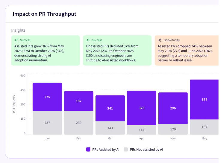
How to Power Your AI Dashboard with the Right Data
How to Power Your AI Dashboard with the Right Data
Everything in the table depends on a data model that works without engineer input. Manual tagging and timesheet entry both decay quickly, since the people responsible for them have more pressing work, and the records thin out during exactly the periods when delivery pressure was highest. Passive collection from existing systems avoids the problem.
Four sources cover the full picture →
- Planning tools: Jira and Linear hold the record of what teams committed to and how the work was classified. This is what allows a cycle time improvement to be read against the kind of work that produced it, since bug fixes and feature builds move at different speeds by nature.
- Version control: GitHub and GitLab hold commit metadata, pull request timestamps, review turnaround, and line-level change history. This is the densest source in the model, since it feeds throughput, review latency, rework, and AI code footprint at once.
- CI/CD and release systems: Deployment records and incident history supply two of the four DORA metrics directly. They also close the loop on everything upstream, since a merged pull request only counts as delivered work once it has been released.
- AI vendor APIs: Each AI vendor exposes its own data on seats, users, models, API calls, and token consumption. Formats and definitions differ between them, and they change without much notice, so this source needs more upkeep than the other three combined.
Connecting the four sources is straightforward compared to matching the people inside them. A single engineer appears under a GitHub handle, a Jira account, a work email, and a separate identity in every AI tool the company pays for.
The dashboard needs all of those resolved to one developer record before any cost figure can be tied to any piece of delivered work.
A note on attribution → The identity model produces individual-level data as a byproduct, which raises a question about how the dashboard reports. Stack ranking engineers by AI usage or throughput undermines trust in the tooling and pushes people to optimize for the metric, and neither outcome helps the investment case. Team-level aggregates carry everything leadership needs.
Why Enterprise Teams Choose Jellyfish for AI Investment Tracking
Why Enterprise Teams Choose Jellyfish for AI Investment Tracking
The data model described above is possible to build in-house. But doing so means four categories of source systems, an identity model that resolves every engineer across all of them, and ongoing maintenance as each AI vendor changes its reporting. That work competes directly with the roadmap for the same engineering hours.
Jellyfish is a software engineering intelligence platform that handles this measurement work as a product. Its AI Impact offering connects AI spend and adoption data to delivery outcomes across the SDLC, which covers the full scope of the dashboard described in this article.
Six capabilities carry most of the weight for AI investment reporting:
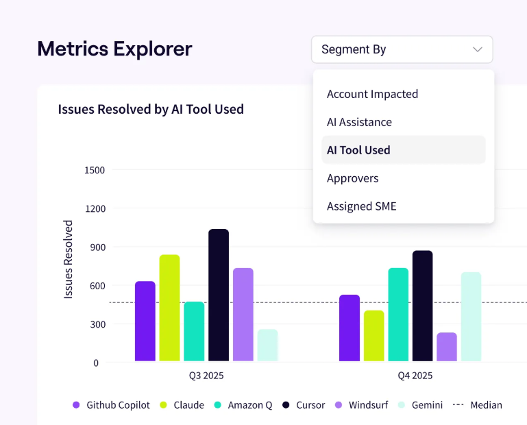
- Vendor-agnostic comparison: Jellyfish measures Copilot, Cursor, Claude Code, Amazon Q, Gemini Code Assist, and agentic tools like Devin and Copilot Agent on one consistent model. That solves the problem native dashboards create, since a team running three assistants can compare cost efficiency between them on the same definitions.
- AI token spend dashboard: Spend and token usage break down by tool, team, and initiative, which shows where the variable portion of the AI bill concentrates. Cost overruns become visible while there is still time to respond, and the same data supports the cost-per-unit calculations finance teams ask for.
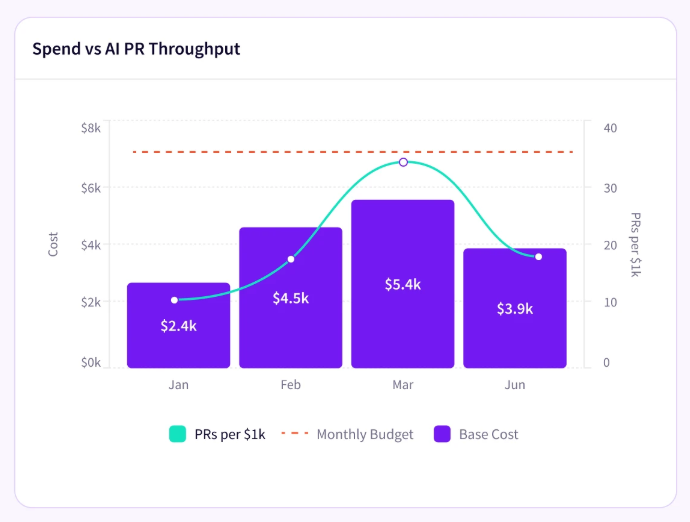
- Adoption insights without manual tagging: Jellyfish detects who uses AI, where, and with which tool from signals already present in Git and planning systems. No engineer records their AI usage, and no team changes its workflow, which removes the data decay problem that undermines self-reported models.
- Impact insights across the SDLC: AI usage connects to throughput, delivery speed, and code quality through signals from the delivery pipeline itself. This is where an ROI figure comes from, because it shows what happened to AI-assisted work after the code left the editor and moved into review, testing, and production.
- DevFinOps and software capitalization: Jellyfish categorizes R&D effort and produces audit-ready software capitalization figures automatically. Finance teams receive engineering cost data in the format their reporting already uses, which removes a recurring manual exercise and gives both functions one shared source.
- Executive reporting and peer benchmarks: Executive-ready AI reports generate from the underlying data, covering what is working, what is not, and where the next investment belongs. Jellyfish also benchmarks delivery metrics against comparable companies, which answers the follow-up question a board asks after seeing internal numbers.
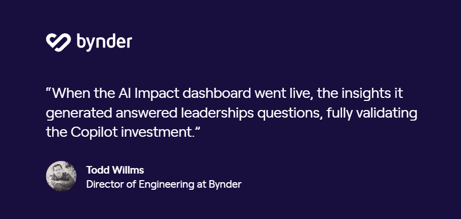
Engineering leaders who have gone through this describe the same benefit. Here is Todd Willms, Director of Engineering at Bynder:
Setup takes days, since Jellyfish reads the systems your teams already use. Request an AI Impact demo to see your AI spend measured against cycle time, deployment frequency, and code quality.
FAQs
FAQs
Which engineering intelligence platforms offer AI investment vs. output dashboards?
Most established SEI platforms now report on AI usage alongside delivery data, including Jellyfish, Swarmia, LinearB, and DX. They differ in how far the correlation goes.
Some report adoption next to throughput and leave the interpretation to you, and others attribute AI involvement at the pull request level and measure it against DORA metrics, cycle time, and quality signals.
When evaluating options, check whether the platform detects AI usage from Git and workflow data or depends on vendor-supplied exports, since that determines coverage across the assistants your teams already run.
How does an AI investment dashboard protect against Goodhart’s law?
Goodhart’s law says a measure stops working once it becomes a target, and adoption metrics prove the point quickly. Set a team goal for suggestion acceptance rate, and acceptance rate will rise, with no guarantee that anything downstream improved.
A well-built dashboard limits this by measuring several categories together, so a team cannot raise adoption without the delivery, quality, and cost numbers being visible in the same view.
About the author

Lauren is Senior Product Marketing Director at Jellyfish where she works closely with the product team to bring software engineering intelligence solutions to market. Prior to Jellyfish, Lauren served as Director of Product Marketing at Pluralsight.