In this article
Engineering teams rarely stop at one AI coding tool. GitHub Copilot handles autocomplete, Cursor covers editor work, and Claude Code or Codex takes on agentic tasks.
Each tool comes with its own dashboard, counts usage in its own way, and bills on its own model. Anyone who wants one number for the whole investment has to assemble it by hand.
That manual effort explains a finding from the 2026 State of Engineering Management Report from Jellyfish. 84% of engineering leaders treat productivity as a top management priority, while only 46% of organizations track AI-specific metrics such as adoption, acceptance rates, and model usage.
AI coding tool analytics platforms handle that reconciliation automatically. They pull usage and spend from each vendor, connect it to delivery data from Git and Jira, and report on both together. Below are eight platforms worth evaluating and what each one measures well.
What Are AI Coding Tool Analytics Platforms?
What Are AI Coding Tool Analytics Platforms?
An AI coding tool analytics platform measures what a team gets back from its AI development tools.
These platforms read usage and billing data from Copilot, Cursor, Claude Code, and similar products, and then combine that data with activity from Git, Jira, and CI systems. The combination shows how AI tool usage relates to the code a team ships.
The category grew out of a limit built into every vendor dashboard, which reports only on activity inside its own product. Copilot shows accepted suggestions for last month, and Cursor shows request volume, and the trail goes cold once that code leaves the editor.
Nothing in either dashboard covers the review cycle, the rework after merge, or the cost of the tokens that produced the code.
Coverage differs by vendor, but four areas of measurement show up in almost every platform:
- Adoption tracks tool usage by team and by developer over time. A CTO who bought 400 Copilot seats uses this data to find out how many of those seats see weekly use.
- Spend breaks seat costs and token consumption down by team, repository, or individual developer. Token usage varies widely across people who do similar work, and the cost view exposes those differences.
- Delivery impact compares cycle time, PR throughput, review load, and merge rates for AI-assisted work against a baseline. This measurement carries the most weight in ROI conversations because it describes outcomes, not activity.
- Code quality checks what happens to AI-written code after it merges. Faster delivery means little when the same code comes back as a defect two sprints later, and quality data catches that pattern early.
These platforms overlap with the broader software engineering intelligence market, and the difference comes down to depth on the AI side.
A general engineering metrics tool reports DORA metrics and cycle time with no view of token spend or tool adoption. A dedicated AI analytics platform covers both, which becomes necessary once AI tooling grows into a major budget line.
How to Choose the Right Analytics Solution for Your Engineering Org
How to Choose the Right Analytics Solution for Your Engineering Org
Platforms in this category cover similar ground, and they differ in how deep they go on each part of it. The seven capabilities below cover what to check during an evaluation.
Multi-Tool and Tool-Agnostic Support
Multi-tool support means the platform pulls data from every AI coding tool across your organization, whatever the vendor. It integrates with Copilot, Cursor, Claude Code, Codex, and the products your teams adopt next year, then normalizes the data so one report covers the whole stack.
Why the AI stack made it necessary → The mixed stack became standard fast. A team runs an assistant for autocomplete and an agentic tool for larger tasks, often in the same repository on the same day. Any platform that reads from one vendor gives you a slice of that picture, and slices lead to bad renewal decisions.
AI vs. Human Code Differentiation
Code differentiation classifies each change by its origin. Agentic tools write some code end to end, developers write some with inline suggestions, and some arrive with no AI involvement at all. Platforms that track the three separately give you clean comparisons.
Why the AI stack made it necessary → ROI claims depend on a comparison, and no comparison holds up without attribution. A team that ships 40% more pull requests after a Copilot rollout proves nothing on its own, since headcount, scope, and seasonality all move at once. Attribution supplies a control group from inside your own organization, where assisted work and manual work function under identical conditions.
Full SDLC Visibility From Prompt to Production
SDLC visibility connects AI tool activity to the systems that record engineering work. The platform ties usage data from each vendor to commits in Git, tickets in Jira, and runs in CI, which lets a leader follow a piece of AI-generated code from the moment a developer accepted it through review, merge, and deployment.
Why the AI stack made it necessary → Speed at the editor rarely survives the trip to production. AI generates code faster than any developer types, and all of it queues for review with the same reviewers who handled a smaller volume last quarter. Teams that measure the first step alone report gains that never reach a customer, and the review bottleneck they created stays invisible in the numbers.
Adoption Data by Team and Developer
Adoption data shows which teams and individuals use each AI tool, how often, and how those patterns changed over time. Useful platforms report at the team and developer level, which exposes the variation that an org-wide average hides.
Why the AI stack made it necessary → An organization at 60% adoption might have every team hovering near 60%, or half the teams at 95% and the other half near zero. Those two situations call for opposite responses, and the headline number describes both. Granular data points to the teams that need enablement, the licenses nobody touched since the rollout, and the groups worth studying because they got more from the same tools than everyone else.
Token Spend and Cost Attribution
Cost attribution assigns AI spend to the teams, repositories, and projects that generate it. That covers seat licenses and token consumption together, since agentic tools bill on usage and the totals move month to month.
Why the AI stack made it necessary → Seat-based pricing made AI costs predictable, and agentic tools ended that. Two developers on the same team can consume very different amounts of tokens in a week, and a single long-running agent session costs more than a month of autocomplete. Engineering leaders who see one invoice for the whole organization have no way to answer where the money went, which teams justify it, or what next quarter looks like.
Code Quality and Reliability Guardrails
Quality guardrails track defect rates, rework, and post-merge fixes on AI-assisted changes, then compare those figures against work developers wrote without AI. The comparison runs on the same attribution data that separates AI code from human code, so both metrics come from one source.
Why the AI stack made it necessary → Velocity numbers look strong in isolation and mean nothing without quality control beside them. A team that merges twice as many pull requests and reverts a third of them delivered less than it did before the tools arrived. Quality data catches that pattern in the same quarter it starts, well before the technical debt reaches a customer or an incident review.
Clear Cost vs. Value Reporting
Cost and value reporting puts AI spend next to delivery outcomes in one view, built for people outside engineering. Strong platforms produce that report on their own, with the numbers already tied to teams, projects, and business initiatives the finance team recognizes.
Why the AI stack made it necessary → Engineering leaders defend the AI budget in front of audiences who never read a DORA dashboard. A CFO wants the cost per team against the work that team shipped, and a board wants the connection between AI spend and a roadmap commitment. Platforms that stop at engineering metrics leave that translation to the leader, who then rebuilds it manually every quarter in a slide deck.
8 AI Coding Tool Analytics Platforms to Consider
8 AI Coding Tool Analytics Platforms to Consider
The table below covers what separates each platform, followed by a full breakdown of every entry.
| Platform | Best for | Key differentiator | Pricing |
| Jellyfish | Engineering leaders who need the complete picture, from tool usage through to business return | One dataset covers adoption, token spend, delivery, quality, and investment allocation | Custom |
| LinearB | Teams that need AI adoption data and the workflow controls to respond to it | gitStream applies automated policy rules to every pull request | From $29 per user/month |
| Faros AI | Enterprises running several AI tools in parallel who want head-to-head performance data | Cause-and-effect analysis that controls for confounding variables | Custom |
| Exceeds AI | Orgs where agentic tools write a large share of the codebase | Line-level attribution that identifies which tool wrote which lines | From $65 per manager/month |
| Plandek | Regulated enterprises that need adoption data and compliance evidence together | Governance reporting against ISO 42001, the EU AI Act, and FCA or SEC rules | $25 to $55 per contributor/month |
| Cortex | Teams running hundreds of services where AI output has to meet the same operational bar | Scorecards that hold agent-generated code to defined readiness standards | Custom |
| DX | Research-driven leaders who want measurement grounded in a published framework | Developer-reported time savings measured through a research-backed survey | Custom |
| Swarmia | Leaders who answer to finance on project cost | Token spend and engineering time combined into one build cost per initiative | Free under 10 devs, from €4 per developer/month |
1. Jellyfish
Best for: All-around best choice for engineering leaders who need the complete picture, from which developers use which tools through to what the AI investment returned in shipped work.
Jellyfish is a full-stack software engineering intelligence and AI impact platform that connects every part of AI measurement. Adoption data, token analytics, delivery metrics, quality signals, and investment allocation all run on one dataset built from Git, planning tools, CI/CD, and the AI tools themselves.
Depth and breadth rarely arrive together in this category, and Jellyfish delivers both. Token analytics reach individual and repository level, tool comparison spans assistants, review agents, and agentic systems, and the same platform reports investment allocation to executives.
Key Features
- Adoption insights: Jellyfish detects who uses AI, where, how often, and which tool, all from system signals. Nobody tags commits or fills out a form, because the data comes from Git, planning tools, and workflow activity that already exists. Adoption reporting works even for tools that lack a formal integration.
- AI token spend dashboard: Token spend maps onto the teams and projects that generated it. That attribution turns a lump-sum AI bill into a set of numbers a finance team can work with, and the projection tools make the next quarter predictable.
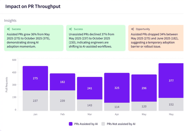
- Impact insights: Impact Insights measures what changed in delivery after AI arrived. Throughput, cycle time, and code quality all come from SDLC data, which produces numbers that hold up when someone asks what else moved that quarter.
- Vendor comparison: Assistants, AI coding agents, and review tools all get measured against one consistent model. Coverage spans GitHub Copilot, Cursor, Claude Code, Amazon Q, Gemini Code Assist, Windsurf, agentic systems like Devin and Google Jules, and review agents including CodeRabbit and Greptile.
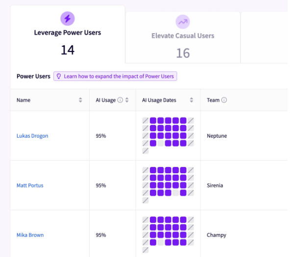
- Enablement insights: The biggest limit on AI return comes from uneven adoption. Jellyfish shows which developers get the most from their tools and what they do differently, then recommends how to spread those workflows to teams that have not caught up.
- Auto report builder: The builder generates executive-ready AI reports covering what works, what does not, and where to invest next. Engineering leaders spend less time assembling slides for board and finance conversations, and the reports refresh as the data changes.
What Real Users Are Saying about the Value of Jellyfish
Engineering leaders spend a lot of time assembling context from separate systems, and Jellyfish removes most of that work. One G2 user tracks AI usage, Jira tickets, pull request analytics, and team allocation in a single platform with clean graphs across all of it. [Read Full G2 Review]
LastPass put that to work during its Claude rollout. CTO Jason Rasmussen ran a small early adopter group first, used Jellyfish to confirm faster code reviews and higher PR volume, then expanded org-wide and tracked adoption to 100%. Measured against a pre-AI baseline, the issue lifecycle shortened by 30 to 40%, and the best teams moved two to three times faster. [Read Case Study]
The reporting work itself gets easier too. Another G2 user notes that Jellyfish automates the manual assembly of AI usage metrics and dashboards, and singles out the AI chat feature and custom query mechanism as the parts that remove the usual dashboarding limits. [Read Full G2 Review]
Pricing
Jellyfish quotes each customer individually, with the number depending on how many engineers you have and which products you take. Longer contract terms bring the rate down.
You can walk through the AI Impact dashboards first through a demo or the self-guided tour.
2. LinearB
Best for: Best for engineering leaders who need AI adoption data and the workflow controls to respond to it.
LinearB is a software delivery intelligence platform that reads pull request, commit, ticket, and pipeline metadata from GitHub, GitLab, Jira, and CI systems. It reports on cycle time, DORA metrics, and AI-assisted contribution rates, then applies automated policy to the pull request pipeline through its gitStream engine.
The gitStream engine separates LinearB from pure analytics platforms. Teams write rules against the patterns their metrics expose, and those rules run automatically against every pull request that opens.
Key Features
- AI Analytics and classification: LinearB classifies commits and pull requests as AI-assisted and reports adoption, velocity, and quality metrics separately for that work. Teams adjust the classification threshold from the 50% default to match how much AI involvement counts as AI-assisted in their org.
- gitStream workflow automation: The gitStream engine applies rules to every pull request as it opens, which covers reviewer assignment, approval requirements, PR size checks, and merge gates.
- DORA and delivery metrics: The platform tracks deployment frequency, lead time, change failure rate, and mean time to restore alongside pickup time, review time, and PR size. Those metrics give the baseline that AI-assisted work compares against.
Pros
- Strong CI/CD and deployment monitoring: Teams call the deployment dashboard the strongest part of the product. It shows pipeline execution, repository changes, and review status together, and the Jira or Azure DevOps connection ties deployment status back to the tickets that triggered it. [Read Full G2 Review]
- DORA support with benchmarks attached: Full DORA coverage plus published benchmarks makes the numbers easier to present outside engineering. Managers report that the combination works well in stakeholder conversations, since a metric with a comparison point needs less explanation than a metric on its own. [Read Full G2 Review]
- Steady release cadence and early access: LinearB ships new capabilities frequently and opens early access to customers who want them. Teams who track a fast-moving category value that pace, since AI tooling changes faster than most annual roadmaps accommodate. [Read Full G2 Review]
Cons
- Granularity works against executive summaries: Detail is the tradeoff here. Teams get thorough metrics for their own use and then rebuild them into a simpler format for leadership, and several users have asked for a scorecard report that handles that step for them. [Read Full G2 Review]
- Per-team setup comes with training overhead: The per-team settings model cuts both ways. Each team tunes the platform to its own workflow, and each team also needs training to do it, which stretches rollout timelines across a bigger organization. [Read Full G2 Review]
- Metrics run on inconsistent time windows: Time granularity varies across the metric library. A team that wants everything on a sprint cadence has to replicate that window with the date picker for the metrics that default to weekly, which slows down routine reporting. [Read Full G2 Review]
Pricing
Two paid tiers cover most buyers. Essentials costs $29 per user per month and includes AI impact measurement, AI code review, DORA metrics, and developer surveys.
Enterprise costs $59 and adds support for GitLab, Bitbucket, and Azure DevOps, which any team outside GitHub Cloud needs from the start.
Learn more → 8 Best LinearB Alternatives & Competitors on the Market Now
3. Faros AI
Best for: Enterprises running multiple AI coding tools in parallel who want head-to-head data on which tool performs best with their codebase and their developers.
Faros AI unifies engineering data from version control, issue trackers, CI/CD, incident management, and AI coding assistants into one normalized model.
Its AI impact module tracks adoption and acceptance across Copilot, Cursor, Claude, Windsurf, Devin, and Amazon Q Developer, then ties that usage to delivery and quality outcomes.
The company publishes its own research from two years of telemetry across 22,000 developers and 4,000 teams, and it includes findings that complicate the AI story, such as rising bug rates at high adoption levels. That dataset also serves as a benchmark for customers.
Key Features
- Cause-and-effect analysis: Faros separates AI impact from the other variables moving inside an engineering org during the same period. The analysis controls for team composition, project type, and workload, which produces attribution that holds up when a CFO asks what else changed that quarter.
- Multi-tool adoption tracking: The platform measures daily, weekly, and monthly adoption across Copilot, Cursor, Claude, Windsurf, Devin, and Amazon Q Developer. Metrics cover acceptance rates and generated code volume broken down by language and editor.
- Tool and model comparison: Teams run head-to-head evaluations to find which assistant and which model perform best against their codebase. The comparison covers developer preference alongside output quality.
Pros
- Pre-built integrations plus a path for custom ones: The out-of-the-box coverage works well for teams starting out, and the platform accepts custom integrations for systems the connector library misses. Users also point to the range of visualization options as a strength when the same data has to reach different audiences. [Read Full G2 Review]
- Dashboards built around your own use cases: Teams describe the platform as highly customizable, with metrics, reports, and dashboards shaped around specific use cases. Engineering and product leaders use that flexibility for resource allocation decisions, where a generic dashboard rarely answers the question at hand. [Read Full G2 Review]
- Qualitative and quantitative data in one view: One customer describes the value of correlating survey feedback with data pulled from code repos and ticketing systems. That combination has helped teams assess Copilot adoption and measure what it changed for product teams. [Read Full G2 Review]
Cons
- Multi-level team structures complicate onboarding: The hardest part involves modeling a multi-level organizational structure inside the platform. Teams with complex reporting lines should plan for that work rather than treat onboarding as a quick configuration task. [Read Full G2 Review]
- Self-service capability under development: Self-service options were limited in earlier versions, and customers report steady improvement over time. Teams that want to make changes without vendor involvement should confirm which tasks they can handle alone during evaluation. [Read Full G2 Review]
- Panels take time to load: Load times on certain panels run longer than users would like. Nothing blocking, though it does slow down the ad-hoc exploration the platform otherwise encourages. [Read Full G2 Review]
Pricing
No public pricing. Faros charges per contributor and sells modules separately, which means two organizations of the same size pay different amounts depending on the modules they need.
Learn more → 8 Faros AI Competitors & Alternatives for 2026
4. Exceeds AI
Best for: Engineering orgs where agentic tools generate a large share of the codebase and leaders need to know which lines came from which tool.
Exceeds AI is a code-level analytics platform that maps AI-generated lines inside each commit and pull request, identifies which tool produced them, and connects that attribution to cycle time, rework, and incident data over the following weeks.
The platform tracks AI-authored code long after it merges. Changes that pass review cleanly and cause incidents a month later show up in the data, which is where the technical debt from AI adoption accumulates.
Key Features
- AI Usage Diff Mapping: The platform finds which specific lines in a commit or pull request came from AI and which tool generated them. Line-level attribution replaces the threshold-based classification that metadata platforms use.
- Multi-tool detection with per-tool depth: Exceeds comes with dedicated adapters for Claude Code, Cursor, Codex, GitHub Copilot, and Windsurf, with lighter detection across roughly 50 additional AI tools.
- AI versus non-AI outcome analytics: The platform compares AI-authored and human-authored code across cycle time, review iterations, rework, and incident rates. Both datasets come from the same repositories during the same period.
Pros & Cons
No verified user reviews exist for Exceeds AI on G2, Capterra, or Trustpilot. Anything that comes back under a similar name belongs to Exceed.ai, a conversational sales chatbot with no relation to this product. The company launched relatively recently, most of its customers have yet to reach a first renewal, and review volume follows that same curve.
What we know comes from the product itself. Line-level diff analysis is the strongest argument in its favor, since it identifies AI authorship directly and every metric downstream inherits that accuracy.
Track record is the clearest limitation. Exceeds lists SOC2 Type II as in progress, and enterprise procurement teams treat an incomplete certification as a hard gate.
Pricing
Exceeds offers three plans:
- Pilot: Seven days free with one seat, 10 contributors, and 5 repos, enough to test the attribution on a single team.
- Pro: $65 per manager per month on annual billing, covering up to 50 seats and unlimited contributors and repositories.
- Enterprise: Quoted by sales, with Okta SSO, Jira and Linear connections, custom metrics, and governance features for larger orgs.
The Exceeds Ink add-on costs $10 per seat per month on Pro and comes included at the Enterprise tier.
5. Plandek
Best for: Regulated enterprises that need AI adoption data and compliance evidence from one platform, since Plandek maps AI usage against ISO 42001, the EU AI Act, and FCA or SEC requirements.
Plandek measures software delivery performance through value stream analysis and connects AI tool usage to each stage of that pipeline.
The platform compares AI-authored, AI-assisted, and non-AI work across the same metrics, and its Dekka assistant reports risks and blockers without manual analysis.
Key Features
- Three-way work classification: The platform separates AI-authored, AI-assisted, and non-AI work, then compares all three across lead time, throughput, and merge time. That breakdown answers whether autonomous AI agents and assisted developers produce different outcomes.
- Governance and regulatory reporting: Plandek reports risk signals from delivery workflows and supports compliance with ISO 42001, the EU AI Act, and FCA or SEC requirements. Regulated organizations use that output as evidence during audits, where AI usage now falls within scope.
- Stage-level lead time analysis: Lead time breaks down by stage across code review, testing, and deployment. That granularity locates where AI-generated volume creates pressure, which the 2026 Plandek benchmarks identify as code review for most teams.
Pros
- Feature timelines and on-track status: Teams use Plandek to check whether feature work stays on schedule. Sprint breakdowns are detailed enough that managers open the platform several times a week to check sprint progress or status on longer projects. [Read Full G2 Review]
- Team performance in clear terms: Detailed breakdowns make team performance understandable without interpretation work, which matters when the same view goes to a manager and a stakeholder. [Read Full G2 Review]
- Easy custom metrics and dashboards: Building new dashboards and metrics takes little effort, and users report a smooth experience integrating with the Deployment API. [Read Full G2 Review]
Cons
- Confusing color choices in metric displays: Some color combinations in the metric displays clash enough that identifying individual data points takes effort. A small problem on its own, and an irritating one for anyone reading charts daily. [Read Full G2 Review]
- Slow loads on repo-heavy dashboards: Load times stretch when a dashboard pulls from many repos at once. The delay shows up on the heaviest configurations, so smaller setups may never encounter it. [Read Full G2 Review]
- Grouping and layout in the workspace view: Login drops users into the Workspaces view, which gets crowded in orgs with long team lists. The grouping by business line, product, and team requires scrolling and scanning to locate a specific team, and users mention reaching for the search field more often than they would like. [Read Full G2 Review]
Pricing
One plan covers every feature, priced from $25 to $55 per contributor per month.
That range includes the Dekka assistant, unlimited boards and code repos, 180-day data retention, and connections across Jira, GitHub, GitLab, Bitbucket, Azure DevOps, and CI/CD tools.
Plandek also offers a technical proof of concept at no cost, which lets teams validate the data before committing.
Learn more → 8 Plandek Competitors & Alternatives for 2026
6. Cortex
Best for: Engineering teams running hundreds of services where AI output has to meet the same operational bar as human work.
Cortex is an engineering operations platform that unifies data from 50+ tools including GitHub, Jira, Datadog, and PagerDuty into an automatically mapped context graph of services, owners, and dependencies.
Its AI Impact product connects AI tool usage to outcomes such as cycle time, MTTR, deployment frequency, and incident rates, while Scorecards hold every service to defined readiness standards.
Key Features
- AI Impact dashboards: The product connects AI tool usage to cycle time, MTTR, deployment frequency, and change failure rates across teams. Adoption and outcome data appear together.
- Comparative analysis between AI and non-AI teams: Eng Intelligence compares cycle time, deployment frequency, incident frequency, merged PRs, PR size, time to resolution, and completed work items between developers who use AI tools and those who do not.
- Cortex MCP for agent context: Coding agents and assistants query ownership, standards, dependencies, and next steps through Model Context Protocol from an IDE, Slack, or a chat interface.
Pros
- Reliable source of truth for service ownership: Customers describe Cortex as the one place ownership and team rosters stay accurate, even in organizations that reorganize constantly. Answering who owns a service and who currently belongs to a team removes a lot of ambiguity. [Read Full G2 Review]
- Vendor involvement during rollout: Users report heavy vendor involvement during implementation, covering onboarding through to adoption across teams. Rollouts in this category stall on incomplete data more than anything else, and hands-on support addresses that directly. [Read Full G2 Review]
- Stable performance at scale: Users describe the platform as dependable in regular use. Given how many competitors in this space draw complaints about slow dashboards, an absence of performance criticism is a genuine strength. [Read Full G2 Review]
Cons
- The ingestion process could be simpler: Ingestion is functional and less approachable than it could be. Teams hoping non-technical staff could connect and validate data sources will find that work still requires someone technical. [Read Full G2 Review]
- Interface favors developers over executives: Organizations using Cortex for executive reporting flag the UX as an area for improvement. The platform serves developers well, and leaders reviewing KPIs and compliance data get a less polished experience. [Read Full G2 Review]
- Accuracy depends on team maintenance: Cortex mirrors whatever discipline the organization brings to it. Neglected services accumulate stale ownership data, and scorecards produce full value only when every team participates, which takes buy-in from leadership. [Read Full G2 Review]
Pricing
Pricing comes through a custom proposal.
Cortex asks a handful of questions about team size and requirements, then quotes accordingly, with packages structured around where an organization stands on its operational maturity path.
Learn more → 7 Cortex Competitors & Alternatives for 2026
7. DX
Best for: Research-driven engineering leaders who want AI measurement grounded in a published framework and benchmarked against 500+ organizations.
DX is an engineering intelligence platform, acquired by Atlassian in 2025, that combines developer surveys with system telemetry from source control, CI/CD, and AI coding tools.
Its AI report compares AI users against non-users across PR throughput, change failure rate, and the Developer Experience Index, alongside self-reported time savings.
Key Features
- AI-driven time savings: DX measures developer hours saved per week through a research-backed survey instrument, which has become an industry-standard metric.
- AI Impact Report: The report compares AI usage against the four Core 4 dimensions covering speed, effectiveness, quality, and business impact. Filters let leaders compare AI users against non-users, heavy users against moderate users, one team against another, and one vendor against another inside the same view.
- Agent output measurement: DX reports human-equivalent hours of work completed by autonomous agents. That metric matters as agentic tools take on whole tasks, where per-suggestion acceptance rates describe nothing useful.
Pros
- Snapshots with driver-level comparison: The Insights tab and the Snapshots section carry most of the platform’s value. Each driver appears against internal and industry comparison points, so prioritizing one goal and checking the result at the next snapshot takes no extra analysis. [Read Full G2 Review]
- Short, medium, and long-term recommendations: DX recommends specific actions during the prioritization process. The suggestions cover different time horizons, which helps when the data identifies a problem with no obvious fix. [Read Full G2 Review]
- Support for cross-functional arguments: Engineering managers describe the platform as useful for internal arguments. Data from DX carries more authority in those conversations than a personal read on the situation does. [Read Full G2 Review]
Cons
- Confusing navigation on the overview page: The Overview page is the weakest part of the interface. Regular use gravitates toward the Insights tab, where the same information comes across more clearly. [Read Full G2 Review]
- No repository for action plans and history: DX reports the data without providing anywhere to record the response. A repository for analyses and action plans would keep the history of each decision alongside the metrics that prompted it. [Read Full G2 Review]
- Inconsistent team and group filtering: Filtering behavior varies from report to report. Group selection appears in some views and disappears in others, and selections reset unpredictably during routine analysis. [Read Full G2 Review]
Pricing
DX prices by developer license, with additional usage tiers for MCP server access.
No public figures exist, and Atlassian has signaled plans for tiered pricing to reach smaller customers than DX historically served.
8. Swarmia
Best for: Engineering leaders who answer to finance on project cost and need tokens, licenses, and time in a single figure.
Swarmia is an engineering intelligence tool that measures software delivery across three areas covering business outcomes, developer productivity, and developer experience.
For AI specifically, the platform tracks adoption and idle licenses, classifies pull requests by which AI tool assisted them, and reports agent-created pull requests in a dedicated view alongside throughput and merge rates.
Key Features
- Dedicated coding agents view: Swarmia detects pull requests created end-to-end by GitHub Copilot, Cursor, and Claude Code agents, then reports agent PR throughput, merge percentage, and batch size separately.
- Adoption and license utilization: The platform tracks licenses, active users, idle seats, and adoption by team over time. Copilot data breaks down further by feature, model, editor, and programming language, which locates where usage concentrates and where it never started.
- Natural language querying: Swarmia AI answers questions about engineering data in plain language across code metrics, adoption, AI impact, coding agents, and survey views.
Pros
- Visual timelines without report building: The visual layout covers projects, ticket timelines, and individual work in a way that answers questions at a glance. Nothing requires exporting or building a custom report first. [Read Full G2 Review]
- Natural language querying for managers: Management uses the chat feature to get direct answers from engineering data. It removes the step where someone interprets a dashboard before the conversation can happen. [Read Full G2 Review]
- Survey and metric correlation: The correlation between survey responses and system metrics adds context that neither source provides alone. Users describe it as one of the platform’s better touches. [Read Full G2 Review]
Cons
- No breakdown of PR time by stage owner: Pull request time arrives as a single figure that covers development and QA together. Teams that want to know where the delay originated have no way to separate the two inside the platform. [Read Full G2 Review]
- Navigation and interface clarity can be an issue: Finding a specific view a second time takes work. One user described seeing a chart breaking down PR categories and never locating it again, which points to a navigation structure that hides its own depth. [Read Full G2 Review]
- Individual metrics need heavy filtering: Getting to developer-level or repository-level detail involves more filtering than it should. The data supports those questions, and the interface does little to make them quick. [Read Full G2 Review]
Pricing
Pricing is public and modular. All rates below apply to annual billing:
- Free: No cost for companies with up to 9 developers.
- Standard: €42 per developer per month, covering every feature across AI adoption and cost, developer surveys, software capitalization, and productivity and AI impact.
- Enterprise: €52 per developer per month, bringing on-premise integrations, HR system connections, and professional services.
- Individual modules: €4 for AI adoption and cost, €8 for developer surveys, €16 for software capitalization, and €22 for productivity and AI impact.
The €4 module gives teams license tracking and spend data on its own, which makes Swarmia the cheapest entry point on this list by a wide margin.
Learn more → 14 Best Swarmia Alternatives & Competitors on the Market Today
Connect AI to Business Value with Jellyfish
Connect AI to Business Value with Jellyfish
AI adoption across engineering teams reached near-universal levels over the past two years, while the reporting infrastructure around it stayed thin.
Most organizations can say how many seats they bought and how often developers use them. Far fewer can say what changed in delivery, what each team spent, or whether the investment moved effort toward higher-value work.
Jellyfish covers both sets of questions from one place. The platform tracks engineering work as it happens across Git, planning tools, CI/CD, and every AI tool a team runs, then reports what each team spent, what changed in delivery, and where the effort went.
Here’s what that means in practice:
- Automatic detection covers who uses AI, how often, and with which tool, across every product in the stack.
- Token spend breaks down by tool, team, and initiative, with run rate and projections that make next quarter predictable.
- The platform compares AI-assisted work against a baseline across speed, throughput, and quality.
- Every AI tool gets scored on the same terms, which makes head-to-head comparison possible at renewal.
- The platform shows which teams get the most from AI and what separates their workflows.
- Auto-generated reports package the whole picture for board and finance conversations without the manual slide work.
Measuring AI properly takes days to set up and pays off at every renewal, budget review, and board meeting after that.
Book an AI Impact demo and see how Jellyfish handles the questions your leadership team keeps asking.
FAQs
FAQs
Do these platforms track vibe coding tools like Replit and Lovable?
Coverage varies. Most platforms on this list built their integrations around IDE integration with assistants like Copilot, Cursor, Tabnine, and Claude Code, since those tools produce commits that arrive in your Git history.
Vibe coding tools such as Replit, Lovable, and bolt.new work differently, because rapid prototyping happens in a hosted environment and the output reaches your repository later, if at all. Ask each vendor how they handle AI code generation from outside the IDE.
The same question applies to ChatGPT and other LLMs that developers use in a browser, where natural language commands produce code nobody attributes to a tool.
Platforms that read Git metadata catch some of this. Platforms that require a vendor API catch none of it. Coverage for agent mode and autonomous agents has improved fastest, since those agents open pull requests under their own identities.
Can I export the data to my own data warehouse or BI tool?
Most enterprise-tier platforms support it. Jellyfish, Faros AI, and Cortex all offer data export or API access that pushes engineering metrics into a data warehouse, where your team queries it with SQL alongside other business data.
From there, teams build their own data visualization in Microsoft Power BI, Domo, ThoughtSpot, or a Looker model defined in LookML.
Ask about embedded analytics if you want to place these metrics inside an internal portal your developers already open. Export capability usually starts at the enterprise tier, so confirm it during evaluation.
Do these platforms offer predictive analytics or anomaly detection?
Some do, and the depth differs. Anomaly detection appears most often, where the platform flags a metric that moved outside its normal range and prompts someone to look. Cortex and Jellyfish both include automated highlights of that kind.
Predictive analytics and delivery forecasting show up in platforms with a value stream heritage, including Plandek and LinearB, whose project completion dates from current throughput.
For AI spend specifically, run rate and projection features answer the budget question, so ask whether the platform forecasts token consumption alongside delivery.
About the author

Lauren is Senior Product Marketing Director at Jellyfish where she works closely with the product team to bring software engineering intelligence solutions to market. Prior to Jellyfish, Lauren served as Director of Product Marketing at Pluralsight.