In this article
Developer productivity has always been hard to pin down, and the conditions that made it hard have multiplied over the past two years. Teams ship more code with AI assistance, spread that work across more services and repositories, and report the results to executives who want the summary in business terms.
Commit counts and closed tickets stopped serving that audience a while ago. What leaders need now is context, enough to explain why cycle time moved and whether the last round of tooling investment changed anything. In Jellyfish’s 2026 State of Engineering Management report, 84% of engineering leaders named productivity a top management concern.
This guide covers seven developer productivity insight platforms built for that work. For each one, we look at what it measures, where it goes deepest, what users say about it in practice, and the type of engineering organization it suits.
What Are Developer Productivity Insight Platforms?
What Are Developer Productivity Insight Platforms?
Developer productivity insight platforms collect data from across the software delivery process and convert it into contextual analysis for engineering managers and executives.
They connect to Git providers, issue trackers, CI/CD systems, AI coding assistants, and in many cases HR and finance tools, then work out what those sources mean when read together. The output explains why delivery performance changed and points to where a manager should start.
What separates an insight platform from a traditional dashboard → The difference comes down to how much analysis each tool finishes before a person opens it. Dashboards finish very little. They report totals and leave the interpretation to you, so a manager who wants to know what changed opens Git, Jira, and the CI logs and works through it manually. Insight platforms complete that analysis first. When cycle time climbs, the platform identifies the teams behind the increase and the stage where the extra days accumulated.
Most platforms in this category organize their analysis around four areas:
- Work categorization and effort allocation: A platform in this category sorts engineering hours by the type of work they produced, separating new features from maintenance, technical debt, and unplanned support. Leadership gets a clear answer on what the roadmap consumed, and finance gets the numbers it needs for software capitalization.
- Delivery stalls and idle time: Cycle time divides into the stages a change moves through, from first commit to production, with each stage measured on its own. You can see how long pull requests wait for a first review, how long work stays open in QA, and how much time CI queues add. A manager who knows which stage holds the time knows which process to change.
- Developer sentiment and cognitive load: Surveys collect developer input, and the platform reads those responses alongside the delivery data. Questions ask about interruptions, context switching, on-call load, meeting volume, and whether the tooling helps or gets in the way. The answers explain conditions that delivery metrics register late, since a team under pressure usually holds its output steady for a while before performance drops.
- Alignment with business outcomes: The last area connects R&D investment to roadmap delivery, ties allocation data to financial reporting, and puts engineering activity in terms executives use during planning. Platforms differ widely here. Some build dedicated allocation and cost models, and others leave the work to exports and manual analysis.
How much of this you get depends on how your teams already work. Platforms read your existing ticket structure, repository organization, and CI configuration, so cleaner conventions produce better analysis from the first week.
Understanding the Role of Developer Productivity Insight Platforms
Understanding the Role of Developer Productivity Insight Platforms
Every one of these has a manual version that engineering organizations already perform, usually in a spreadsheet somebody maintains between other priorities. The platform’s value comes down to how much of that work it takes over.
Five roles account for most deployments:
- A single view of engineering performance: Engineering data spreads across planning tools, source control, CI/CD systems, incident platforms, and collaboration tools, and none of them share identifiers. Insight platforms connect those records so a leader can follow how work moves through the organization without pulling separate reports first.
- Diagnosis of where delivery slows down: Leaders need to know which part of the process holds the time, whether that stage is planning, development, review, testing, or release. These platforms measure each stage separately and report where the delays repeat, which directs management attention to the parts of the workflow that cost the most time.
- Visibility into developer experience: Delivery metrics measure output without explaining the conditions behind it. Platforms that pair operational data with developer feedback show where interruptions, process problems, or weak tooling get in the way, which gives managers something specific to work on.
- A link between engineering effort and business priorities: Executives want to know where R&D capacity goes and whether it supports the initiatives the company committed to. Insight platforms map effort to product areas, strategic programs, maintenance, and other categories, which produces figures leaders can bring into planning and budget conversations.
- Supporting planning and investment decisions: Engineering leaders use historical performance data to make decisions about capacity, roadmap commitments, staffing, and new tooling. Productivity insight platforms give those decisions a stronger evidence base by showing how teams have delivered in the past and how changes in priorities or investment affect outcomes.
Where platforms differ → Most platforms can support several of these use cases, but they usually have a center of gravity. Some are strongest in developer experience, others in delivery analytics, business alignment, AI measurement, or executive reporting. The right choice depends less on how many metrics a platform tracks and more on which decisions your engineering leadership team needs it to support.
Key Features Unique to Productivity Insight Platforms
Key Features Unique to Productivity Insight Platforms
What follows is the functional range of these platforms, from delivery diagnostics through to financial reporting. Some capabilities serve engineering managers day to day, and others serve executives and finance a few times a year.
- Automated work categorization. Effort gets sorted into new product work, maintenance, technical debt, and unplanned support without anyone filling in a timesheet. The platform reads how your tickets, repositories, and commits are already organized and works it out from there.
- Cycle time decomposition: A single cycle time figure covers too much ground to act on, so these platforms divide it into sub-stages. Typical breakdowns include time to first review, review turnaround, idle time between approval and merge, and deployment lag. Each stage points to a different owner and a different fix.
- Developer experience surveys tied to delivery data: Surveys pick up what the systems never see, including interruptions, meeting load, and whether the tooling helps or gets in the way. A survey alone finds a frustrated team without explaining why. Read next to the delivery data, it points at something specific.
- Delivery risk and anomaly detection: The platform watches work as it moves and speaks up when a date looks threatened. Scope added mid-sprint, pull requests open too long, tickets with no recent activity, carryover above the usual level. Some products use fixed thresholds, and others learn what normal looks like for your teams.
- Financial reporting and capitalization support: Finance needs the effort data classified, tied to cost centers, and defensible under audit. Coverage varies more here than anywhere else on this list, from platforms that generate the schedules directly to platforms that give you an export.
- AI impact measurement: Measurement here depends on a connection between two data sets that normally stay apart. On one side are adoption figures from the AI vendors, and on the other are delivery and quality metrics from your engineering systems. These platforms join them at the team and developer level, which produces a clear read on which teams gained speed, which added review work, and how spend compares to the result.
- Benchmarks against comparable organizations: Leaders comparing their own numbers over time can see direction without knowing whether the starting point was reasonable. Benchmark data covers that, placing a team’s delivery metrics against organizations with similar headcount, industry, and engineering structure. The quality of the comparison depends on how many companies contribute data and how closely the platform matches peer groups.
Top Developer Productivity Insight Platforms to Consider
Top Developer Productivity Insight Platforms to Consider
Each platform below approaches productivity measurement from a different starting point, whether that means delivery analytics, developer experience, forecasting, or AI accounting.
The table gives you the short version, and the sections underneath cover capabilities, strengths, and limitations.
| Platform | Ideal use case | Strongest productivity capability | Pricing |
| Jellyfish | Mid-market and enterprise orgs that need the full productivity picture in one platform | Delivery, allocation, DevEx, AI impact, and R&D spend on one data model | Custom, per engineering seat. Demo required |
| DX (Atlassian) | Enterprises treating developer experience as its own measurement discipline | DXI score built from 14 survey dimensions, with peer benchmarks | Custom, contact sales |
| Swarmia | Teams that own their process improvements and act on data themselves | Working agreements with Slack notifications | Free up to 9 developers. Single modules from ~$23/dev/month, full suite ~$45/dev/month annually. 14-day trial |
| LinearB | Teams where code review drives most of the delivery delay | gitStream automation applied to pull requests | Free up to 10 developers. Business tier ~$30/dev/month. Enterprise custom |
| Allstacks | Enterprises tracking committed dates across several teams and toolchains | ML forecasting from portfolio initiative to individual story | Custom, contact sales |
| Typo | Small and mid-sized teams that want broad coverage without an implementation project | Delivery metrics, sprint health, and DevEx from one quick setup | Free plan for up to 10 developers. Paid tiers up to ~$30/contributor/month |
| Faros AI | Large enterprises with complex, fragmented toolchains | AI token spend attributed to sessions, teams, and outcomes | Modular pricing by capability, contact sales |
1. Jellyfish
Best for: Mid-market and enterprise engineering organizations that want best-in-class productivity insights without relying on multiple point solutions.
Jellyfish is a software engineering intelligence platform built for the full productivity picture, with delivery performance, developer experience, AI impact, and R&D spend all reported from one data model.
Productivity means something different to a team lead and to a CFO, and most platforms serve one of them. Jellyfish covers both, with cycle time and review data for the manager and effort-to-investment reporting for the executive, all from the same measurement.
Key Features
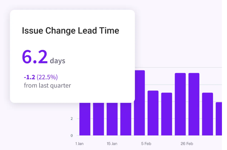
- Engineering productivity diagnostics: Cycle time, PR review time, throughput, DORA metrics, and delivery trends report together, which lets leaders find bottlenecks and see where work slows down. The same measures show whether a process change produced a tangible improvement.
- AI impact across the SDLC: Jellyfish measures AI spend, adoption, and usage alongside delivery and quality outcomes, then adds workflow-level analysis of how AI changes writing, review, testing, and collaboration. That gives leaders a fuller productivity picture than AI adoption rates alone.
- Automated work allocation and business alignment: The platform’s Work Model automatically reconstructs engineering effort from signals across the development toolchain and categorizes it by initiatives, product areas, work types, and other business dimensions. Managers can see where capacity goes without asking developers to maintain manual time records.
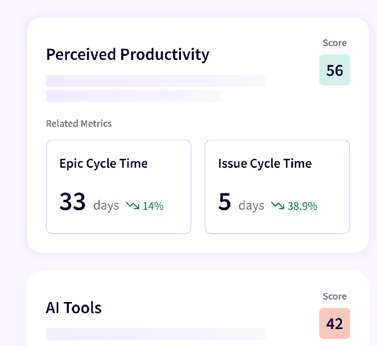
- DevEx tied to system data: Research-backed surveys collect developer sentiment, and the platform checks those responses against system metrics for the same teams, which separates a real problem from a perception the data does not support. Alerts cover excessive meeting time, high context switching, and developers spread across too many projects.
- Automated R&D capitalization: Jellyfish calculates engineering effort from development-system signals and combines it with cost data to support auditable capitalization reporting. That extends productivity insight into financial planning without asking engineers to record hours manually.
What Real Users Are Saying about the Value of Jellyfish
Productivity questions arrive at different altitudes, sometimes about one team and sometimes about the whole organization. One G2 user points to Jellyfish answering both from the same data, with Jira and GitHub connected and measurement available at group and org level. [Read Full G2 Review]
Jobvite’s engineering organization shows what that visibility produces over time. With a clear view of how effort is divided between new product work, technical debt, and maintenance, the team increased throughput by 80% and cut its backlog from more than 20 open items to four or fewer. Priority 3 resolution times fell 68% and priority 2 times fell 77%, and the team now closes P3 tickets in 23 days against a 30-day SLA it set to replace its old 90-day target. [Read Case Study]
The second thing users mention is who else can read the output. Another G2 user credits the dashboards with making engineering productivity legible to both technical and non-technical, which covers the usual translation work before a cross-functional meeting. They name planning, investment tracking, and justifying priorities to other business units as the main use. [Read Full G2 Review]
2. DX (Atlassian)
Best for: Enterprise teams that want developer experience measured through structured surveys and a research-backed metric, particularly those already committed to the Atlassian toolchain.
DX is a developer experience measurement platform that quantifies how well an engineering organization supports its developers, using survey data and system telemetry together.
DX publishes its own measurement frameworks, DXI and Core 4, and much of its customer base adopts them as the shared language for productivity conversations. That research position gives the platform more credibility with skeptical engineers than a delivery dashboard usually receives.
Key Features
- DXI, a composite developer experience score: DX’s own developer experience index, calculated from 14 measured dimensions and expressed as a single score. The company translates point movements into hours saved per developer, which gives the metric a cost equivalent.
- The Core 4 framework: DX developed this framework to consolidate delivery speed, effectiveness, quality, and business impact into four top-level measures, which prevents the metric sprawl that undermines a lot of measurement programs.
- Structured survey infrastructure: Built-in surveys collect developer input on a fixed schedule, with results broken out by team and role. Response rates hold up better than internal surveys because developers see what changed after they answer.
Advantages
- Early warning between survey cycles: The survey cadence covers two speeds at once, with a quarterly baseline for trend work and Pulse alerts that find changes as they happen. Teams describe this as the difference between finding a problem in week three and finding it at quarter close, which affects how much of the quarter you can still salvage. [Read Full G2 Review]
- Reporting managers share without editing: Engineering managers report using the team stats board as a single reference point during one-on-ones and planning, and the charts move into Slack without reformatting. Comment threads attached to specific results let a manager start a conversation where the data already exists, which keeps the discussion connected to what prompted it. [Read Full G2 Review]
Limitations
- Less depth in post-production operations: DX covers much of the software development lifecycle, but users have noted that ongoing operational work can be harder to analyze with the same depth. Buyers with heavy on-call, reliability, or production-support workloads may still need complementary tooling or manual analysis. [Read Full G2 Review]
- Composite scores are harder to interpret than trends: Some users find the Insights tab clearer than the Overview page, where composite metrics like innovation ratio and fail percentage require interpretation. A percentage that comes from survey question phrasing can read differently from how the team feels, and the weekly trends in Insights get closer to the situation. Teams tend to work primarily in the detail views for that reason. [Read Full G2 Review]
Related read → 12 Best GetDX Alternatives for Engineering Teams Heading Into 2026
3. Swarmia
Best for: Engineering organizations where teams own their own process improvements and need measurement that supports that work at the team level.
Swarmia is an engineering effectiveness platform that measures delivery performance, developer experience, AI tool usage, and R&D cost on a single data model, then pushes the findings back to teams through Slack and Teams.
The working agreements feature is the clearest difference. Teams commit to their own limits on things like work in progress and review turnaround, and Swarmia watches those limits and posts to Slack or Teams when one is at risk.
Key Features
- Working agreements with automated tracking: Teams set their own limits on work in progress, review turnaround, or batch size, and Swarmia watches those limits and posts to Slack or Teams as a team approaches one. This is where the platform’s team-level orientation shows most clearly.
- Cycle time broken into stages: Pull request cycle time and issue cycle time each divide into their component stages, so a team can see whether the delay came from review pickup, review turnaround, or the wait between approval and merge. Each stage points to a different process problem.
- Developer experience surveys with team heatmaps: The platform includes its own survey engine, with results broken out by team in heatmap form and ranked by what to fix first. Survey findings and delivery data share one org structure, which lets a manager check a reported problem against the measurement behind it.
Advantages
- Team-level measurement that engineers tolerate: Managers describe getting full visibility into the delivery process without the platform reading as surveillance, which comes down to the team-level framing of measures like flow efficiency, cycle time, and focus time. That’s especially important if you have engineers who have pushed back on measurement before. [Read Full G2 Review]
- Granular filters make the data easier to reuse: Swarmia lets teams analyze productivity and delivery data by initiative, issue type, and other work attributes. Users find that especially useful when different stakeholders need different views of the same engineering activity. [Read Full G2 Review]
Limitations
- Scope creep detection lacks nuance: Users note that small additions during review, such as a quick bug fix, get classified as scope creep alongside genuine expansions. Without a way to mark a change as minor, the metric can overstate how much scope actually moved, which matters if you plan to use it in client or executive conversations. [Read Full G2 Review]
- Setup and drill-down can take time: Users appreciate the depth of Swarmia’s data, but that depth can make navigation feel more involved when they need a specific answer. Buyers should expect some setup and exploration, especially if their tooling structure doesn’t map cleanly to Swarmia’s default categorization. [Read Full G2 Review]
Related read → 14 Best Swarmia Alternatives & Competitors on the Market Today
4. LinearB
Best for: Teams that want measurement and workflow automation in one product, where the platform assigns reviewers, merges low-risk changes, and prompts developers when a review is waiting.
LinearB is a delivery analytics platform for engineering teams that covers cycle time decomposition, DORA metrics, and resource allocation, with automation that acts on pull requests as they move through review.
The measurement and the intervention can both be found in one product here. A team that finds review pickup adding two days to cycle time can write a gitStream rule that assigns reviewers automatically, and then watch the same metric to see whether the rule worked.
Key Features
- DORA metrics with benchmarks: The four DORA measures come from Git and CI/CD data with no manual tagging. Benchmark data from LinearB’s annual research places each metric against percentile ranges, which gives leaders a reference point for whether a number needs attention.
- gitStream automation: Teams write YAML rules that assign reviewers by code ownership, label pull requests by size or risk, merge safe changes without review, and route risky ones for closer scrutiny. The platform measures what each rule did to throughput and review load, so the automation gets evaluated like any other change.
- WorkerB developer notifications: Alerts reach developers in Slack when a review is waiting, or a pull request has been open too long, which addresses idle time at the point where it accumulates. LinearB reports that this can reduce developer idle time substantially, though the figure comes from the vendor.
Advantages
- Strong support for planning discipline: Users say LinearB helps expose where weak planning practices translate into missed dates or repeated carryover. Over time, that visibility can help teams tighten planning processes and give the wider business more confidence around when major work is likely to ship. One organization tracked its planning accuracy from about half to roughly 70% across six months. [Read Full G2 Review]
- Strong end-to-end delivery monitoring: Once the issue tracker is connected, a manager can follow a change from ticket through pipeline to production without leaving the platform. Users single out the deployment view as the reason they check LinearB rather than the Git provider when someone asks where something is. [Read Full G2 Review]
Limitations
- Summary reporting could be more executive-friendly: The depth that makes the platform useful at team level works against it when reporting upward. Users have asked for scorecard-style summaries with benchmarks included, since condensing the detailed views into something a senior leadership audience will read takes manual effort. [Read Full G2 Review]
- Reporting periods are not fully harmonized: Some metrics display by sprint and others by week, which means comparing them requires setting a custom date range to match the sprint length. Some teams want more consistency here, since the extra step adds work to a routine team review and makes it harder to read several metrics against each other. [Read Full G2 Review]
Related read → 8 Best LinearB Alternatives & Competitors on the Market Now
5. Allstacks
Best for: Enterprise companies that need delivery forecasts and early risk alerts on committed dates, particularly across multiple teams and toolchains.
Allstacks is a value stream intelligence platform that connects Jira, Git, and CI/CD systems, then applies machine learning to the combined data to forecast completion dates and find delivery risks before they affect a committed timeline.
Most of the product leads back to the forecasting. Allstacks projects completion dates from portfolio initiative down to individual Jira story and alerts leaders to delivery risks weeks before a status meeting would raise them.
Key Features
- Productivity risk and anomaly detection: Alerts arrive when work starts moving differently from how it normally moves, whether that means scope growing mid-cycle, dependencies falling out of sequence, or throughput dropping on one team. The timing gives managers room to respond while the date is still recoverable.
- Traceability from initiative to commit: Work maps from business initiatives through epics and tickets down to individual commits and pull requests. When a forecast moves, a leader can follow that chain to the specific work causing it instead of collecting status updates from three teams.
- Broad metric coverage across frameworks: The platform supports DORA, SPACE, and Flow measures alongside more than 120 engineering metrics, with process mapping and bottleneck identification. Custom dashboards let different audiences see the subset relevant to them.
Advantages
- Portfolio view for cross-team status: The portfolio view shows what each team has in progress, how far along it is, and where the blockers are, which removes the switching between Jira, GitHub, and everything else. Managers describe walking into team conversations with specific questions already formed, since the data points to which work needs attention before anyone asks. [Read Full G2 Review]
- Individual-level data managers can use: The depth extends to individual contributions, which managers use when building promotion cases and performance plans. Objective numbers alongside a manager’s own observations make those discussions easier to defend, and organizations sensitive about individual measurement should know the capability is there. [Read Full G2 Review]
Limitations
- Configuration takes time up front: Some users say the breadth of integrations, dashboards, and metrics can make onboarding feel overwhelming at first. Teams may need time to decide which views matter most before the platform becomes genuinely useful day to day. [Read Full G2 Review]
- Limited permission controls on sharing: Sharing a single dashboard with a group currently gives those users access to navigate the rest of the teams and metrics. Organizations that want to give a stakeholder group one view without opening everything else have asked for finer permissions, which matters most in larger companies with sensitivity around cross-team visibility. [Read Full G2 Review]
Related read → The Top 7 Alternatives to Allstacks for 2026
6. Typo
Best for: Small and mid-sized engineering teams that want delivery metrics, developer experience surveys, and AI code review in one platform without an enterprise implementation.
Typo is an AI-based software engineering intelligence platform that reports DORA metrics, sprint health, work allocation, and developer experience from connected Git, ticketing, and CI/CD systems, and also reviews pull requests directly.
The measurement covers unusually wide ground for a product at this price. Delivery metrics, sprint predictability, work allocation, AI impact, and developer experience all report from one place, which suits teams that want the full picture without buying three tools. The trade is depth, since each capability goes less far than a platform built around it alone.
Key Features
- DORA metrics and delivery health in real time: Deployment frequency, cycle time, change failure rate, and mean time to recovery are calculated continuously from connected systems, with benchmarks against comparable teams. The platform identifies where delivery slows down before the delay compounds across a sprint.
- Sprint health monitoring: Carryover rate, scope creep, and work in progress limits get tracked across teams, and the platform forecasts delivery timelines from cycle time data in Jira or Linear.
- Work allocation reporting: Engineering effort maps to new features, maintenance, bugs, and technical debt, which gives leadership the split between new development and upkeep. The same data supports R&D investment conversations with a CTO or CFO.
Advantages
- Stage-level view of where delivery slows down: Teams say Typo can replace a lot of manual reporting work and make productivity data easier to use across both engineering and leadership. Its workflow views also help teams pinpoint which stage of the development cycle is creating delays. [Read Full G2 Review]
- Quick connection to existing repositories: Connecting to GitHub, GitLab, or Bitbucket takes minimal work, and users describe the code insights as stronger than what they had seen from larger platforms in the category. That combination is important for teams without someone available to own a lengthy implementation. [Read Full G2 Review]
Limitation
- Where the numbers come from is unclear in-product: Some metrics categorize results without making the underlying thresholds visible in the interface. The documentation covers this well once found, and users have asked for the information to appear closer to the metric itself, since the question usually comes up while looking at the number. [Read Full G2 Review]
- Qualitative feedback needs more treatment: The surveys collect written comments alongside the scores, and the analysis of that written feedback goes less far than users want. Teams end up reading responses manually to find patterns, which limits the value of open questions in larger organizations where the volume makes that impractical. [Read Full G2 Review]
7. Faros AI
Best for: Large enterprises that need customizable productivity insights across complex, fragmented SDLC toolchains.
Faros AI is an enterprise engineering intelligence platform built on a normalized data model that spans version control, issue tracking, CI/CD, and AI coding agents, so productivity metrics and AI cost data report from the same source.
The benchmark data behind the platform comes from two years of telemetry across 22,000 developers and more than 4,000 teams, which gives its comparisons a larger foundation than most vendors can offer. Faros publishes findings from that data annually.
Key Features
- Token intelligence and AI cost attribution: Every token gets classified by the quality of the session that consumed it, and spend attributes to teams, tools, and outcomes. Leaders can see which teams operate above or below budget baseline and which tool and model pairings work best for each type of work.
- Unified data model across 100-plus sources: The platform standardizes data from version control, issue trackers, CI/CD pipelines, incident management, and AI coding agents into one structure, including custom internal sources.
- Natural language querying and custom dashboards: Managers ask questions in plain language or build custom dashboards without a data analyst, and templated dashboards cover productivity, delivery, budgeting, and talent out of the box.
Advantages
- Gives a clearer view of engineering health: Teams like that Faros brings operational and productivity data into one place, which makes it easier to connect delivery, quality, and engineering health signals. That reduces the need to reconcile separate reports before leaders can see where performance is improving or slipping. [Read Full G2 Review]
- Flexible dashboards with strong reporting automation: Faros gives teams a lot of flexibility in how they present and monitor engineering data. Users especially appreciate that reports and alerts can run automatically after the underlying queries are configured. [Read Full G2 Review]
Limitations
- Occasional slowness in the interface: A few users have noted that some Faros dashboards take longer to load than expected. That may be a minor inconvenience for periodic reporting, but it can matter more for teams that use the platform heavily for live analysis. [Read Full G2 Review]
- The flexible data model comes with a setup cost: The initial configuration takes effort, particularly the part where you decide how to represent your organizational structure across multiple levels. However, users report working through this with the Faros team and describe that support as strong, so it’s not something you face alone. [Read Full G2 Review]
Related read → 8 Faros AI Competitors & Alternatives for 2026
How to Choose the Right Developer Productivity Insight Platform for Your Organization
How to Choose the Right Developer Productivity Insight Platform for Your Organization
Most of these platforms overlap on the basics, so the decision comes down to what each one does best and what it leaves to you.
- If you want the broadest productivity picture, choose Jellyfish. It brings delivery performance, developer experience, AI impact, work allocation, and R&D investment into one view, so leaders can understand productivity across both team and business levels.
- If developer experience is the part you cannot measure, DX built its platform around structured surveys and published the DXI and Core 4 frameworks its customers use as shared language. Procurement gets simpler too if your organization already buys through Atlassian.
- If your teams have pushed back on measurement before, Swarmia gives engineers something they set themselves. Working agreements let a team define its own limits, and the notifications arrive in Slack where the team already works.
- If code review is where your delivery time goes, LinearB measures the problem and acts on it. gitStream rules assign reviewers, label pull requests, and merge low-risk changes automatically, with the platform reporting what each rule changed.
- If delivery predictability is the problem, Allstacks forecasts when work will finish based on how comparable work has moved before. Leaders see the distance between the committed date and the projected one early enough to respond.
- If you need broad coverage on a small team’s budget and timeline, Typo handles delivery metrics, sprint health, allocation, and developer surveys from one product, with the trade being less depth in each area than a specialist tool.
- If your engineering data spans more systems than you can list, Faros AI connects over 100 sources including custom internal ones, and attributes AI token spend down to individual sessions and pull requests.
Turn Raw Development Data into Actionable Productivity Insights with Jellyfish
Turn Raw Development Data into Actionable Productivity Insights with Jellyfish
Developer productivity has no single metric behind it. Cycle time drops while review load climbs, defect counts follow throughput upward, and a team that hits every date can still be exhausted. Every number leaves something out.
Jellyfish reports the whole picture from one data model, with delivery performance, developer experience, AI usage, work allocation, and business context in the same place. A leader who sees cycle time improve can check what happened to review load and quality in the same period.
The platform handles all of it:
- Cycle time, PR review time, throughput, and DORA metrics show where delivery slows down and whether your process changes worked.
- The Work Model reconstructs engineering effort from your existing toolchain and sorts it by initiative, product area, and work type, with no time tracking.
- Research-backed surveys report alongside system metrics, so you can check what your team says against what the data shows.
- AI spend, adoption, and usage report against delivery and quality outcomes, plus workflow-level analysis of how AI changes writing, review, and testing.
- Scenario Planner models capacity decisions against your own delivery history, so roadmap commitments rest on evidence.
- Finance gets audit-ready capitalization schedules from work already recorded in tickets and repositories.
Engineering leaders make better calls when every part of the productivity question comes from one place. Book a demo and see what Jellyfish reports on your own data.
FAQs
FAQs
What tools do developer productivity insight platforms connect to?
Most connect to Git providers, issue trackers, CI/CD pipelines, and observability tools, with GitHub, GitLab, Bitbucket, Jira, Linear, and Azure DevOps covered as standard.
Many also read from security scanning and incident systems, since vulnerability data belongs next to delivery data. What you get is a single source of truth for engineering activity, plus real-time insights once the historical load finishes.
How do these platforms measure the impact of AI coding assistants?
Developer productivity tools pull usage data from GitHub Copilot, Cursor, and VS Code extensions, then compare teams with heavy adoption against teams with light adoption on the same metrics.
Cycle time, review turnaround, and defect rates all report before and after. Some platforms attach cost per team to that comparison and offer actionable recommendations on enablement and unused licenses.
About the author

Lauren is Senior Product Marketing Director at Jellyfish where she works closely with the product team to bring software engineering intelligence solutions to market. Prior to Jellyfish, Lauren served as Director of Product Marketing at Pluralsight.