In this article
Developer performance benchmarking platforms measure engineering output against internal baselines and external industry standards. They pull data from Git providers, issue trackers, CI/CD pipelines, and AI coding tools, and then translate it into metrics leaders can compare across teams, across quarters, and against peer organizations.
Demand for these tools has grown alongside AI investment. DORA’s 2025 research put AI adoption among technology professionals at 90%, up 14 points in a year, and boards now expect evidence that the spending shortened delivery timelines. Most engineering teams lack a baseline precise enough to prove it either way.
This guide compares the 9 best developer performance benchmarking platforms available in 2026. For each one, we cover core benchmarking capabilities and the type of engineering organization it suits best.
What Is a Developer Performance Benchmarking Platform?
What Is a Developer Performance Benchmarking Platform?
A developer performance benchmarking platform correlates event data across the software delivery lifecycle to produce standardized engineering metrics, and then compares those metrics against relevant baselines.
That reference point is what separates benchmarking from standard engineering analytics. A dashboard reports that median cycle time was 4.2 days last quarter. A benchmarking platform determines whether 4.2 days is strong, average, or a problem for an organization of your size and industry.
These tools pull data from source control, issue trackers, CI/CD pipelines, incident management, and AI coding assistants, and then normalize it and generate comparisons along two dimensions:
- External: your metrics against other engineering organizations, ideally grouped by company size, industry, and team structure. Sample size and cohort granularity vary widely between vendors, which affects how much weight a given percentile deserves.
- Internal: team against team, quarter against quarter, and before against after a tooling or process change. Fewer variables are in play here, which makes the output more actionable week to week.
Many platforms also map these comparisons to published frameworks like DORA, SPACE, or DX Core 4, which gives leadership a shared vocabulary for board reporting.
The AI dimension → Seat utilization and acceptance rates describe how developers interact with the tools. A team can accept most of its Copilot suggestions and still ship at last year’s pace when review and QA never scaled to match the new volume. More complete benchmarking follows AI-assisted work from commit through production and measures whether that work reaches customers.
Agents make attribution even more complicated. They open pull requests and pipeline runs independently, so the platform has to separate agent-authored work from AI-assisted and human-written code before any of those metrics hold up.
Key Features to Look for in a Performance Benchmarking Platform
Key Features to Look for in a Performance Benchmarking Platform
The integrations look similar across vendors, and so does the metric list. What varies is normalization quality, the depth of the comparison sets, and how far AI attribution extends past the IDE.
Here are the specific six criteria to evaluate:
- Peer data with meaningful filters: Access to anonymized data from other engineering organizations is the baseline requirement, but match quality determines whether the comparison means anything. A cohort defined as “software companies” covers too much ground to be useful. Filtering by headcount, industry, deployment model, and team structure produces a percentile you can defend in a board meeting.
- Granular team and repository segmentation: Variance between teams inside one organization often exceeds the variance between organizations. Segmentation by team, repository, group, business unit, and time period exposes that spread, which is where most of the actionable findings come from.
- End-to-end AI impact tracking: The platform should follow AI-assisted code from generation through review, merge, and deployment, and then report the delivery outcome. That means separating AI-authored, agent-authored, and human-written code at the commit level and connecting each to downstream performance metrics like cycle time, rework, and change failure rate.
- Full-lifecycle data coverage: A platform reading only pull request data misses the time between ticket creation and first commit, which is often the largest block in the cycle. Complete measurement pulls from issue trackers, source control, code review, CI/CD, and incident management, then correlates those events into a single path from ticket to deployment.
- Balanced operational and experience metrics: Look for platforms that combine delivery metrics with developer experience data like onboarding time and burnout indicators. Telemetry shows what happened in the systems. Surveys explain why, and the two together support better decisions than either one alone. DORA’s 2025 guidance recommends running both.
- Reporting built for non-engineering audiences: The audience for these reports usually includes people outside engineering. Platforms in this category handle that differently. Some export raw metrics and leave the translation to you, while others produce finance-ready views with cost per initiative, roadmap versus maintenance allocation, and tooling ROI already calculated.
A common evaluation mistake → Buyers tend to weight integration count heavily, and it rarely predicts anything. Two platforms can both connect to Jira and GitHub while producing cycle times that differ by days, depending on where each one starts the clock and how it handles work that crosses repositories.
9 Best Developer Performance Benchmarking Platforms to Consider
9 Best Developer Performance Benchmarking Platforms to Consider
The nine platforms below all benchmark engineering performance. Where they part ways is the source of the comparison data and how far AI attribution reaches.
The table gives you the quick read, and the reviews underneath cover key features, advantages, and limitations.
| Platform | External benchmarking | Internal benchmarking | AI attribution |
| Jellyfish | Peer comparison across industry data, methodology published | Org, groups, teams | Vendor-neutral, usage linked to delivery outcomes |
| Waydev | Industry percentiles (P50/P75/P90) | Company-defined standards | IDE acceptance through merged PR |
| DX (Atlassian) | 4M+ samples, custom peer groups | Team level | AI Measurement Framework |
| Typo | Similar companies, industries, team sizes | Historical, custom goals | AI-assisted vs. non-AI delivery |
| Allstacks | Industry benchmarks from customer data | Historical performance baselines, DORA/SPACE/Flow | AI usage and token data vs. delivery |
| Swarmia | Reference bands, not strict percentiles | Previous period, org average, team | Adoption, cost, and quality split |
| LinearB | 8.1M+ PRs, 4,800 teams, 42 countries | Team comparison views | 50+ tools plus downstream impact |
| Harness AI DLC Insights | Recommended benchmark ranges | Org Trees | On-device agent, commit attribution |
| Faros AI | Industry and DORA references | Normalized across teams, org chart rollups | Token to session to PR attribution |
1. Jellyfish
Best for: Enterprises that need every engineering benchmark on one data model, from delivery and developer experience through AI adoption, token spend, and investment allocation.
Jellyfish is a software engineering intelligence and AI Impact platform that connects data from across the SDLC into a single model, benchmarking teams internally and against a peer dataset built from 200,000 engineers and 37 million pull requests.
It publishes the largest ongoing AI research dataset in the category, spanning more than 1,000 companies and tens of millions of pull requests, alongside product benchmarks built from its own customer base. Buyers can inspect the research methodology before committing, which few competitors allow.
Key Features
- Benchmarking at org, team, and engineer level: Where many competitors stop at company-level averages, Jellyfish benchmarks your org, specific teams, and individual engineers against peers, historical trends, or broader industry segments. That covers the internal and external comparison a leadership report needs.
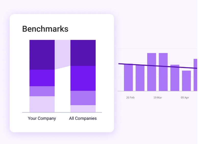
- Vendor-neutral AI impact measurement: Jellyfish benchmarks assistants, agents, and new tools through one consistent measurement model, detects usage automatically from system signals, and links it to throughput, quality, and delivery speed.
- Token spend by tool, team, or initiative: The AI token spend dashboard tracks usage and cost across those three dimensions, which prevents overruns and shows where AI investment produces measurable value. Cost per outcome becomes something you can compare between teams.
- Investment allocation with peer comparison: Resource allocations can be compared over time and benchmarked across teams, org, and industry, with AI-powered categorization producing accurate allocations through a patented multi-source model regardless of data hygiene.
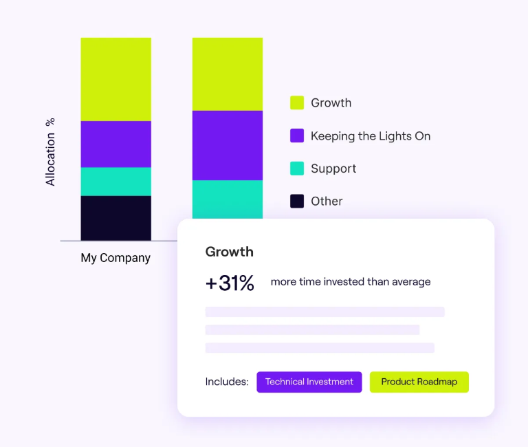
- Developer experience with peer comparison: Survey responses correlate directly with quantitative signals like PR cycle time and tool satisfaction, and AI interprets the results into in-context recommendations.
What Real Users Are Saying about the Value of Jellyfish
Jellyfish benchmarks every metric it tracks, at org, team, and individual level, against peers, historical trends, or industry segments. Customers describe that range as the reason it changes their decisions. One G2 user calls peer comparison against other software companies their favorite part of the platform, since it shows where to focus and makes it possible to fail fast when metrics decline after a process change. [Read Full G2 Review]
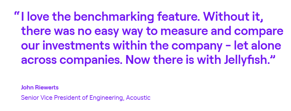
Acoustic shows what that produces over several quarters. Their benchmarks exposed teams that spent far more energy on support work than industry peers, so Acoustic strengthened the support function in front of engineering and skipped the extra engineering headcount. The same data showed one contracting agency outperformed another across nearly every tracked metric, and Acoustic moved spend to the stronger one. Contractor savings reached $80K, and product predictability rose 35%. [Read Case Study]
Customers also credit the platform with removing work. One G2 account describes automated data collection across tasks their team previously handled manually, and calls out benchmarking and the best practice guides specifically. Process validation against industry norms is slow and expensive when a team builds it alone. [Read Full G2 Review]
2. Waydev
Best for: Large, distributed engineering organizations that need framework breadth across DORA, SPACE, and DX with both internal targets and industry percentiles in one view.
Waydev is an engineering analytics platform that measures delivery performance from codebase, pull request, ticket, and CI/CD data, with a dedicated Benchmark module for scoring teams against company standards and industry percentile tiers.
Waydev separates internal targets from external context. The Benchmark module scores teams against standards you define, while industry percentiles at P50, P75, and P90 supply the peer comparison, and the Studio feature lets you build custom metric formulas behind either one.
That split suits organizations that measure teams against internal goals but still need an external reference point for leadership reporting.
Key Features
- Benchmark module: Waydev’s Benchmark feature scores team performance against company standards and key metrics, with separate industry percentile tiers at P50, P75, and P90 for external comparison. You get internal targets and peer context as two separate views.
- DORA, SPACE, and Core 4 coverage: The platform reports DORA metrics and SPACE analytics from repository, project management, and CI/CD data, plus Waydev Core 4, its own model built on the DX Core 4 framework.
- AI adoption and ROI tracking: Waydev’s AI module tracks how coding assistant usage correlates with delivery speed and code contribution patterns. This covers the adoption-to-outcome question, though attribution depth is worth verifying in a demo if commit-level AI classification is a requirement.
Advantages
- Straightforward connection process: Connecting Git providers and Jira takes a handful of clicks, and teams report that the documentation covers the process clearly enough to avoid support tickets. That matters for benchmarking, since historical data has to be backfilled before any comparison holds up. [Read Full G2 Review]
- Custom dashboards with DORA as the baseline: Teams report that configurations can be adjusted quickly, which helps when different stakeholders need different benchmark views. The metric library is deep, and the DORA implementation supplies a widely accepted reference point for measuring delivery performance against. [Read Full G2 Review]
Limitations
- Team mapping requires upfront work: Connecting the tools is quick, but getting contributor mapping and data views right takes longer, according to some users. The consequence is a delay between go-live and trustworthy benchmarks, particularly in organizations where engineers contribute across several teams. [Read Full G2 Review]
- Limited customization on AI reporting: G2 feedback points to AI insights arriving in a fairly fixed format, which creates friction when different stakeholders need different levels of detail. Executives and engineering managers usually want different cuts of the same AI impact data, and producing both takes more manual work than expected. The AI module has seen active development through 2025 and into 2026, so this may have changed. [Read Full G2 Review]
Related read → 14 Waydev Competitors & Alternatives for 2026
3. DX (Atlassian)
Best for: Organizations standardized on Atlassian that need survey-based and system-based benchmarking in one platform.
DX is an engineering intelligence platform that measures developer productivity through the DX Core 4 framework, which pairs system metrics with a survey-based Developer Experience Index (DEI).
The main differentiator is cohort control. Direct Benchmarking allows organizations to choose the specific companies they compare against, which addresses the usual complaint about peer benchmarks being too broad to mean anything.
Key Features
- The industry’s largest benchmark dataset: Over 4 million samples from hundreds of companies feed DX’s benchmarks, across both delivery metrics and developer sentiment. A dataset that size holds up when you narrow the cohort, where thinner samples produce percentiles that move with every new customer added.
- Direct Benchmarking against named peers: Organizations can select the specific peer companies and competitors they want to compare against, instead of accepting a generic industry cohort.
- DX Core 4 with the DXI composite score. The framework measures development speed, effectiveness, quality, and impact, and combines quantitative engineering metrics with the survey-based DXI.
Advantages
- Peer context others don’t provide: Teams report that measuring results against similar companies gives them a clear picture of where they stand, and several describe it as the capability missing from platforms they used before. That context changes the conversation with leadership, since every metric arrives with a position attached. [Read Full G2 Review]
- High participation without the chase: Users point to the combination of survey sentiment and system metrics as the platform’s strongest quality, and the surveys themselves run without much administrative work. One customer reports clearing 90% participation across eight quarterly cycles, which keeps the DXI score credible enough to benchmark against. [Read Full G2 Review]
Limitations
- Data volume outpaces the summaries: At larger organizations, the amount of available data becomes its own obstacle. Leaders running many teams want shorter summaries per department with clear recommended actions, and until that improves, someone has to do that analysis manually each quarter. DX released an early version of executive summaries and continues to build on it. [Read Full G2 Review]
- Correlation across data types takes manual work: The qualitative and quantitative sides both work well, and users say the connection between them could be tighter. What some want is a single view per team that pairs sentiment scores with operational signals like service reliability and repo health. Until that exists, diagnosing why a team’s experience score dropped requires a second pass through the system data. [Read Full G2 Review]
Related read → 12 Best GetDX Alternatives for Engineering Teams Heading Into 2026
4. Typo
Best for: Small and mid-sized engineering teams that want DORA benchmarking and AI impact measurement without an enterprise rollout or enterprise pricing.
Typo is an AI-powered software engineering intelligence platform that tracks DORA metrics, delivery health, and AI coding tool impact from data across Git providers, issue trackers, and CI/CD pipelines.
It benchmarks performance against relevant industries and team sizes at a price point well below the enterprise platforms here, and user feedback frequently cites cost as the reason for choosing it over LinearB or similar tools. The trade-off is the dataset scale compared to DX.
Key Features
- Industry and team size benchmarking: Typo compares your results against relevant industries and team sizes, alongside historical comparison that tracks improvement or regression against your own past performance.
- Real-time DORA tracking with bottleneck detection: Deployment frequency, cycle time, change failure rate, and MTTR update in real time, with lead time broken down by pipeline stage so delays trace to a specific step such as code review or testing.
- Goals, benchmarks, and alerting: Teams can set goals, define their own benchmarks, and create alerts across work allocation, PR cycle time, DORA metrics, and sprint predictability.
Advantages
- Real-time visibility across Git, Jira, and CI/CD: The platform pulls from across the delivery lifecycle and reports DORA metrics, PR flow, performance bottlenecks, and sprint efficiency in real time. G2 feedback points to that combination as the core value, particularly for teams that previously stitched the same picture together from separate tools. [Read Full G2 Review]
- Automated quality checks inside the PR workflow: Users also point to Typo’s automated code quality checks as a useful complement to its engineering analytics. Running these checks directly in pull request workflows helps teams evaluate delivery speed alongside the quality of the code being produced. [Read Full G2 Review]
Limitations
- Some web navigation feels less seamless than the integrations: Although Typo integrates closely with GitHub, the web experience does not always preserve the user’s place when switching between the two. That can make simple tasks such as checking a specific PR take a few more clicks than expected. [Read Full G2 Review]
- Metric thresholds could be clearer inside the product: Teams may occasionally need to consult Typo’s documentation to understand the thresholds behind certain metric classifications. The information is available and reportedly well explained, but having it closer to the dashboard would reduce the extra step. [Read Full G2 Review]
5. Allstacks
Best for: Teams that need benchmarking and audit-ready R&D capitalization reporting from the same dataset.
Allstacks combines historical delivery data across engineering tools into an intelligence system that reports over 120 engineering metrics, ML-based forecasting, and automated risk alerts through customizable dashboards.
Allstacks leads with prediction where most platforms here lead with description. Its ML models forecast delivery dates and find risks weeks before they become blockers, so benchmarks arrive alongside an early warning on the projects that will miss.
Key Features
- 120+ engineering metrics across DORA, SPACE, and Flow: The platform reports over 120 engineering metrics through customizable dashboards, with automatic DORA calculation plus SPACE and Flow framework support.
- Initiative-to-commit traceability: Allstacks provides traceability from business initiatives down to individual commits and pull requests. This connects performance benchmarks to specific roadmap work.
- Automated software capitalization: The platform generates audit-ready capitalization reports from development activity without timesheets, pulling from the same dataset that produces the benchmarks.
Advantages
- Useful visibility into performance and investment allocation: G2 feedback mentions a short window between setup and useful output, with efficiency and allocation data both available early. For benchmarking, that shortens the wait before you have something worth reporting upward. [Read Full G2 Review]
- Team health tracking on your terms: Engineering managers point to dashboard flexibility as the strongest quality, with the ability to build views around the specific metrics a team tracks. One iCIMS manager describes reviewing team health weekly through custom dashboards, which suits a benchmarking use case where the default view rarely matches what a given team needs to watch. [Read Full G2 Review]
Limitations
- Limited access to underlying data: The gap in an otherwise strong customization story is metric creation. Filtering, metric tweaking, and dashboard building are all covered, but building a metric outside the standard set is not an option today. Users also want more control over which tickets feed milestones and portfolio views. [Read Full G2 Review]
- Early configuration takes orientation: Breadth cuts against ease of setup here. Feedback points to difficulty deciding which dashboards to use early on, given how much the platform offers by default. Once teams settle on a set, the volume stops being an obstacle. [Read Full G2 Review]
Related read → The Top 7 Alternatives to Allstacks for 2026
6. Swarmia
Best for: Engineering leaders who want team-level performance comparisons with strong historical baselines, organization averages, and external benchmarks.
Swarmia gives engineering leaders one place to see how teams work, how they feel, and where investment goes, based on DORA and SPACE metrics, AI usage and cost data, developer surveys, and capitalization reporting.
The platform is deliberately selective about what it measures, reporting only metrics with a proven correlation to business outcomes, developer productivity, and developer experience. That restraint separates it from platforms with 120+ metric libraries, though it also means less flexibility if your benchmark criteria fall outside the standard set.
Key Features
- DORA and SPACE with drill-down context: Swarmia measures all DORA metrics with context, supports drilling into individual data points, and reports the contributing factors behind each number.
- Developer experience surveys on the same data model: Survey data and system metrics share one org structure, so sentiment scores and delivery numbers line up at the team level without manual reconciliation.
- Working agreements and Slack notifications: Teams set their own working agreements and receive signals through Slack or Teams, which turns benchmark data into a weekly feedback loop. This is the mechanism behind Swarmia’s team-ownership approach.
Advantages
- Internal benchmarking across teams: Teams value being able to compare performance across the broader engineering organization instead of looking at each team in isolation. That wider context helps managers set more realistic targets and understand whether a PR metric is strong relative to peer teams. [Read Full G2 Review]
- Good high-level view of engineering health: Managers appreciate not having to assemble engineering metrics manually across several systems. Swarmia provides an ongoing overview of software delivery that can act as a useful baseline for deciding what to investigate or improve. [Read Full G2 Review]
Limitations
- Work allocation may need manual cleanup: Some feedback indicates that not every ticket is always categorized correctly when teams analyze how time is split between features, maintenance, refactoring, and bug fixes. If items remain uncategorized, users may need to classify them manually unless they have access to Swarmia’s AI-assisted categorization features. [Read Full G2 Review]
- Some dashboards can feel too predefined: There is feedback that certain dashboards still guide users toward fairly prescribed ways of viewing engineering data. Swarmia has been adding more personalized dashboarding and AI-driven options, but teams with highly specific reporting models may still want more freedom. [Read Full G2 Review]
Related read → 14 Best Swarmia Alternatives & Competitors on the Market Today
7. LinearB
Best for: Organizations ready to act on benchmark findings through policy-as-code automation in the PR workflow.
LinearB tracks engineering metrics across Open, Coding, and Review stages, benchmarks them against community data, and provides automation tooling to address the bottlenecks those benchmarks expose.
LinearB connects measurement to action through gitStream, a policy-as-code engine that handles PR routing, contextual labeling, and auto-approval of low-risk changes. A benchmark that exposes slow review time comes with the tooling to address it, which few competitors offer natively.
Key Features
- Metrics Report and team comparison views: The Metrics Report breaks down how a team performs against each benchmarked metric, and multiple teams can be combined in one dashboard for side-by-side comparison.
- gitStream policy-as-code automation: Rules defined in code govern how pull requests move through review, covering reviewer assignment, labeling based on the nature of the change, and auto-approval of low-risk modifications. That closes the loop between a benchmark gap and the workflow producing it.
- Team Goals with progress tracking: Managers set targets for metrics like PR size, review time, and pickup time, and LinearB tracks progress against those goals and notifies teams when work risks falling behind.
Advantages
- External benchmarks with workflow context: The platform can help teams move from “we’re below benchmark” to a clearer view of what needs attention. By highlighting areas of flow that are underperforming and tracking progress over time, it gives managers a way to measure whether improvement initiatives are working. [Read Full G2 Review]
- Low learning curve for day-to-day use: LinearB appears to make its performance data relatively easy to navigate without needing much training. That can be valuable for organizations where multiple managers need to interpret the same benchmarks and delivery metrics consistently. [Read Full G2 Review]
Limitations
- Executive benchmark reporting could be more concise: Condensing granular data into a simple leadership summary takes work. The request that comes up repeatedly is a scorecard view with benchmarks included, which would remove a recurring manual step for anyone presenting quarterly. Check whether recent releases cover this. [Read Full G2 Review]
- Team structure maintenance adds overhead: Organizations with fluid team structures run into extra work here. Every joiner, leaver, and reorganization has to be updated in the platform, and outdated assignments weaken benchmark comparisons at the team level. A GitHub Teams integration now exists and covers part of this, though not every customer has tested it yet. [Read Full G2 Review]
Related read → 8 Best LinearB Alternatives & Competitors on the Market Now
8. Harness AI DLC Insights (formerly SEI)
Best for: Large engineering organizations that need benchmarks aligned to their specific reporting structure, and that want AI token spend traced through to shipped code.
Harness AI DLC Insights (formerly SEI) benchmarks delivery performance across teams inside the Harness platform, with configurable profiles that determine how each metric gets calculated and an on-machine agent that attributes AI-generated code at the commit level.
The benchmarking advantage is structural comparison. Org Trees model your organization from an HRIS export, so DORA and sprint metrics filter to actual business units and reporting lines instead of repository groupings.
Key Features
- Org Trees for cross-organization comparison: Org Trees model your organization from a CSV or HRIS export, so structures follow reporting lines, business units, or regions. Each Org Tree appears as a tile on the dashboard, and selecting one filters all DORA and sprint metrics to the teams and repositories inside that unit.
- Broad DevOps tool coverage: AI DLC Insights connects to source control, CI/CD, and ticketing systems, with a rebuilt integration framework that adds health monitoring, diagnostics, and retry logic for failed syncs.
- Commit-level AI attribution: An on-machine agent installed in the developer’s environment captures AI-generated lines, records token costs per model and tool, and maps that spend through to the pull request and ticket. Claude Code, GitHub Copilot, and Cursor are supported.
Advantages
- Benchmarks make leadership conversations easier: Customers point to the industry benchmark comparisons as what changes the tone of leadership conversations. Executives outside engineering have no internal frame for a cycle time figure, and a percentile position supplies one. [Read Full Gartner Review]
Limitations
- Accuracy depends on how you configure it: The product takes time to learn, according to customer feedback, and mistakes made during setup can distort results later. Organizations with detailed org structures, profiles, and custom metrics carry the most exposure. However, recent work on AI DLC Insights and the Org Tree model addresses one part of this. [Read Full Gartner Review]
Disclaimer → There simply are not many reviews of this module. Harness sells a large platform, and most published feedback covers pipelines and deployment rather than engineering analytics, so weigh the user evidence here more lightly than for the standalone tools on this list.
Related read → 8 Harness Competitors & Alternatives for 2026
9. Faros AI
Best for: Engineering organizations that want telemetry-based benchmarking with deeper analysis of how AI changes throughput, quality, and delivery performance.
Faros AI is an enterprise SEI platform that centralizes and normalizes engineering data across standard and custom sources, then benchmarks teams against industry standards and internal targets through pre-built intelligence modules.
The platform extends benchmarking into token economics. Token Intelligence classifies spend as productive, inefficient, or wasteful with a dollar figure attached to each, and benchmarks every team against the company baseline.
Key Features
- Benchmarks normalized across teams: Faros produces enterprise benchmarks normalized for differences in stack, geography, and workflow, built on DORA, SPACE, DevEx, and Stanford research frameworks.
- AI impact measurement across tools: The AI module covers GitHub Copilot, Cursor, Windsurf, Claude, Devin, and Amazon CodeWhisperer. It reports adoption, acceptance rates, and percent AI-generated code by repo, and then connects those to delivery and quality outcomes.
- 100+ integrations without standardization: Faros pulls from over 100 tools and custom sources without requiring teams to standardize their workflows first. Custom attributes can be mapped from any tool, cloud or on-prem.
Advantages
- Strong support for custom engineering analysis: A major strength is the flexibility to connect CI/CD data with internally generated metrics and other operational signals. That gives teams more room to build benchmarking models around their own engineering environment instead of relying only on predefined dashboards. [Read Full G2 Review]
- Responsive guidance for complex setups: Customer feedback also points to a responsive Faros team that takes time to understand the organization’s measurement goals during setup. That can reduce some of the friction of configuring a flexible platform, especially when teams need guidance on how to structure data or build meaningful views. [Read Full G2 Review]
Limitations
- Multi-level hierarchies need planning: The hardest early decision is org modeling. Customers report difficulty settling on how to represent their structure across several levels, and since benchmarks accumulate along that structure, a poor choice carries into the reporting. [Read Full G2 Review]
- Slower loads on heavy dashboards: Dashboard load times occasionally stretch longer than customers would like. Minor in isolation, and worth testing against your own data volume during evaluation, since Faros handles enterprise-scale datasets where performance depends heavily on how much you pull into a single view. [Read Full G2 Review]
Related read → 8 Faros AI Competitors & Alternatives for 2026
How to Choose the Right Developer Performance Benchmarking Tool
How to Choose the Right Developer Performance Benchmarking Tool
Most platforms here will produce a usable benchmark. What separates them is which comparison you need most, how much configuration your team can absorb, and whether AI attribution has to reach the commit level.
Match those against your situation below.
- If you need every benchmark on one data model, pick Jellyfish. Delivery, developer experience, AI adoption, token spend, and investment allocation all come from the same dataset, so engineering, finance, and the board work from one set of numbers.
- If cohort precision matters more than anything else, pick DX. Direct Benchmarking lets you name the specific companies you compare against, and the sample behind it is the largest published in this category.
- If you want to act on findings inside the PR workflow, pick LinearB. When benchmarks expose slow review times, gitStream applies automated routing and approval rules directly to the pull requests causing the problem.
- If your teams should own their own numbers, pick Swarmia. Metrics reach developers through Slack and working agreements, so improvement happens without a manager in the middle.
- If you want benchmarks running this week on a smaller budget, pick Typo. Setup takes minutes, and the industry and team-size comparisons cost far less than the enterprise options here.
- If your targets are internal rather than industry-wide, pick Waydev. The Benchmark module scores teams against standards you define, and Studio lets you build the metric formulas behind them.
- If missed dates cost you more than percentile position, pick Allstacks. ML forecasting predicts which projects will slip weeks ahead, and the same dataset produces audit-ready capitalization reports.
- If your data lives across many custom and off-the-shelf sources, pick Faros AI. It normalizes benchmarks across teams without forcing workflow standardization, and Token Intelligence puts a dollar figure on productive versus wasted AI spend.
- If benchmarks have to follow your real reporting structure, pick Harness AI DLC Insights. Org Trees model the organization from an HRIS export, and the on-machine agent attributes AI-generated code at the commit level.
Benchmark Your Engineering Performance Against Industry Leaders With Jellyfish
Benchmark Your Engineering Performance Against Industry Leaders With Jellyfish
You have nine options and a shortlist to build. Most of them handle one part of the job well and leave you to fill the rest with a second or third subscription, which is how engineering orgs end up with a metrics tool, a survey tool, and a capitalization spreadsheet that nobody keeps in sync.
Jellyfish keeps everything on one data model, from peer benchmarking and AI measurement through developer experience, investment allocation, delivery forecasting, and audit-ready financial reporting.
Here’s exactly what you get:
- Benchmark context on all tracked metrics, at whatever level you need it
- Peer comparison against industry data, with the methodology published openly
- Vendor-neutral AI measurement across Copilot, Cursor, Claude Code, and agentic tools
- Token spend broken down by tool, team, or initiative
- Investment allocation that connects engineering activities to business objectives
- DevEx surveys benchmarked against industry peers and correlated with delivery data
- Executive reports that translate all of it for a non-technical audience
Boards will keep asking how your delivery speed compares and whether AI spend changed anything. Jellyfish covers both, using data from your own systems and measured against the industry.
Book a demo to see where your teams stand.
FAQs
FAQs
Is developer performance benchmarking the same as performance testing?
No, though the terms overlap enough to cause confusion.
Performance testing measures how your application behaves under stress. Tools like JMeter simulate traffic and report response time, error rates, CPU consumption, and resource utilization, while load testing answers whether the system holds at scale.
Developer performance benchmarking measures how teams work across the software development life cycle, from ticket creation through unit test coverage and deployment. A team can ship fast and still run a slow application.
Which KPIs should engineering leaders benchmark first?
Start with the four DORA metrics. They have the widest industry adoption, which makes them comparable across organizations.
Most leaders then track engineering productivity signals that explain those numbers, like context switching across parallel projects. Platform engineering teams usually add onboarding time and build latency, because both affect every team downstream.
Can these platforms predict delivery problems before they happen?
Some can. Allstacks applies predictive analytics to historical data and forecasts whether projects will hit their dates weeks ahead.
Most platforms take a simpler route with alerts that fire when a metric moves outside its normal range. Forecast quality depends on how much clean history the platform holds, so expect a quarter or two before you trust the output.
About the author

Lauren is Senior Product Marketing Director at Jellyfish where she works closely with the product team to bring software engineering intelligence solutions to market. Prior to Jellyfish, Lauren served as Director of Product Marketing at Pluralsight.