In this article
Most of what we know about AI coding productivity comes from surveys. Jellyfish surveyed 645 engineering professionals, and 62% reported gains of at least 25% in developer velocity and productivity.
But direct measurement of the same question has produced different numbers. In METR’s randomized trial, experienced developers estimated a 20% speedup on tasks while their recorded completion times ran 19% longer.
Self-reported speed carries little weight in a budget review. What holds up is evidence tying AI usage to cycle time, review load, defect rates, and cost per engineer.
The seven tools below handle that problem in different ways. You’ll get the best-fit use case for each, a rundown of its features, and the pros and cons G2 reviewers report from deployments.
What are AI Developer Productivity Measurement Tools?
What are AI Developer Productivity Measurement Tools?
AI developer productivity measurement tools are engineering analytics systems that attribute changes in delivery performance to AI coding assistance.
They pull data from version control, issue trackers, and the AI tools themselves, then connect usage to outcomes such as cycle time, pull request throughput, code quality, and cost per engineer.
Most teams adopt one of these platforms for a specific reason(s):
- Proving the value of AI tool spend when renewals come up
- Spotting teams that barely touch the licenses they pay for
- Comparing AI tools against each other before standardizing on one
- Watching code quality as AI-assisted volume grows
- Keeping token costs visible for teams running agentic workflows
- Understanding why quicker code has not shortened cycle time
The category is still young, so coverage varies a lot from one platform to the next. Some connect to every major AI vendor and report on quality and cost together, while others focus on a single part of the problem.
Why Measuring AI Developer Productivity is Different from Measuring Traditional Productivity
Why Measuring AI Developer Productivity is Different from Measuring Traditional Productivity
Traditional productivity measurement assumes the people producing the work and the pace they produce it at stay roughly constant. AI changes both, and the metrics built on that assumption keep reporting as though nothing happened.
Here is where the difference shows up.
Traditional Metrics Cannot Isolate What AI Contributed
The old assumption → Repositories record what changed, who committed it, and when it was merged. That was enough for a long time, since every line came from a person and the source was never in question.
What AI broke → AI brings a variable that leaves no trace in the data. Commits look the same whether a developer wrote them or accepted them from Copilot. A shorter cycle time in Q2 carries no evidence about which cause produced it, and the rollout usually hit every team at once, so there is no untouched group to compare against.
Faster Code Does Not Mean Faster Delivery
The old assumption → Writing code was the slow part of software delivery for most of the industry’s history. Metrics built around output volume made sense on that basis, since a developer producing more code was a developer moving work through the pipeline faster.
What AI broke → AI compresses the writing while review, testing, and deployment run at their previous speed. DORA’s 2025 research found that higher AI adoption correlates with larger pull requests and longer code review times. Commit frequency and pull request volume climb, and whether that turns into faster delivery depends on how much the stages behind them can absorb.
Output Volume Climbs Before Value Does
The old assumption → Lines of code and commit counts have a poor reputation in engineering, though most teams still glance at them. The reason they survived is that effort and output moved together, and a rising line meant someone had put hours into it.
What AI broke → AI removes most of the cost of producing code, which breaks the link between volume and effort. The counts still rise, and they now describe how much the assistant generated more than how much work the team completed. Reading them alongside rework rates and revert frequency restores some of the signal, though those numbers arrive on a slower schedule.
Token Spend Moves With Usage, Not Headcount
The old assumption → Engineering cost was predictable for a long time. Salaries and seat licenses were fixed per person per year, so any productivity ratio had a stable denominator that finance could plan around.
What AI broke → Agentic tools charge for what they consume. Spend follows usage patterns like model choice, context size, and session length, so the cost attached to each developer changes from one month to the next. Measuring productivity without tracking that leaves half the ratio unaccounted for.
AI Usage Data Comes from Several Vendors
The old assumption → Comparing two teams or two quarters was straightforward when every number came from the same place. A commit meant a commit, a ticket meant a ticket, and the definitions held steady across the organization.
What AI broke → AI usage data comes from the vendors themselves, and most engineering organizations run more than one. A team using Copilot in the IDE, Claude Code in the terminal, and Cursor for larger refactors pulls from three dashboards that count activity three different ways. An acceptance rate from one carries different weight from an acceptance rate from another, and none of them connects to what eventually shipped.
How to Evaluate Tools for Measuring AI Developer Productivity
How to Evaluate Tools for Measuring AI Developer Productivity
These are the capabilities that vary most across the category. Checking each one during an evaluation gives you a basis for comparing platforms that describe themselves in similar terms:
- AI adoption and usage visibility: The platform should report which AI coding tools your teams use, who uses them, and how often. Break that down by team and by individual product, since most organizations run several tools at once and consolidate at some point. That breakdown also shows where paid seats go unused.
- Cost and ROI measurement: Token consumption moves with usage, so the cost side of any productivity figure needs tracking of its own. Look for spend reported per team, per tool, and per engineer, detailed enough to catch heavy consumption on long agentic sessions. Seat utilization belongs in the same view.
- Outcome-based productivity metrics: Your tool needs to connect activity to cycle time, pull request throughput, deployment frequency, and review time for the same body of work. Confirm the connection holds at the commit or pull request level, since team averages hide the comparison you need.
- Quality and rework signals: Speed and quality need to appear in the same view. The platform should track reverted pull requests, change failure rate, and maintenance burden over a window long enough for those numbers to settle, since quality effects show up weeks after the velocity gain does.
- Developer experience measurement: Some effects of AI adoption reach developers before they reach any metric. A platform with built-in survey tooling captures cognitive load, interruption frequency, and how much time developers spend verifying AI output. Those responses explain movements in the system data that would otherwise look unexplained.
- Integration depth: Check which Git providers, issue trackers, CI/CD systems, and AI vendors the platform connects to today. Coverage matters most for tools your teams adopted recently, since agentic products reach the market faster than integrations get built for them. Ask how quickly the vendor ships a connection when an AI provider changes its API.
- Reporting for non-engineering audiences: These figures travel to finance, the executive team, and sometimes the board. Check whether the platform produces reports those audiences can read without an engineer to interpret them, and whether you can assemble a report each quarter without pulling engineering time.
7 Best Tools to Measure AI Developer Productivity
7 Best Tools to Measure AI Developer Productivity
Here is the short version before the detail. Each platform suits a different kind of buyer, and the differences show up most in cost tracking and attribution depth:
| Platform | Best for | Key differentiator | Pricing |
| Jellyfish | Engineering leaders who need adoption, spend, and delivery outcomes in one place | Widest tool coverage, from assistants to autonomous agents, on one measurement model | Custom |
| DX | Enterprise teams that want research-backed frameworks and industry benchmarks | Local AI code detection, so source code never leaves the developer machine | Custom |
| Swarmia | Teams that want per-tool activity data without a long procurement cycle | Working agreements and Slack alerts push data back to engineers | From €4 per developer/month; €42 for all modules |
| LinearB | Teams that want to measure AI impact and enforce policy on AI pull requests | gitStream turns a measurement finding into an enforced merge rule | From $29 per user/month; $59 Enterprise |
| Faros AI | Large enterprises that need token-level spend attribution across many systems | Token Intelligence attributes every token to a team, tool, and model | Custom |
| Waydev | VPs and CTOs who want cost per pull request attributed by tool and team | AI Checkpoints follow AI code from commit through to production | Free tier; $29 Pro; $49 Premium |
| Typo | Organizations that want AI measurement and code review at a mid-market price | Classifies AI code by work type across features, bugs, and maintenance | $20 Starter; $28 Pro |
1. Jellyfish
Best for: Engineering leaders at any scale who need a complete picture of AI adoption, spend, and delivery outcomes without assembling it from several tools.
Jellyfish is an all-in-one software engineering intelligence platform that measures the full AI development lifecycle in one platform, from which tools developers use, to what code those tools produced, and to how that code performed in delivery and what it cost per team.
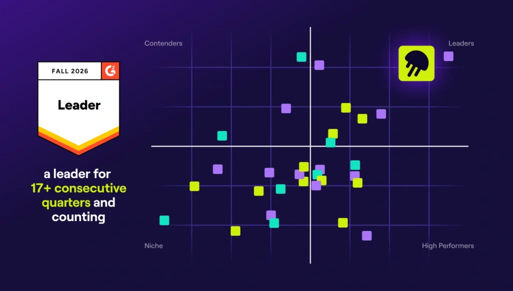
Coverage is wider than anything else in this category. Jellyfish measures Copilot, Cursor, Claude Code, Amazon Q, Gemini Code Assist, Windsurf, and CodeRabbit alongside autonomous agents including Devin, Copilot Agent, and Google Jules, all through one consistent measurement model.
Key Features
- AI adoption detection: The platform reports AI activity at the individual and team level without asking anyone to log anything. An AI Adoption Score gives leaders a composite read on maturity, so progress across the organization can be tracked over time.
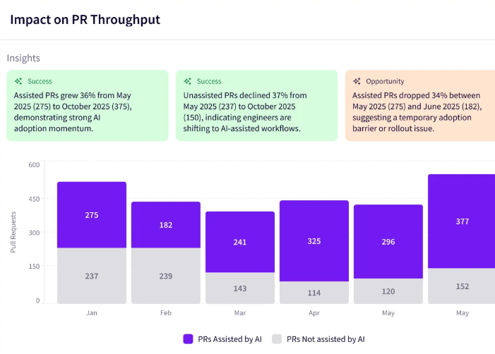
- Impact insights: Jellyfish compares delivery speed and pull request cycle time for work done with AI against work done without it. That side-by-side view produces the quantified difference leaders need when someone asks what changed.
 Multi-tool comparison: One evaluation model applies to every AI tool in the organization, which makes comparison possible in the first place. The output tells leaders where to scale investment, where to cut it, and where a tool underperforms against its price.
- Token usage and spend monitoring: Token usage, costs, and outcomes appear together across every tool, team, and model. Leaders can forecast spend, cut waste, and check whether consumption translated into delivery, which matters most for teams running agentic workflows.
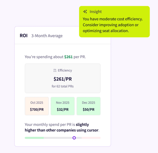
- Executive report builder: Jellyfish generates executive-ready AI reports with highlights, risks, and recommendations pulled automatically from your engineering data. That saves the quarterly work of translating internal metrics for a finance or board audience.
- Agentic and code review agent coverage: Coverage extends to code review agents including CodeRabbit, Graphite, and Greptile, along with autonomous agents such as Devin, Copilot Agent, and Google Jules. Jellyfish measures autonomous agent activity as the share of pull requests an agent opened, which tracks the point where AI starts producing shippable work on its own.
What Real Users Are Saying about the Value of Jellyfish
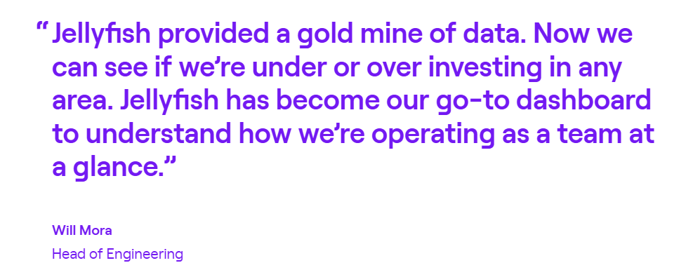
Most platforms in this category handle one part of the AI measurement problem well and leave the rest to you. Jellyfish holds adoption, delivery outcomes, spend, and developer sentiment in the same model, which removes the assembly work that usually falls to an engineering ops person.
One G2 user points to exactly that, describing how the platform took over the manual job of pulling together actionable metrics and building dashboards for AI usage. [Read Full G2 Review]
Ada’s engineering team shows what that looks like over time. Ada runs continuous experiments with new AI releases, and Jellyfish gave them a measured read on what came of it, with the Copilot dashboard showing a 14% improvement in cycle times. That figure now guides where Ada puts its AI budget, so each round of experimentation starts from evidence. [Read Case Study]
Teams describe the same routine use. One reviewer tracks engineering productivity and delivery across teams from one place, with AI usage, Jira tickets, pull requests, and PR analytics all reported through clear graphs. [Read Full G2 Review]
Pricing
Jellyfish builds a quote around your engineering headcount and the parts of the platform you plan to use, from AI impact through delivery metrics, developer experience, and capitalization.
You can sign annually or commit to multiple years for a better rate. A demo and an interactive tour both let you see the AI Impact dashboards before you decide.
2. DX
Best for: Enterprise engineering teams that need research-backed metric frameworks and industry benchmarks alongside their own adoption data.
DX is a developer intelligence platform that measures engineering productivity and AI impact through a combination of system telemetry, recurring developer surveys, and its own published frameworks, including DX Core 4 and the AI Measurement Framework.
The survey side is the clearest difference. DX collects developer sentiment on a schedule and reports it next to system data, which gives leaders an explanation for movements in the delivery metrics that repository data alone leaves open.
Key Features
- AI Measurement Framework: DX organizes its AI metrics into three dimensions that include utilization, impact, and cost. That structure matches the order most organizations follow, starting with adoption questions, moving to delivery effects, and ending with return on spend.
- AI code detection: The platform identifies AI-authored code locally, without source code leaving the developer machine, and reports the percentage of AI code by commit, pull request, and repository. Detection works across IDEs and AI tools, which matters for teams running Copilot, Cursor, and terminal agents at the same time.
- Developer surveys: DevSat, experience sampling, and targeted studies collect developer input on friction, time savings, and confidence in AI output. Those responses feed the Developer Experience Index, a composite score DX links to time loss and financial impact.
Pros
- Clear data visualization: Users point to the Insights tab and the Snapshots view as the strongest part of the product. Each driver appears next to a company-wide and industry comparison, which makes it easier to decide where to focus. [Read Full G2 Review]
- Guidance attached to each metric: DX pairs each driver with suggestions for how to act on it. Teams report that the guidance saves them from interpreting a score on their own and gives managers a starting point for the conversation with their team. [Read Full G2 Review]
- Support for internal decisions: Managers describe using the data two ways. They form a view about a team or an individual and check it against what DX shows, and they also spot figures that prompt them to go look at something they had not considered, whether a problem or a breakthrough. The same data helps when they need to persuade peers or a manager who reads the situation differently. [Read Full G2 Review]
Cons
- Uneven clarity across views: Not every screen reads as clearly as the Insights tab. Several users single out the Overview landing page as the harder one to understand, and say it takes time to work out what a particular chart is showing. [Read Full G2 Review]
- Composite scores of limited use: Metrics like fail percentage and innovation ratio come in for criticism, since they have not always matched how a team feels about its own work. Some of that traces back to how the Snapshot questions are worded. Users tend to find weekly trend lines more informative than a single composite figure. [Read Full G2 Review]
- Filter behavior varies by report: The Teams and Groups structure works, though the experience varies from one part of the platform to another. Some reports accept a group selection and others do not, and default selections do not always hold. [Read Full G2 Review]
Pricing
DX keeps its rates off the website.
The model runs per developer license, with separate usage tiers for MCP server access, and quotes come through the sales team. A free proof of concept covering a subset of your engineers is available first.
3. Swarmia
Best for: Engineering leaders who need per-tool activity data across Copilot, Cursor, and Claude Code without a long enterprise procurement cycle.
Swarmia is an engineering intelligence platform that combines SPACE and DORA metrics, AI adoption and cost data, developer surveys, and software capitalization on a single org structure and data model.
Swarmia pushes data back to the teams producing it. Working agreements and Slack notifications give engineers something to act on directly, which separates it from platforms built mainly for reporting upward to executives.
Key Features
- AI adoption and license tracking: Swarmia connects to GitHub Copilot, Cursor, and Claude Code, then reports licenses, active users, and idle seats across teams. Contributors show as active or idle depending on whether they accepted code or used chat in the period.
- Adoption compared against delivery metrics: The Teams view puts AI adoption next to productivity data, so you can check whether teams with higher adoption see faster pull request cycle times and whether batch sizes hold steady.
- Swarmia AI: Leaders can ask questions in plain language from the AI adoption, AI impact, coding agents, and survey views, and the assistant works across both metrics and survey comments. Any chart it returns opens in the Explore view, where you can save it as a custom report.
Pros
- Custom reports you can save and export: Building a view around a specific question takes little effort. Users describe saving those custom reports for repeat use and exporting them when a spreadsheet suits the next step better. [Read Full G2 Review]
- Swarmia AI as a shortcut through the data: The AI coding assistant gets credit for saving time. Leaders can pose a question directly and receive a straightforward read on what the data shows, which suits anyone who checks in weekly and does not want to interpret charts. [Read Full G2 Review]
- Dashboards are easy to read: Swarmia keeps its dashboards uncluttered, which makes team data easy to follow. Pairing survey results with delivery metrics in the same view comes up often as something users appreciate. [Read Full G2 Review]
Cons
- Weight points missing from author pages: Some data appears in one view and not another. Weight points show up in the team-wide activity log though not on the author page, which forces users to switch views for a complete picture. [Read Full G2 Review]
- Evaluation window feels tight: The free tier covers only a handful of developers, and the trial runs shorter than some buyers want. Teams suggest a month would give a company enough time to show meaningful value before a decision. [Read Full G2 Review]
- Performance drops with large data sets: Larger deployments run into problems. Users working across multiple teams with big data sets report dashboard features that perform poorly or stop working entirely. [Read Full G2 Review]
Pricing
Paid plans price per developer per month on annual billing, and you can buy a single module or take everything in one plan.
Full plans:
- Standard, €42 per developer per month: Covers every module, meaning AI adoption and cost, developer surveys, software capitalization, and productivity and AI impact.
- Enterprise, €52 per developer per month: Brings on-premise integrations, HR system integrations, and professional services.
Individual modules:
- AI adoption and cost, €4 per developer per month: AI adoption, activity, and cost metrics.
- Developer surveys, €8 per developer per month: Survey tooling, Slack reminders, and survey benchmarks.
- Software capitalization, €16 per developer per month: Capitalization, investment balance, initiatives, and focus summary.
- Productivity and AI impact, €22 per developer per month: AI adoption, impact and costs, code, issue and DORA metrics, benchmarks, and working agreements.
Learn more → 14 Best Swarmia Alternatives & Competitors on the Market Today
4. LinearB
Best for: Teams that want to measure AI impact and enforce policy on AI-assisted pull requests in the same platform.
LinearB is a developer productivity tool that detects AI activity across 50+ coding tools and reports its effect on cycle time, throughput, and code quality.
One of the main selling points is that the platform acts on the data it collects. gitStream lets teams write policy in YAML that routes pull requests, assigns reviewers, and blocks AI-assisted changes from merging without review, which converts a measurement finding into an enforced rule.
Key Features
- AI adoption across 50+ tools: LinearB detects AI activity in engineering work covering coding assistants, code review tools, and coding agents. Data segments by team, user, repository, and individual tool, so you can compare adoption patterns across the organization.
- AI-assisted work compared against the rest: The platform tracks pull requests that involve AI and puts cycle time, throughput, and quality metrics for that work next to everything else.
- Delivery metrics and benchmarks: It also reports DORA metrics alongside pickup time, review time, pull request size, approval time, and merge frequency. Benchmarks are based on more than 8 million pull requests across roughly 4,800 engineering teams.
Pros
- Detail down to the individual level: The depth of the data comes up often. Teams can pull statistics at almost any level of detail, which suits leaders who need to trace a trend back to a specific team or repository. [Read Full G2 Review]
- The interface is intuitive: Navigation takes little effort. Many G2 users describe finding their way around from the first session and getting value without working through documentation first. [Read Full G2 Review]
- You get a dedicated success manager: The success manager relationship comes up repeatedly in reviews. Users value having a single contact who understands their project well enough to recommend which features to configure and how. [Read Full G2 Review]
Cons
- No scorecard summary view: Presenting the data upward takes work. Several users would like a condensed scorecard report with benchmarks included, since the detailed views are more than an executive audience needs. [Read Full G2 Review]
- Onboarding effort across teams: LinearB offers quick-start settings that teams refine later, though the per-team structure means training has to happen team by team, which stretches the rollout. [Read Full G2 Review]
- Sprint and week views don’t always align: Time periods vary from one metric to another. Some report by sprint and others by week, so comparing them means setting a custom date range by hand to match the sprint length. [Read Full G2 Review]
Pricing
Pricing starts at $29 per user per month on the Essentials plan, which already covers AI impact measurement, AI code review, DORA metrics, and developer surveys.
The catch is that Essentials works with GitHub Cloud only, so teams on GitLab, Bitbucket, or Azure DevOps move to Enterprise at $59 per user per month.
Learn more → 8 Best LinearB Alternatives & Competitors on the Market Now
5. Faros AI
Best for: Large enterprises running several AI coding tools that need token-level spend attribution alongside delivery outcomes.
Faros AI is an enterprise engineering intelligence platform that unifies data from more than 100 SDLC tools and measures how AI coding tools affect velocity, quality, security, and developer sentiment.
Token Intelligence gives Faros a cost view few competitors match. Every token gets classified and attributed to a team, tool, and model, then mapped to the work it produced.
Key Features
- Multi-tool comparison: Faros tracks Copilot, Cursor, Claude Code, Codex, Windsurf, Devin, and other assistants in the same dashboard, reporting adoption, acceptance, and downstream quality by tool.
- Token Intelligence: The platform reports token spend across every team, tool, and model in one view and maps it to the work it produced. That attribution matters most for teams running agents, where a single session can consume more than a month of seat licenses.
- 100+ connectors: Data comes from Git providers, issue trackers, CI/CD, incident management, and AI vendors, feeding one engineering data model. Breadth of coverage is the point for large organizations, where the delivery picture spans systems no single integration reaches.
Pros
- Heavy lifting handled by the platform: Faros absorbs the work most organizations would otherwise hand to a data team. Users say an experienced person can build views, reports, and dashboards in minutes or hours, where the same output would take a technical team months to assemble elsewhere. [Read Full G2 Review]
- Strong visualization and alerting: Users get considerable control over how data appears and when it reaches them. Alert workflows handle the distribution, which means a report built once keeps delivering without anyone rerunning it. [Read Full G2 Review]
- Broad integrations with room to customize: Faros ships with a wide integration list and leaves room for custom connectors where a team needs something specific. [Read Full G2 Review]
Cons
- Self-service still developing: Self-service functionality started thin. Users report it improving steadily, though earlier customers had to lean on Faros for changes they now expect to make themselves. [Read Full G2 Review]
- Custom connectors take time to grasp: New users face a period of learning how the data is organized before custom connector work makes sense. Support fills the gap, and most describe getting comfortable quickly once someone explains the model. [Read Full G2 Review]
- Mapping org structure takes effort: Teams find the hardest part is deciding how to represent a multi-level organizational structure inside the platform, which shapes everything reported afterward. [Read Full G2 Review]
Pricing
Expect a custom quote. Faros prices per contributor and sells its capabilities in modules, so what you pay depends on which parts of the platform you take.
6. Waydev
Best for: VPs of engineering and CTOs managing AI coding budgets who want cost per pull request attributed by tool and team.
Waydev is an engineering management platform that traces AI-generated code from the first token consumed through to production deployment, reporting adoption, impact, and cost along the way.
Every answer from the Waydev Agent comes with editable SQL behind it. Teams can audit the query, adjust it, and rerun it, which removes the black-box objection that tends to come up when engineering analytics reaches a budget conversation.
Key Features
- Vendor comparison on production outcomes: Copilot, Cursor, Claude Code, Windsurf, and Devin get compared on acceptance and deployment results across teams and repositories. Leaders can check which tool performs cleanest in a given part of the codebase before standardizing.
- AI Checkpoints: Waydev captures which agent produced each change at the commit level, along with tokens consumed, cost per pull request, acceptance rate, and whether the code deployed.
- DORA and SPACE framework metrics: Cycle time, deployment frequency, change failure rate, and coding days come configured out of the box. Health views cover pull request quality and review collaboration, which matters when AI-assisted volume puts pressure on reviewers.
Pros
- Depth of analysis: Several describe the ability to query the data conversationally as a meaningful improvement over assembling views by hand. [Read Full G2 Review]
- Clear dashboards for leadership: Presenting to executives takes little preparation. The default views are clear enough that engineering leaders share them as they are, which is not always true of platforms in this category. [Read Full G2 Review]
- Adoption tied to delivery outcomes: Teams rolling out AI coding tools get hard telemetry on what changed. Seeing adoption next to cycle time and deployment frequency gives leaders the measured difference in velocity. [Read Full G2 Review]
Cons
- Aligning internal definitions: Users report a learning period at the beginning, mostly spent mapping internal definitions onto the platform’s. Teams without an agreed view of what they are measuring will feel that step more. [Read Full G2 Review]
- AI insights need more customization: The AI insights could adapt better to different audiences. Users want more control over tailoring views for engineering managers and executives separately, since the two groups need different levels of detail from the same data. [Read Full G2 Review]
- Granularity gaps in default reports: Default reporting on AI telemetry leaves less room than users would like. The request that comes up is finer control over how the data gets sliced, which matters for anyone investigating a specific team or repository. [Read Full G2 Review]
Pricing
Teams evaluating Waydev for AI measurement should look at Premium, which costs $49 per active contributor per month and holds the AI Impact checkpoints and AI ROI reporting.
Pro at $29 covers adoption tracking only, and a free Tokenmeter plan gives you AI cost per merged pull request and related spend metrics at no charge. Enterprise comes with on-premise deployment and SSO on a custom quote.
Learn more → 14 Waydev Competitors & Alternatives for 2026
7. Typo
Best for: Organizations that want AI measurement and automated code review in one product at a mid-market price.
Typo is a software engineering productivity platform launched in 2023 and built for the AI coding era, with adoption tracking, delivery metrics, spend reporting, and code review in a single self-serve product.
The platform takes minutes to connect and starts free, with paid plans running $20 to $35 per contributor per month. That puts serious AI measurement within reach of teams that would never clear the budget for an enterprise platform.
Key Features
- Work-type breakdown: AI-written code gets classified across maintenance, performance, new features, and bug fixes. This answers a question most adoption dashboards leave open, which is whether AI handles routine work or contributes to the roadmap.
- Impact on delivery workflows: The platform measures how AI-assisted coding affects delivery speed, review cycles, deployment frequency, and rework. Typo reports that customers identify AI-related quality regressions twice as fast with this data in place.
- Spend tracking by team and model: Typo reports AI usage and cost by team, individual, tool, and model, then connects that spend to delivery outcomes. Leaders comparing two assistants get a cost picture at the team level.
Pros
- LLM-powered pull request reviews: Typo runs LLM-powered reviews on every pull request and picks up bugs, security flaws, and smaller errors before merge. Users describe this as replacing a manual step that was tedious and prone to slips, which frees reviewer attention for the parts that need judgment. [Read Full G2 Review]
- Useful for developers and leadership: The platform works for two audiences at once. Development teams get review feedback on their own work, and leadership gets developer productivity metrics from the same source, which avoids running separate tools for each. [Read Full G2 Review]
- Immediate visibility on your own work: Feedback arrives immediately, which developers find motivating. Seeing movement on speed or accuracy right away helps people identify what to work on, and the instant corrections keep engagement higher than a monthly report would. [Read Full G2 Review]
Cons
- Dashboards and reports need more flexibility: Customization on the metrics dashboard and in reporting comes up as a gap. Teams ask for more control over both dashboards and report configuration, particularly where their workflow differs from the norm. [Read Full G2 Review]
- Some reports stay too high-level: The detail varies by audience. Executives get what they need, while team leads sometimes find the same reports too broad to act on within their own scope. [Read Full G2 Review]
- Security findings need manual filtering: Not every security finding warrants action. Users report sorting through low-risk flags to identify immediate threats, which means the output still needs a human pass before anyone acts on it. [Read Full G2 Review]
Pricing
Starter costs $20 per developer per month, and Pro costs $28, both billed annually, with custom Enterprise pricing above that.
The AI measurement features come with Starter, so the entry tier covers what most teams buying for this purpose need.
Connect AI Adoption to True Business Impact with Jellyfish
Connect AI Adoption to True Business Impact with Jellyfish
Each platform here has a strength. Where they differ is in attribution method, cost visibility, and how far the measurement reaches into the delivery process.
Jellyfish covers the full range, from tool detection through to what shipped and what your teams spent to get there.
What you get:
- Automatic detection of AI usage across every tool your teams run, with no tagging or manual reporting
- One vendor-neutral model that compares Copilot, Cursor, Claude Code, and agents on the same terms
- Cycle time and throughput for AI-assisted work measured against work done without it
- Token spend and license costs broken out by team, tool, model, and initiative
- Work type attribution through Jira, Linear, and Azure DevOps, so you know what AI handles
- Developer surveys that explain what the delivery data leaves open
- Executive reports built automatically from your own engineering data
Most teams take days to assemble a picture this complete, and it goes stale by the next quarter. Jellyfish keeps it current from data you already generate.
Book an AI Impact demo to see your AI adoption, spend, and delivery outcomes in one place.
About the author

Lauren is Senior Product Marketing Director at Jellyfish where she works closely with the product team to bring software engineering intelligence solutions to market. Prior to Jellyfish, Lauren served as Director of Product Marketing at Pluralsight.