In this article
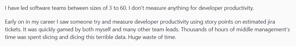
Developer productivity measurement has a terrible reputation, and frankly, there’s good reason for it.
Most attempts at tracking developer performance only create toxic competition, encourage gaming the system, and pit developers against each other.
The problem runs so deep that even experienced engineering leaders have given up entirely on measurement:
(Source)
You can’t blame them, given how badly this usually goes. But teams still need to see where their processes break down and what’s slowing them down.
That’s what developer productivity dashboards can solve. When you build them right, you get a clear picture of how your systems work and where your team gets stuck.
Building one isn’t easy, though. You need to choose which specific metrics to track, structure the data properly, and avoid the mistakes that create toxic team dynamics.
Don’t worry, we’ll walk you through it step-by-step below.
What is a Developer Experience Dashboard?
What is a Developer Experience Dashboard?
A developer productivity dashboard is a visual interface that monitors your team’s development workflow. You can see how quickly and smoothly code changes move from idea to production.
To be clear, developer productivity dashboards do NOT track individual performance metrics like:
- Lines of code written per developer
- Number of commits by person
- Code review completion rates by individual
- Bug counts attributed to specific team members
These individual metrics create competition and encourage gaming. Good productivity dashboards focus on team and system performance instead.
This is why it can be easy to confuse them with project management dashboards. But they serve different purposes:
Project management dashboards track story points, sprint burndowns, and feature delivery timelines. They focus on what work gets done and when.
Developer productivity dashboards track the technical workflow. They show how efficiently your systems and processes handle code changes, not how fast individual developers work.
The primary purpose of a developer productivity dashboard is to answer key process questions, such as:
- How long does it take for an idea to get from commit to production? (Cycle time)
- Where do code changes get stuck most often? (Process blockers)
- Are we deploying frequently enough? (Deployment frequency)
- How often do our deployments fail? (Change failure rate)
- How quickly can we fix issues in production? (Recovery time)
- How much time do we spend on code review vs. coding? (Work distribution)
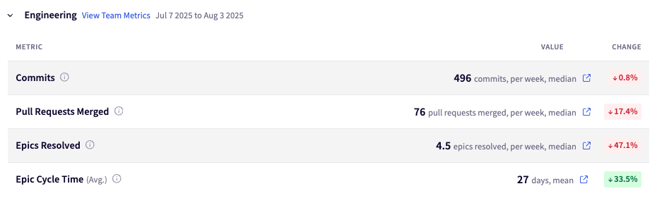
A well-designed dashboard might include a section like this. Notice how it focuses on process health rather than individual performance:
Who uses these dashboards: Engineering managers and team leads use them most, but they’re valuable for different stakeholders:
- Engineering managers track team health and process improvements
- Team leads outline workflow problems and coach their teams
- Senior developers spot patterns in code review and deployment cycles
- Engineering executives understand development and planning capacity
The difference between helpful and harmful dashboards usually comes down to what you choose to measure and how you present it. Get those two things right and you’ll start seeing continuous improvements in your development process.
Common Misconceptions About Developer Productivity Dashboards
Despite their potential, teams often build these dashboards wrong. Here are the most common mistakes and why they backfire:
- “More metrics means better insights.” → Actually, too many metrics create noise. Focus on 5-7 key measurements that directly impact your team’s biggest challenges.
- “We need real-time updates.” → Daily or weekly updates work fine for most teams. Hourly dashboard refreshes just create anxiety without adding value.
- “Everyone should see the same data.” → Different roles need different views. Developers care about code review times, while executives care about delivery predictability.
- “Individual accountability drives performance.” → This backfires every time. Teams perform better when dashboards outline process problems, not people problems.
- “If we can measure it, we should track it.” → Just because you can pull data from your tools doesn’t mean it belongs on your dashboard. Irrelevant metrics distract from what actually matters.
- “The dashboard will solve our productivity problems.” → Dashboards reveal problems, but they don’t fix them. You still need to act on the insights and fine-tune your processes.
Getting these dashboards right means avoiding the temptation to track everything and instead focusing on the few metrics that actually help your team improve.
Engineering Productivity Metrics to Include in Your Dashboard
Engineering Productivity Metrics to Include in Your Dashboard
Good dashboards focus on a core set of measurements that show you where your development process flows smoothly and where it gets stuck.
Here are the main types of metrics to pay attention to:
DORA Metrics: The Industry Standard for DevOps Performance
If you want a clear view of how well your engineering team delivers software, DORA metrics are a strong place to start.
They were introduced by the DevOps Research and Assessment group. Later, they were backed by Google’s research as the gold standard for measuring developer productivity and delivery performance.
The four DORA metrics are:
- Deployment frequency: How often does your team release working software?
- Lead time for changes: How long does it take to go from commit to production?
- Change failure rate: What percentage of your deployments result in a rollback, hotfix, or incident?
- Time to restore service: When things break in production, how quickly can you fix them?
The key difference with DORA is that problems point to system problems, not people problems. Instead of asking “why is Matt’s code taking so long,” you ask “what’s slowing down our entire pipeline?”
Even on Reddit, where developers are notoriously critical of productivity tracking, DORA gets positive feedback:
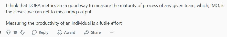
(Source)
Of course, DORA isn’t a silver bullet. Many engineering leaders combine DORA data with other signals like developer surveys and team health checks to get the full picture.
Flow Metrics: Understanding Workflow Efficiency
Flow metrics track how work moves through your development process, from initial request to completion in agile workflows. They help you spot where tasks get stuck and how your team handles different types of work.
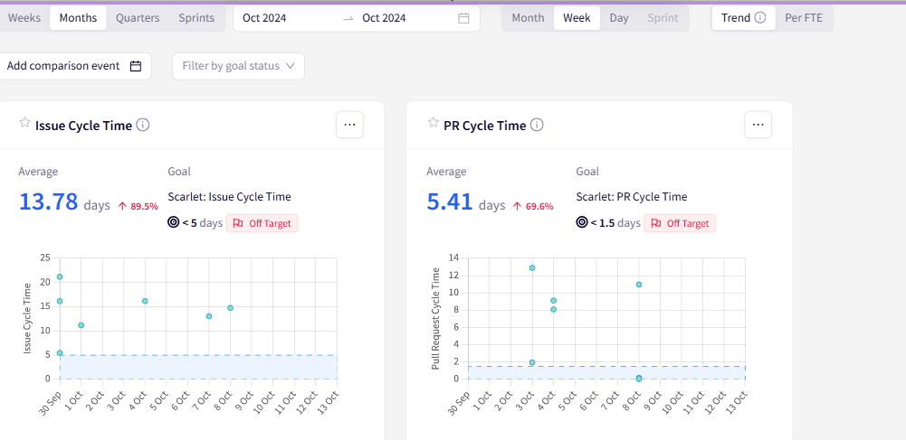
Cycle time shows how long it takes for work to go from “started” to “done.” This includes coding, pull requests, review, testing, and deployment time.
This dashboard tracks both issue cycle time (13.78 days) and PR cycle time (5.41 days), so you can see which part of your workflow needs attention.
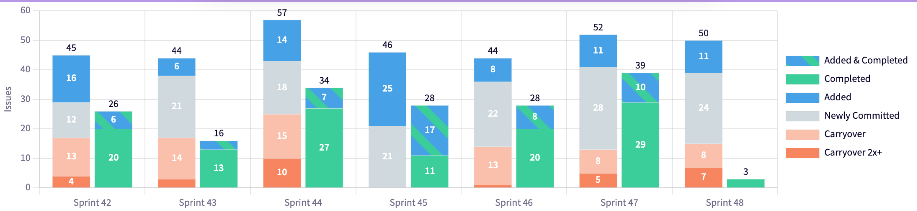
Work in progress (WIP) reveals how much work your team has active at any given time. Too much WIP creates context switching and slows everything down.
This sprint view breaks down work by status. You can see how much gets added, completed, or carried over between sprints to help teams spot workflow patterns.
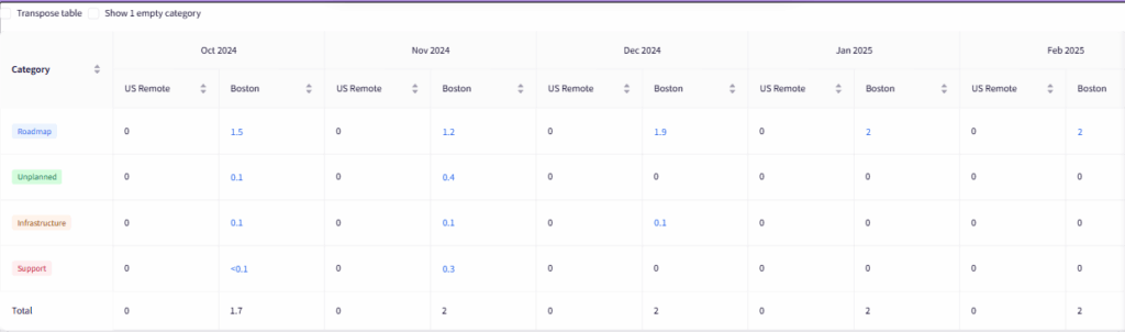
Flow distribution outlines the types of work your team handles (features, bugs, technical debt). This view breaks down how much effort goes toward planned roadmap work versus unplanned support and infrastructure tasks across different teams and timeframes.
These metrics show workflow patterns that DORA metrics miss. For instance, whether your team spends too much time on unplanned work, or if certain types of tasks always take longer than expected.
Note: These screenshots show examples from various Jellyfish dashboards. To see how these metrics would look with your team’s data, request a demo and explore what Jellyfish can reveal about your development workflow.
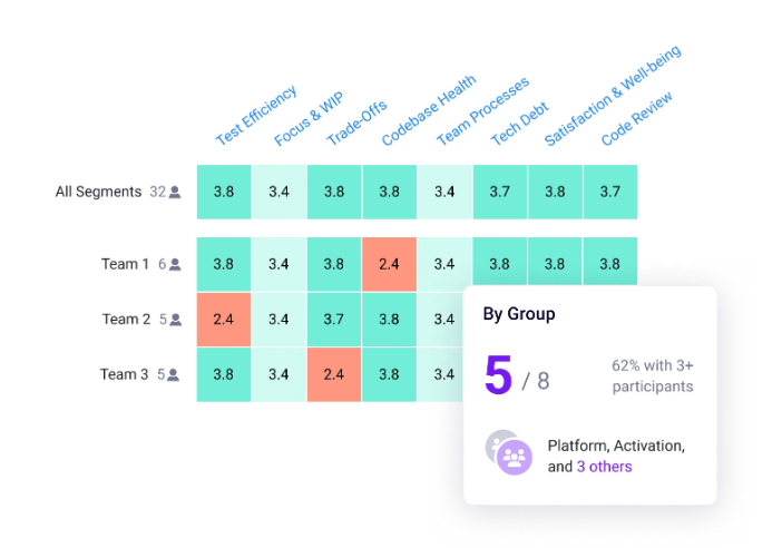
Quality and Collaboration Metrics
Quality and collaboration metrics show how well your team works together and how stable your code is. You can use them to balance speed with code quality and team health.
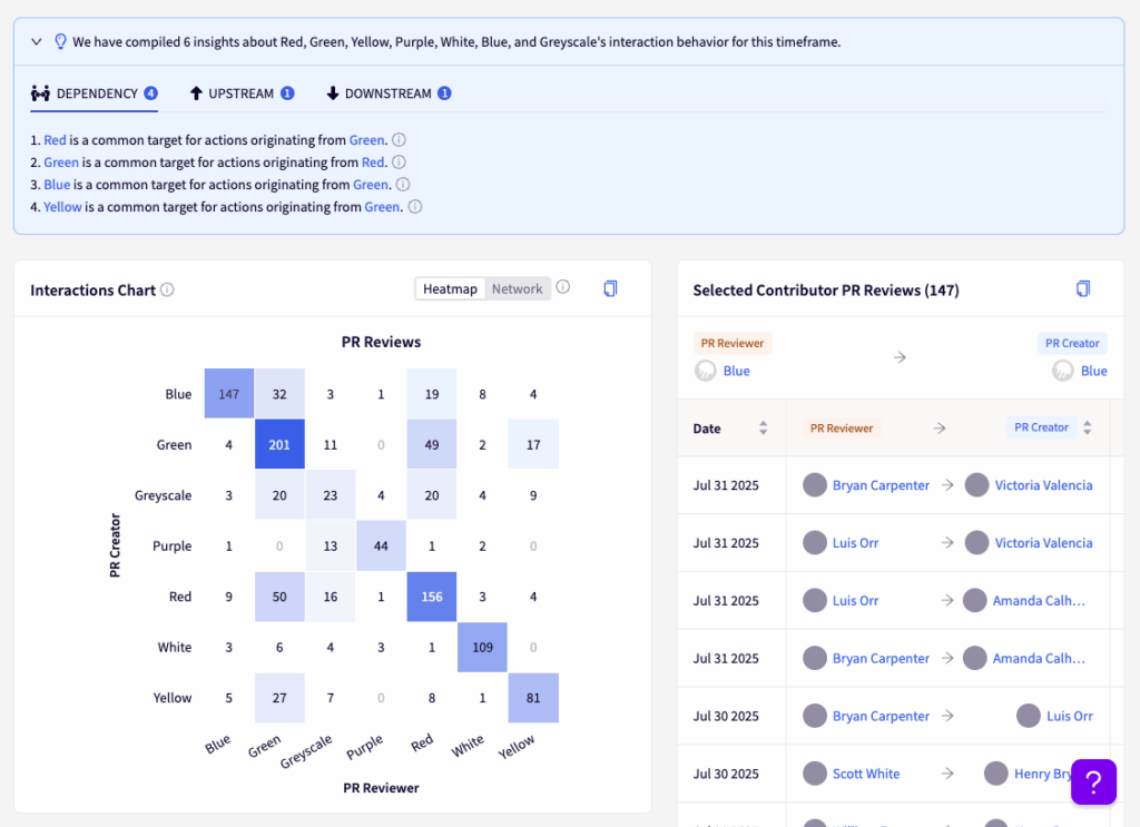
Team contribution balance shows how evenly you distribute work across team members. This view shows each contributor’s allocation percentage, so you can spot if work is too concentrated on certain people.
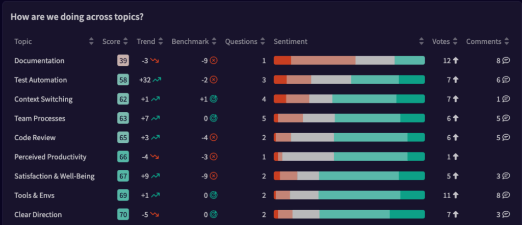
Team satisfaction metrics outline developer happiness scores across different areas like tooling, processes, and work-life balance.
This section breaks down satisfaction by topic, and you can see specific areas where the team struggles or excels.
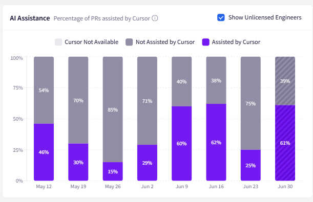
AI tool adoption reveals how much your team uses AI assistants and what impact they have on speed. It makes it easier to justify tool costs and see adoption patterns.
The chart below shows AI assistance rates across different weeks, so you can see which developers benefit most from these tools.
Defect resolution time shows how fast your team finds and fixes bugs after someone reports them.
You can track the average time between when someone opens a defect and when the team resolves it.
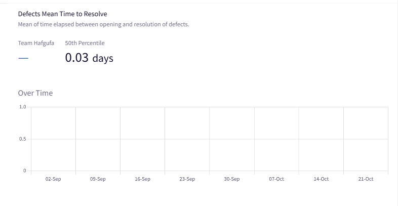
These metrics work best when you track trends rather than absolute numbers. A spike in bug fix time might mean growing technical debt, while better AI adoption rates could explain faster delivery times.
Developer Productivity Dashboard Examples
Developer Productivity Dashboard Examples
Let’s look at three dashboard examples that show the kinds of metrics and layouts that work well in practice.
These templates give you a concrete starting point for building your own team’s productivity dashboards:
Software Delivery Management Dashboard
Purpose: Software delivery dashboards help teams track project progress, predict delivery dates, and spot risks before they derail timelines. You can use this when leadership keeps asking, “When will it be done?” and you need data-backed answers.
Key metrics to track:
- Project progress and timeline forecasting: Track completion percentages with projected delivery dates based on actual velocity (not estimates).
- Resource allocation and capacity: Monitor how team effort is distributed across different projects.
- Delivery risk indicators: Spot projects that are trending behind schedule or over-budget before they become problems.
- Scope and effort tracking: Visualize how project scope changes affect delivery timelines and resource needs.
Visual best practices: Use progress bars and completion percentages for quick status updates, but always include trend lines that show velocity over time. Outline at-risk deliverables with clear signals, and show both current status and projected completion dates.
Jellyfish template you can use: Jellyfish’s software delivery management dashboard shows project lifetime progress, effort distribution, and delivery forecasting in one view. The scenario planner lets you model different resource allocations and delivery scopes, so you can answer “what if” questions about timeline trade-offs before committing to unrealistic deadlines.
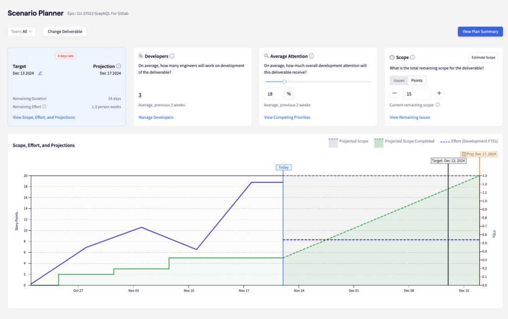
It also connects individual issues to epic-level progress automatically – you can see which specific tickets are blocking delivery and who’s working on what.
The dashboard also flags projects that are trending off-track and helps you spot resource issues before they become crisis meetings.
DevOps Overview (DORA Metrics Dashboard)
Purpose: A DORA metrics dashboard gives you a complete view of your software delivery performance. You can see how fast your team ships code and how often things break during the process. It’s the foundation dashboard that every engineering team should start with because it measures your entire delivery pipeline from code to production.
Key metrics to track:
- Deployment frequency: Track how often you ship to production, so you can better understand your team’s delivery rhythm and release capability.
- Lead time for changes: Measure time from commit to deployment to outline any process delays.
- Change failure rate: Monitor what percentage of deployments cause customer-impacting issues.
- Mean time to recovery: Track how quickly you restore service when incidents occur.
Visual best practices: Use time-series charts to show trends over monthly periods, with clear metric definitions and baseline comparisons. Include drill-down capabilities to analyze specific periods and team performance.
Jellyfish template you can use: Jellyfish’s DevOps metrics dashboard combines all four DORA metrics with intelligent drill-downs. You can see both performance numbers and context, like resource allocation (e.g., 52% roadmap work vs. 25% technical investment).
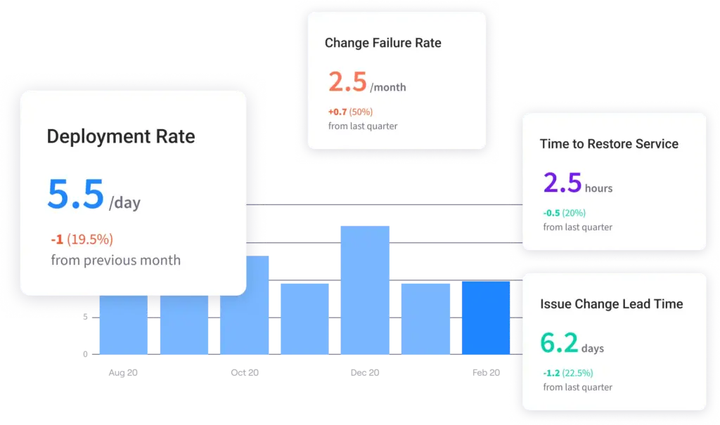
This helps you understand both what’s happening and why, so it’s easy to spot improvements or regressions in your DevOps practices.
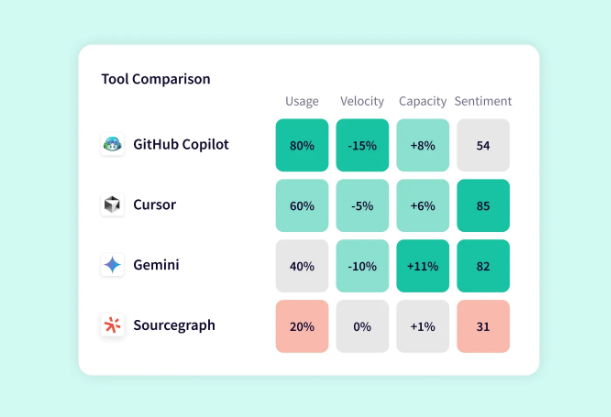
AI Impact & Adoption Dashboard
Purpose: Most teams spend thousands on AI coding tools like Copilot and Cursor, but have no clue if they’re actually making developers more productive. AI impact dashboards solve this by measuring real productivity gains and adoption patterns across your engineering team.
You’ll know which teams get the most value from AI tools, which tools suit different types of work, and whether your AI investment is worth the cost.
Key features:
- Adoption rates and user engagement: Monitor how many developers actually use AI tools versus just having licenses.
- Productivity impact measurements: Track concrete improvements like faster PR completion, reduced cycle times, or increased throughput.
- Tool performance comparisons: Compare effectiveness across different AI assistants and coding languages.
- User enablement and training progress: Outline power users, casual users, and idle users to target training efforts.
Visual best practices: Use before/after comparisons to show productivity improvements clearly, and segment data by team, programming language, and project type. Track adoption trends over time to spot patterns in tool usage, and outline power users who can become internal champions.
Jellyfish template you can use: Jellyfish’s AI Impact dashboard tracks adoption and productivity gains across popular AI coding tools like Copilot, Cursor, and Gemini.
You can see which tools deliver the biggest productivity increase for your teams, identify developers who aren’t getting value from their AI licenses, and get concrete ROI data to justify tool investments.
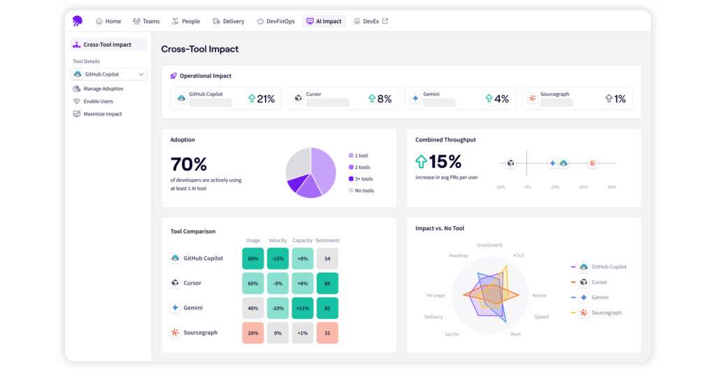
The platform shows everything from high-level adoption rates to detailed breakdowns by programming language and work type. You can optimize your AI strategy based on what actually works for your team.
How to Build a Developer Productivity Dashboard in 5 Steps
How to Build a Developer Productivity Dashboard in 5 Steps
Building a developer productivity dashboard doesn’t have to be overwhelming. Here’s a straightforward approach to get you started:
Step 1: Define Your Goals and Select Key Metrics
Start by figuring out what problems you’re trying to solve. Don’t just build a dashboard because everyone else has one. Be specific about what you want to optimize.
Here’s a breakdown that maps common engineering problems to the metrics that help solve them:
| Problem you’re solving | Primary metrics to track | Secondary metrics |
| Deployments take too long | Lead time, deployment frequency | PR cycle time, review time |
| Too many production bugs | Change failure rate, defect resolution time | Code review coverage |
| Work gets stuck in the process | Cycle time, WIP limits | Flow distribution |
| Team burnout/overload | Flow distribution, WIP | Developer experience scores |
| Poor code quality | Change failure rate, review Time | Defect density |
Pick your primary metrics first. These should directly tackle your biggest pain point. Add secondary metrics only after you’ve tracked the primary ones for a few weeks and have solid baselines.
Also consider who will use this dashboard:
- Engineering managers need process health metrics so they can spot problems and report to leadership
- Team leads need workflow KPIs to find and remove blockers for their team members
- Individual developers need personal workflow data to see how they can create a more efficient development environment
- Engineering executives and CTOs need high-level trends to make data-driven decisions
Start simple. You can always add more metrics later, but it’s harder to remove them once stakeholders get attached to meaningless numbers.
Step 2: Identify and Integrate Your Data Sources
Your dashboard is only as good as the data feeding it. Map out where your team’s development data comes from, and then work out how to pull that information together.
Most teams need data from these core sources:
- Version control (GitHub, GitLab, Bitbucket) for commit data, PR metrics, and code review times
- CI/CD tools (Jenkins, Git Actions, CircleCI) for deployment frequency and build success rates
- Project management (Jira, Linear, Asana) for issue cycle times and work distribution
- Monitoring tools (Datadog, New Relic, PagerDuty) for incident data and recovery times
The tricky part is connecting this data. A single feature might have a Jira ticket, multiple GitHub PRs, several CI builds, and a deployment record. You need to link these together to get accurate cycle times.
Most tools offer APIs, but integration takes time. Start with one data source and get that working before adding new ones.
PRO TIP 💡: Jellyfish automatically connects your issue tracking and source code data to show actual work done, not just story points or ticket counts. It pulls data from your engineering tools without messing up your workflows or making you clean up messy data.
Step 3: Choose Your Dashboard Platform
Once you know what metrics you want and where to get the data, you need to figure out how to build the actual dashboard.
Build your own dashboard, and you get complete control over what you track and how it looks. You’ll spend time connecting APIs, cleaning data, and building charts, but you get a dashboard that fits your team perfectly.
This works well if you have specific needs, technical help, or want to connect custom internal tools.
The downside is time and upkeep. Expect weeks of setup and ongoing work to keep things running when tools change their APIs. You’ll also need to figure out benchmarks and best practices on your own.
Buy a dedicated platform if you want to skip all the technical work. These platforms focus on engineering productivity and handle the complexity for you.
They connect to your existing tools automatically, include ready-made dashboards based on best practices, and show you how your team compares to others.
Jellyfish does exactly this. It pulls data from Jira, GitHub, and other development tools to give you deep insights into team performance that you can’t get from tracking bottlenecks or story points alone.
Our platform automatically tracks DORA metrics, measures AI tool adoption and impact, and connects engineering work with business goals without changing your existing processes.
Quick comparison: Here’s how the two approaches stack up against each other.
| Your Situation | Best Option | Why |
| Small team, tight budget, love building tools | Build your own | You have time to tinker and maintain integrations |
| Need standard metrics quickly | Dedicated platform (Jellyfish) | Get up and running in days, not weeks |
| Unique metrics nobody else tracks | Build your own | You need custom calculations that platforms don’t offer |
| Leadership wants reports now | Dedicated platform (Jellyfish) | Pre-built dashboards and automated reporting |
| Have a data engineering team | Build your own | You already have the skills and resources |
| Just want to start measuring | Dedicated platform (Jellyfish) | Focus on using data instead of building infrastructure |
| Complex compliance requirements | Dedicated platform (Jellyfish) | Professional support and security certifications |
Whatever route you take, you’ll learn more about your development process in the first month than you probably knew before.
Step 4: Visualize the Data and Provide Context
Raw numbers don’t tell stories. A metric that shows “13.2 days cycle time” means nothing without context. Your job is to make the data useful for your team.
And always show trends over time instead of just current numbers. A cycle time that went from 8 days to 13 days tells a story. A flat number doesn’t.
Use line charts for trends, bar charts for comparisons, and avoid pie charts unless you’re showing simple percentages.
Add context that helps people understand what they’re looking at:
- Set realistic goals – Don’t aim for 1-day cycle times if your current average is 15 days
- Include external factors – Note when major releases, holidays, or team changes happened
- Show industry benchmarks – “Our 3-day lead time is faster than 70% of similar teams”
- Explain what initiatives to take – “If PR review time exceeds 2 days, ping the team lead”
Use color coding that makes sense. Red for bad, green for good, yellow for “needs attention.”
Most importantly, put the data where people will see it. A beautiful dashboard that nobody checks is useless. Slack notifications, email summaries, or TV displays in common areas work better than dashboards that people have to remember to visit.
PRO TIP 💡: Jellyfish gives you real-time, actionable insights that work for everyone — executives can see the big picture while team leads can drill down into specific details. You get portfolio-level views when you need them and granular data when you want to dig deeper.
Step 5: Roll Out and Iterate with the Team
Don’t just launch your dashboard and hope people use it. Roll it out gradually and get feedback early.
Start with a small group of team leads or senior developers. Show them the dashboard, explain what each metric means, and ask what confuses them.
And launch with clear expectations about what the dashboard is for:
- It’s for process improvement, not performance reviews – Say this explicitly and repeatedly
- Focus on team trends, not individual numbers – If someone’s metrics look off, dig into what’s blocking them
- Use it in retrospectives and planning – “Our cycle time spiked last sprint. What happened?”
Schedule monthly reviews to see what’s working and what isn’t. Teams often ask for different metrics once they start using the dashboard regularly. Be ready to adjust.
And watch for signs that people are gaming the metrics. If PR review times suddenly drop to 5 minutes, they’re probably rubber-stamping approvals. If deployment frequency jumps but nothing feels faster, they might be pushing empty commits.
Go Beyond Dashboards: Make Strategic Decisions with Jellyfish
Go Beyond Dashboards: Make Strategic Decisions with Jellyfish
Building a dashboard gets you started, but it only shows you what’s happening. You still won’t know why your cycle times shot up or how your engineering work impacts specific business outcomes.
Jellyfish is a software engineering intelligence platform that digs deeper and connects engineering data with business context.
It shows you which projects eat up the most resources, why certain teams consistently deliver faster, and how engineering decisions affect company goals.
Here’s what you can do with Jellyfish:
Measure the True Impact of Your AI Investment
Teams are adopting AI coding tools like Copilot and Gemini at record speed, but most engineering leaders still can’t answer basic questions about their impact.
- Are these tools making developers more productive?
- Which ones work best for different types of workload?
- How much are you spending versus what you’re getting back?
Jellyfish’s AI Impact tracking gives you clear answers. It measures how tools like GitHub Copilot, Cursor, and Sourcegraph affect your team’s delivery speed, workflow efficiency, and resource planning.
You can see which AI tools perform best across different roles and engineering tasks, compare adoption rates by team, and understand their contribution to the overall software development lifecycle.
Connect Productivity to the Developer Experience (DevEx)
Productivity metrics only tell half the story. A team might have great DORA scores but still be burning out from frustrating tools, unclear direction, or constant interruptions.
Jellyfish’s DevEx capabilities help you understand what’s happening with your team’s day-to-day experience. The platform combines team productivity data with developer sentiment surveys to show you the complete picture.
You can see how satisfaction scores in areas like documentation, test automation, and code review correlate with actual performance metrics.
When cycle times increase, you’ll know whether it’s a process issue or if developers are struggling with poor tooling.
Align R&D Investment with Business Goals (DevFinOps)
Most companies spend millions on engineering but can’t tell you how much goes toward new features versus maintenance, or which projects drive revenue.
Finance teams want a clearer overview of R&D spending, while engineering leaders need to justify their budget decisions.
Jellyfish’s DevFinOps functionality bridges this gap. The platform automatically sorts engineering activities by project type and business goal, then creates reports that both engineering and finance teams can use.
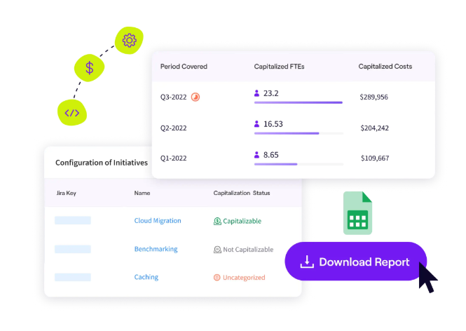
You can clearly break down software costs, track R&D investments, and understand the real cost of technical debt versus new features.
Increase Delivery Predictability with Resource Allocation Insights
Most engineering teams can’t predict software delivery dates because they don’t know where their time actually goes. You might plan for feature work, but then spend 40% of your sprint on unplanned bugs and maintenance.
Jellyfish’s resource allocation tools show you exactly how your team’s effort gets split across different types of work – features, technical debt, support, and infrastructure.
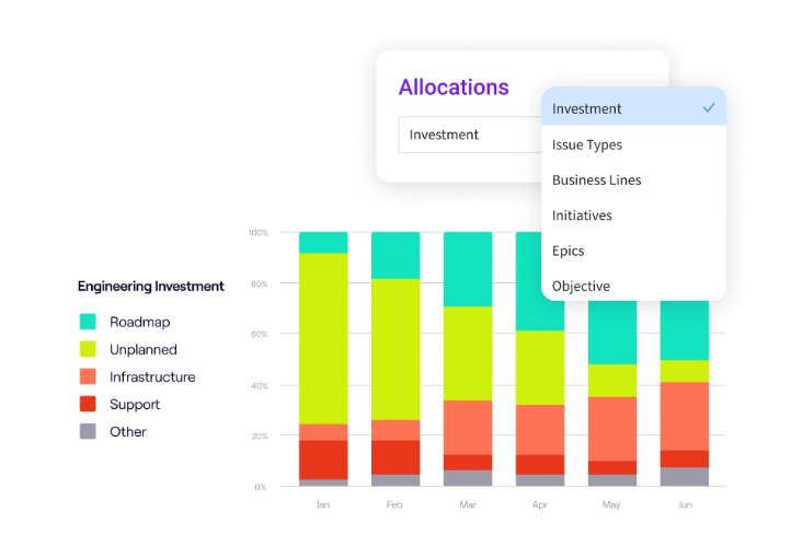
You can see which projects eat up more resources than expected and find development teams that are swamped with unplanned work.
Building an effective developer productivity dashboard takes the right approach, the right metrics, and the right platform. But it doesn’t have to take months of custom development work.
Jellyfish takes care of all the technical complexity for you. Book a demo and find out what your engineering data has been trying to tell you.
Developer Productivity Dashboard FAQs
Developer Productivity Dashboard FAQs
My team’s metrics look bad. How should I react?
Don’t panic or start pointing fingers. Bad metrics usually point to process problems, tool issues, or unrealistic expectations.
Use the data to start conversations about what’s blocking the team. Then, see how you can help remove those obstacles.
How do I get buy-in from developers who are skeptical of being measured?
Be clear about what you’re tracking and why you’re doing it. Focus on team metrics that help spot process problems, not individual performance.
Also, show your developers how the data helps you advocate for better tools, more reasonable deadlines, and process improvements that make their work easier.
Where is the best place to start if I can only track one or two things?
Start with cycle time and deployment frequency if you want to streamline delivery processes. Or, focus on change failure rate and recovery time if quality is your biggest concern.
Pick metrics that directly relate to your team’s most pressing pain points rather than trying to track everything at once.
Learn More About Developer Productivity
Learn More About Developer Productivity
- What is Developer Productivity & How to Measure it the Right Way
- What is Developer Productivity Engineering (DPE)?
- 9 Common Pain Points That Kill Developer Productivity
- How to Improve Developer Productivity: 16 Actionable Tips for Engineering Leaders
- Automation in Software Development: The Engineering Leader’s Playbook
- 29 Best Developer Productivity Tools to Try Right Now
- 21 Developer Productivity Metrics Team Leaders Should Be Tracking
- AI for Developer Productivity: A Practical Implementation Guide
- Developer Burnout: Causes, Warning Signs, and Ways to Prevent It
- 10 Peer Code Review Best Practices That Turn Good Developers Into Great Ones
- Mitigating Context Switching in Software Development
About the author

Lauren is Senior Product Marketing Director at Jellyfish where she works closely with the product team to bring software engineering intelligence solutions to market. Prior to Jellyfish, Lauren served as Director of Product Marketing at Pluralsight.